Description:
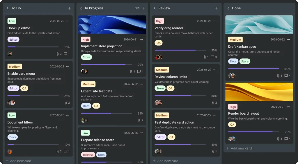
SVAR React Kanban is a React task-board component for moving work through configurable columns.
It supports drag-and-drop card movement, an attachable editor, filtering, sorting, and custom card rendering, with a REST data provider for server persistence.
Preview
Installation
npm install @svar-ui/react-kanbanRender a board
Import the CSS and wrap the board in Willow. The wrapper supplies theme variables for the board and its companion components.
Each card’s
columnmust match a column ID. Column order follows the array from left to right:
import { Kanban, Willow } from '@svar-ui/react-kanban';
import '@svar-ui/react-kanban/all.css';
const columns = [
  { id: 'backlog', label: 'Backlog' },
  { id: 'progress', label: 'In progress' },
  { id: 'done', label: 'Done' },
];
const cards = [
  { id: 1, label: 'Design landing page', column: 'backlog', priority: 2 },
  { id: 2, label: 'Review navigation', column: 'progress', progress: 0.5 },
];
export default function ProjectBoard() {
  return (
    <Willow>
      <Kanban cards={cards} columns={columns} />
    </Willow>
  );
}
Attach the card editor
Capture the instance API with init and pass it to Editor. Selecting a card opens the editor, and field changes dispatch update-card. Changes stay in memory until a backend or action handler saves them.
import { useState } from 'react';
import { Kanban, Editor, Willow } from '@svar-ui/react-kanban';
import '@svar-ui/react-kanban/all.css';
const columns = [
  { id: 'todo', label: 'To do' },
  { id: 'done', label: 'Done' },
];
const cards = [
  { id: 1, label: 'Update project brief', column: 'todo' },
];
export default function EditableBoard() {
  const [api, setApi] = useState(null);
  return (
    <Willow>
      <Kanban cards={cards} columns={columns} init={setApi} />
      {api && <Editor api={api} />}
    </Willow>
  );
}
Card fields and display
The card prop controls visible sections. A section needs both an enabled shape option and data on the card. Configure lookup data for readable priority, tag, and assignee labels.
| Field | Value and behavior |
|---|---|
id | Unique card identifier |
column | Owning column ID; configurable through columnAccessor |
label, description | Card title and supporting text |
priority | Numeric value resolved against configured priority options |
progress | Number from 0 to 1 |
deadline | Date, ISO string, or timestamp |
tags, users | IDs resolved against configured tag and user data |
cover | Image URL |
attachments, comments | Counts shown on the card |
css | Static card CSS classes |
Custom card rendering
For custom markup, pass a React component through cardContent, for example cardContent={TaskCard}. It receives card and cardShape.
Save changes to a backend
RestDataProvider uses a URL root and maps card actions to REST requests. Fetch initial records with getData(), then attach the provider with api.setNext(provider) inside init.
Date strings become Date objects on load, and outgoing dates use ISO strings.
Implement the routes below on your server, or handle actions manually when your API uses another format.
Use
api.on()to observe an action. Useapi.intercept()for validation.
| Action | Request |
|---|---|
| Initial load | GET /cards |
add-card | POST /cards |
update-card | PUT /cards/:id, debounced by 500 ms |
move-card | PUT /cards/:id/move |
delete-card | DELETE /cards/:id |
duplicate-card | POST /cards/:id/duplicate |