Description:
gradient-shimmer is a React text animation component that moves a multi-stop gradient highlight across real DOM text.
You can use it for concise status messages, product headlines, build activity labels, and other interface copy that benefits from a lightweight motion cue.
The component runs through the Web Animations API and does not require a stylesheet, Tailwind CSS, or runtime dependencies.
It includes preset gradients, custom color stops, scroll and viewport pause controls, and reduced-motion behavior for React 18+ projects.
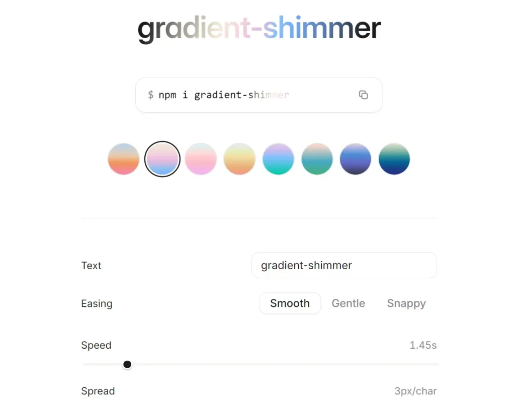
Preview
Features
- Uses the Web Animations API for performant gradient sweeps.
- Real DOM text that remains selectable and accessible to screen readers.
- Pauses animation while scrolling or when the element leaves the viewport.
- Respects the prefers-reduced-motion media query to disable animation automatically.
- Provides nine built-in gradient presets and accepts custom color stops.
- Renders as a span by default, with full control over the rendered element and pass-through props.
- Graceful fallback to plain text when background-clip is not supported.
How To Use It
Installaton
Install the package in an existing React or Next.js project:
npm i gradient-shimmerBasic Usage
Import GradientShimmer and pass a text string as its child content.
import { GradientShimmer } from "gradient-shimmer"
export function BuildStatus() {
  return (
    <p>
      <GradientShimmer>
        Checking your deployment
      </GradientShimmer>
    </p>
  )
}
The component renders a span by default. Set the as prop when the text should use another semantic HTML element.
Add a Shimmering Headline
Use a preset for short landing-page copy or product announcements.
import { GradientShimmer } from "gradient-shimmer"
export function ProductAnnouncement() {
  return (
    <GradientShimmer
      as="h2"
      gradient="twilight"
      duration={1.8}
      pauseBetween={1400}
      style={{
        display: "block",
        fontSize: "2.25rem",
        fontWeight: 700,
      }}
    >
      Workspace insights are ready
    </GradientShimmer>
  )
}
The duration value acts as a reference speed. The component adjusts the sweep against text width so short labels and longer headings keep a similar visual pace.
Use Custom Gradient Stops
Pass a gradient stop array when the built-in presets do not match the project color system.
import { GradientShimmer } from "gradient-shimmer"
export function UpgradeMessage() {
  return (
    <GradientShimmer
      gradient={[
        { color: "#A855F7", position: 0 },
        { color: "#38BDF8", position: 0.5 },
        { color: "#F9A8D4", position: 1 },
      ]}
      baseColor="#64748B"
      angle={100}
      spread={4}
      easing="gentle"
      pauseBetween={1600}
      style={{ fontWeight: 600 }}
    >
      Advanced reporting is processing
    </GradientShimmer>
  )
}
Show Progress From Client-Side State
Keep the shimmer inside a Client Component when it appears alongside local state, click handlers, or browser-side requests.
"use client"
import { useState } from "react"
import { GradientShimmer } from "gradient-shimmer"
export function ReportExportAction() {
  const [isExporting, setIsExporting] = useState(false)
  async function startExport() {
    setIsExporting(true)
    try {
      const response = await fetch("/api/reports/export", {
        method: "POST",
      })
      if (!response.ok) {
        throw new Error("Report export failed")
      }
    } finally {
      setIsExporting(false)
    }
  }
  return (
    <section>
      <button type="button" onClick={startExport} disabled={isExporting}>
        Export report
      </button>
      {isExporting && (
        <p role="status">
          <GradientShimmer gradient="mint" pauseBetween={1200}>
            Preparing your report
          </GradientShimmer>
        </p>
      )}
    </section>
  )
}
Available component props
| Prop | Type | Default | Purpose |
|---|---|---|---|
children | string | Required | Text content for the animated highlight. |
gradient | GradientStop[] | GradientPresetName | "sunrise" | Built-in preset name or custom gradient stop array. |
easing | "smooth" | "gentle" | "snappy" | "smooth" | Sweep timing curve. |
duration | number | 1.45 | Reference speed for the animation. |
spread | number | 3 | Gradient band width in pixels per character. |
angle | number | 105 | Gradient angle in degrees. |
pauseBetween | number | 1000 | Delay between completed sweeps in milliseconds. |
baseColor | string | "currentColor" | Base text color around the highlight band. |
pauseOnScroll | boolean | true | Stops animation while the page scrolls. |
pauseWhenOffscreen | boolean | true | Stops animation outside the viewport. |
respectReducedMotion | boolean | true | Uses a static gradient for reduced-motion preferences. |
as | ElementType | "span" | HTML element or React component to render. |
Built-in gradient presets include sunrise, bubble, sunset, peach, tonic, mint, spring, twilight, and bay.
The package also exports gradientPresets, easingPresets, and buildBandGradient. Use buildBandGradient() when a custom React component or server-rendered style needs the same gradient band output.
Next.js App Router Notes
Place a local wrapper in a Client Component when the shimmer depends on state, user events, browser requests, or other interactive UI logic.
"use client"
import { GradientShimmer } from "gradient-shimmer"
export function ImportStatus() {
  return (
    <GradientShimmer gradient="bay">
      Importing customer records
    </GradientShimmer>
  )
}
Alternatives and Related Resources
- performative-UI: 27+ React Components for AI Startups
- 36+ Copy-paste Loading Components for React
- Auto-Generated Skeleton Screens from Your Real UI
- gradient-shimmer on GitHub
FAQs
Q: Does gradient-shimmer require Tailwind CSS?
A: No. The package does not require Tailwind CSS or a separate stylesheet. Use inline styles, CSS Modules, plain CSS classes, or Tailwind utility classes through className.
Q: Why does the text appear static in some browsers?
A: The animated sweep depends on Element.animate() from the Web Animations API. Browsers without that API retain the initial gradient paint instead of the moving effect.
Q: How do I change the shimmer colors?
A: Pass a built-in preset name through gradient, or supply an array of { color, position } objects. Use baseColor to control the text color outside the highlight band.
Q: Is the text still readable by screen readers?
A: Yes. The component renders real DOM text nodes. The gradient is a background-clip effect, so assistive technologies access the text normally.


