Description:
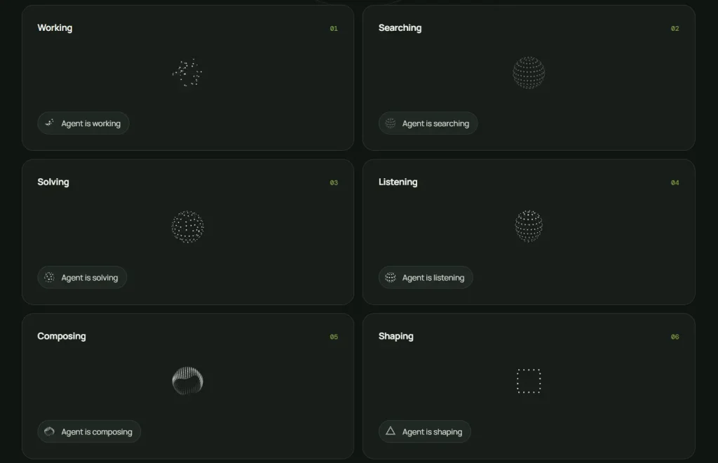
thinking-orbs is a React loading indicator component that represents six AI agent activities as animated dotted orbs. Each state uses a separate canvas animation for working, searching, solving, listening, composing, or shaping.
The component provides a 64px preset for chat avatars and a 20px preset for inline status text. Both sizes use independently tuned particle counts, dot dimensions, and animation speeds.
Preview:
Features:
- Six animations for common AI agent states.
- Separate 20px and 64px visual presets.
- Automatic light and dark theme detection.
- Plain 2D canvas rendering with no WebGL.
- Static frames for reduced-motion preferences.
- Automatic pauses for hidden tabs and offscreen elements.
- Accessible image roles and state-specific labels.
- Standard canvas attributes and React styles.
- Bundled TypeScript declarations.
- MIT license.
Use Cases
- An AI chat avatar changes from listening to composing while a voice response moves through each stage.
- Inline task rows display a compact searching or working indicator beside the current operation.
- Coding assistants distinguish repository analysis, problem solving, and output generation through separate motion patterns.
- Multi-agent dashboards assign a visible activity state to every running process.
- Research interfaces show when an agent moves from search to synthesis before returning its response.
How To Use It
Installation
Install thinking-orbs from npm:
npm install thinking-orbsReact and React DOM 18 or newer must already exist in the project.
Basic Usage
Import ThinkingOrb and select an initial activity state:
import { ThinkingOrb } from 'thinking-orbs';
export function SearchStatus() {
  return (
    <ThinkingOrb
      state="searching"
      size={64}
      aria-label="Searching project files"
    />
  );
}
The component renders a transparent <canvas> element. The searching state displays a dotted globe with a moving scan line.
Choose an Agent State
The state prop accepts six values:
workingdisplays particles moving along tilted orbits.searchingdisplays a scanning meridian across a dotted globe.solvingscrambles and restores segmented bands.listeningmoves a waveform through circular rings.composinganimates a flowing multi-band ribbon.shapingmorphs between a circle, triangle, and square.
Connect the prop to your application state when the agent changes activities:
import { ThinkingOrb } from 'thinking-orbs';
type AgentActivity =
  | 'working'
  | 'searching'
  | 'solving'
  | 'listening'
  | 'composing'
  | 'shaping';
interface AgentIndicatorProps {
  activity: AgentActivity;
}
export function AgentIndicator({
  activity
}: AgentIndicatorProps) {
  return (
    <ThinkingOrb
      state={activity}
      size={64}
      aria-label={`Agent is ${activity}`}
    />
  );
}
Display an Inline Status
Compact toolbars, task histories, and message rows usually need a smaller indicator. The 20px preset uses a separate drawing configuration designed for inline placement.
import { ThinkingOrb } from 'thinking-orbs';
export function InlineTaskStatus() {
  return (
    <span
      style={{
        display: 'inline-flex',
        alignItems: 'center',
        gap: 8
      }}
    >
      <ThinkingOrb
        state="working"
        size={20}
        aria-label="Processing request"
      />
      Processing request
    </span>
  );
}
The component supports only 20 and 64 as official size values. These presets contain different animation settings rather than a single drawing scaled to two dimensions.
Follow the Application Theme
The default auto theme checks ancestor elements for a data-theme attribute or a dark or light class.
<div data-theme="dark">
  <ThinkingOrb
    state="solving"
    size={64}
    theme="auto"
  />
</div>
When no matching ancestor exists, the component reads the operating system or browser color preference.
Set the theme explicitly when the surrounding surface does not follow the global application theme:
<div className="dark-panel">
  <ThinkingOrb
    state="listening"
    size={64}
    theme="dark"
  />
</div>
The dark value draws light dots for dark backgrounds. The light value draws dark dots for light backgrounds.
Control Animation Speed
The speed prop multiplies the timing assigned to the selected state and size:
<ThinkingOrb
  state="composing"
  size={64}
  speed={1.4}
/>
A value above 1 increases the animation speed. A value below 1 slows it down.
Pause the Animation
Set paused when the interface needs to hold the current visual state:
<ThinkingOrb
  state="shaping"
  size={64}
  paused={isWorkflowPaused}
/>
The component still draws a frame while paused. It stops requesting new animation frames until the prop changes.
Component Props
state('working' | 'searching' | 'solving' | 'listening' | 'composing' | 'shaping'): Selects the activity animation. The default isworking.size(20 | 64): Selects the inline or avatar preset. The default is64.theme('auto' | 'dark' | 'light'): Controls the monochrome palette. The default isauto.speed(number): Multiplies the preset animation speed. The default is1.paused(boolean): Freezes the current animation. The default isfalse.style(CSSProperties): Adds inline styles to the canvas.aria-label(string): Replaces the default accessible label for the selected state.
Other standard canvas attributes pass through to the rendered element. These include className, id, event handlers, and data-* attributes.