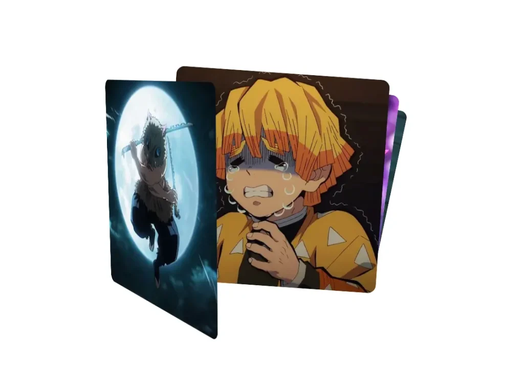
Description:
Dynamic Image Card Stack is a React component that lets you create an interactive, animated stack of cards. It uses 3D transformations and spring physics to produce a fluid user experience where items can be dragged and reordered with a tactile feel.
The component displays a collection of items, such as images or content cards, in a stacked layout. You can interact with the stack by dragging the top card.
As you drag, the card rotates in 3D space based on the cursor’s position. When you drag a card beyond a certain point, it moves to the bottom of the stack, allowing the next card to come into view.
Features
- 🃏 Dynamic Card Stacking. Cards are arranged in a stack with configurable rotation and scale effects.
- 🔄 3D Drag Interactions. Card rotations respond realistically to your drag movements for an immersive feel.
- 🌀 Spring Physics. Animations are smooth and natural because of the integrated spring transitions.
- 📦 Generic Architecture. The component is built with TypeScript generics, so it works with any type of stackable content.
- ⚙️ Configurable Effects. You can customize rotation angles, scaling factors, and 3D perspective to fit your project’s style.
- 🎯 Threshold Detection. Cards automatically cycle to the bottom of the stack when dragged beyond a set limit.
Preview

How to Use It
1. Clone the repository from Github and navigate into the project directory.
git clone https://github.com/mirayatech/image-card-stack.git
cd dynamic-image-card-stack
2. Install the necessary dependencies using npm.
npm install3. Run the local development server. This will start a Vite server, and you can view the project in your browser.
npm run dev