Description:
React Tilt Button is a React component that creates physical, tactile buttons with realistic 3D depth, hover tilt effects, and press squish animations.
The component splits hover interactions into left, middle, and right zones. This creates a directional tilt that responds to cursor position.
Features
- Creates directional tilt effects based on hover zone position.
- Implements press squish animations that simulate physical button compression.
- Maintains visible side walls to represent real button depth.
- Enforces automatic constraint clamping to prevent visual breakage.
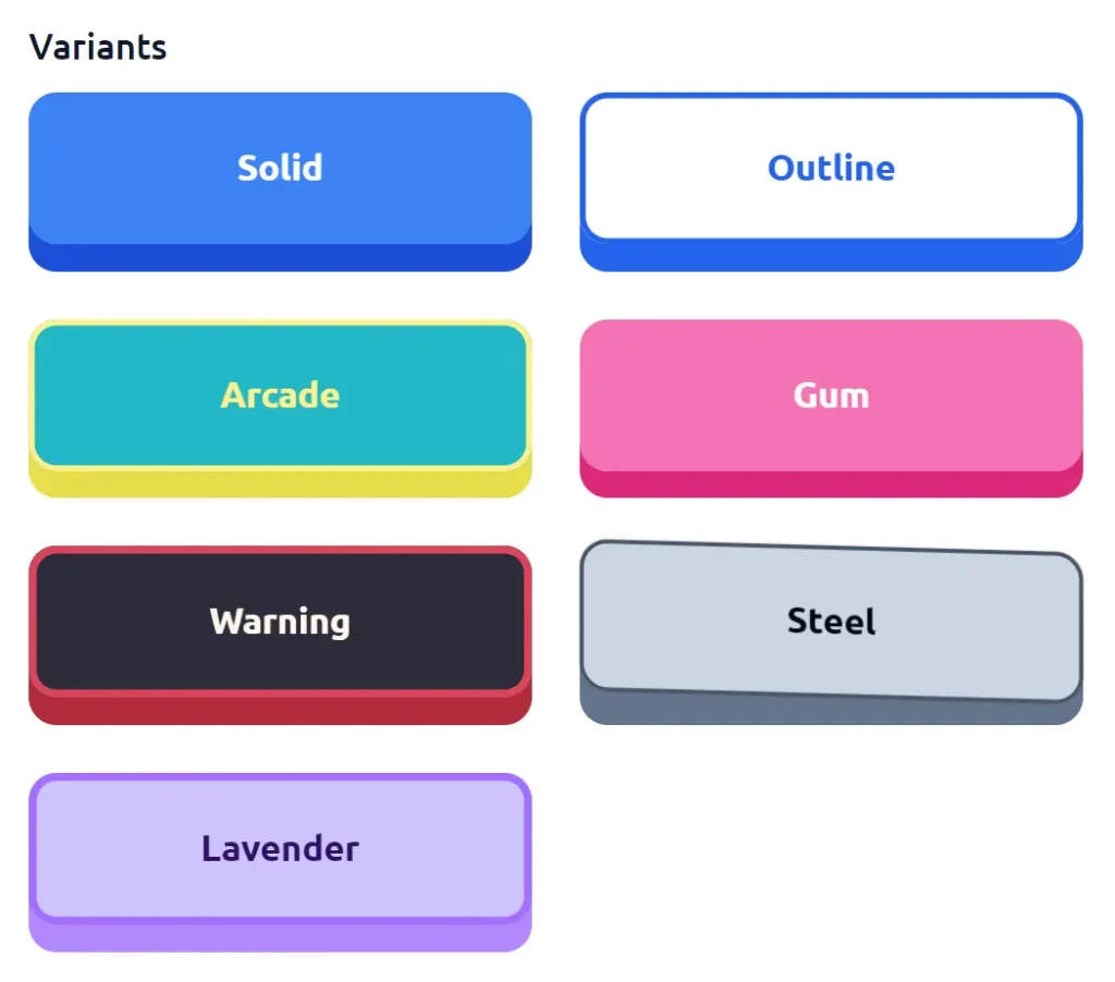
- Provides predefined style variants including solid, outline, arcade, carbon, and warning.
- Supports full geometry customization with width, height, elevation, and tilt properties.
- Includes an optional specular glare highlight that responds to cursor movement.
- Drives all visual styles through CSS variables for external theming.
- Fires click actions only on mouse release for natural button behavior.
Preview
Use Cases
- E-commerce checkout flows where tactile feedback improves user confidence in payment actions.
- Game interfaces requiring responsive, physical button feedback during rapid interactions.
- Admin dashboards where visual depth helps distinguish primary actions from secondary controls.
- Interactive tutorials where button animations signal readiness for the next step.
How to Use It
1. Install the package via npm.
npm install react-tilt-button2. Import the component into your React file. You can then render it with basic text and an onClick handler.
import { TiltButton } from 'react-tilt-button';
export default function App() {
  return (
    // Renders a basic 3D button with default solid styling
    <TiltButton onClick={() => console.log('Form submitted')}>
      Submit Data
    </TiltButton>
  );
}
3. The library includes several predefined variants. You can apply these using the variant prop.
// Renders a dark-themed carbon button
<TiltButton variant="carbon">Save Draft</TiltButton>
// Renders a high-visibility warning button
<TiltButton variant="warning">Delete Account</TiltButton>
4. Override specific colors on any variant.
// Overrides the top face color of the solid variant
<TiltButton
    variant='solid'
    surfaceColor='#3b82f6'
>
    Custom Blue Action
</TiltButton>
5. Customize the exact geometry and animation speed. The component automatically clamps these values. This keeps the 3D effect intact.
// Creates a large, highly elevated button with custom tilt physics
<TiltButton
    variant='arcade'
    width={350}
    height={100}
    elevation={25}
    pressInset={12}
    tilt={3}
    radius={16}
    motion={200}
>
    Start Game
</TiltButton>
6. Add a dynamic specular highlight. This simulates light reflecting off the button surface.
// Adds a subtle white glare band across the button face
<TiltButton
    glareColor='#ffffff'
    glareOpacity={0.15}
    glareWidth={50}
>
    Premium Upgrade
</TiltButton>
7. All component props.
children(ReactNode): Defines the content inside the button.onClick(function): Triggers an action on mouse release.disabled(boolean): Deactivates the button interaction.variant(string): Applies a predefined visual style preset.width(number | string): Sets the overall width.height(number | string): Sets the overall height.elevation(number): Defines the 3D depth.pressInset(number): Determines the downward travel distance on click.tilt(number): Controls the maximum rotation angle on hover.pressTilt(boolean): Maintains the current skew angle during a press.radius(number): Sets the corner roundness.motion(number): Controls the animation speed in milliseconds.surfaceColor(string): Overrides the top face color.sideColor(string): Overrides the 3D depth wall color.textColor(string): Overrides the label color.borderColor(string): Sets a custom border color.borderWidth(number): Defines the border thickness.glareColor(string): Sets the color of the specular highlight.glareOpacity(number): Controls the intensity of the glare effect.glareWidth(number): Defines the percentage width of the glare band.className(string): Applies additional CSS classes.style(object): Merges custom inline styles.
FAQs
Q: Why does the button geometry look distorted at high elevation values?
A: The component automatically clamps the elevation to a maximum of 30 percent of the height. You must increase the overall height to support a larger elevation value.
Q: Can I trigger the click action on mouse down?
A: The component fires the action on mouse release. This mimics real physical button behavior. You cannot change this default interaction model.
Q: How do I integrate custom CSS frameworks like Tailwind?
A: Pass your utility classes to the className prop. The component merges these classes with its internal styling.
Q: Does the tilt effect work on touch devices?
A: The component responds to touch events with a simplified press effect. Full tilt requires cursor movement, which is not available on touch screens.