Description:
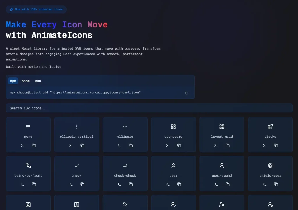
AnimateIcons is a React icon library provides a collection of over 100 customizable SVG icons built with motion/react for smooth and performant animations.
It allows you to replace static icons with dynamic animations to create more engaging user experiences.
Features
- 🎯 Smooth, purposeful animations out-of-the-box.
- ⚡ Lightweight and built with
motion/reactfor optimal performance. - 🎨 Over 100 customizable SVG icons are available.
- 📱 Compatible with both React and Next.js.
- 🔧 Optimized for performance to ensure a smooth user experience.
Preview
Use Cases
- User Interface Feedback: Provide visual cues for user actions, such as button clicks or form submissions.
- Loading Indicators: Use animated icons to show that a process is underway, reducing user uncertainty.
- Notifications: Draw user attention to important updates or messages with eye-catching animations.
- Onboarding: Guide new users through an application’s features with intuitive animated icons.
- Interactive Menus: Create dynamic and engaging navigation menus that respond to user interaction.
How to Use It
1. Install any icon directly into your project with the shadcn CLI. The following commands demonstrate how to add an icon using either npm or bun.
For npm users:
npx shadcn@latest add "https://animateicons.vercel.app/icons/atom.json"For bun users:
bunx shadcn@latest add "https://animateicons.vercel.app/icons/atom.json"You can replace atom.json with the name of any other icon available in the AnimateIcons gallery.
2. Import the icon into your React component. The example below shows how to import and use the AtomIcon.
"use client";
import { AtomIcon } from "./components/ui/AtomIcon";
export default function Page() {
   return <AtomIcon />;
}
3. Some icons offer more advanced control over their animations. For instance, the BellRingIcon can be controlled programmatically. You can start and stop the animation using a ref.
"use client";
import { useRef } from "react";
import { BellRingIcon, BellRingIconHandle } from "./components/ui/BellRingIcon";
export default function Page() {
   const bellRef = useRef<BellRingIconHandle>(null);
   return (
      <div>
         {/* Default hover animation */}
         <BellRingIcon size={32} />
         {/* Programmatic control */}
         <button onClick={() => bellRef.current?.startAnimation()}>Start</button>
         <button onClick={() => bellRef.current?.stopAnimation()}>Stop</button>
         <BellRingIcon ref={bellRef} size={32} />
      </div>
   );
}
FAQs
Q: Can I customize the appearance of the icons?
A: Yes, the SVG icons are customizable, allowing you to adjust them to fit your project’s design.
Q: Is AnimateIcons suitable for mobile applications?
A: AnimateIcons is primarily designed for React and Next.js web applications.
Q: Where can I find a list of all available icons?
A: You can view the complete gallery of icons on the AnimateIcons website at animateicons.vercel.app.
