Description:
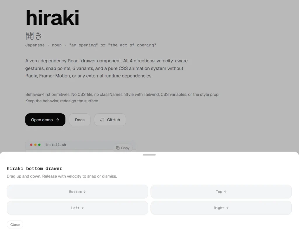
Hiraki is a React drawer component that creates accessible drawer panels, native app-like bottom sheets, and off-canvas navigation menus in React applications.
It supports all four slide directions, velocity-aware touch gestures, multiple snap points, and six visual variants.
Features
- Supports all four slide directions: bottom, top, left, and right.
- Velocity-aware gesture detection with inertia-based snap point targeting across all directions.
- Three snap point formats: pixel values from the edge, viewport percentage strings, and a content-height mode that snaps to the drawer’s natural height.
- Six layout variants: default, floating, sheet, fullscreen, nested, and stack.
- ARIA dialog semantics with focus trapping, Escape-to-dismiss, overlay-click dismissal, and scroll locking.
- iOS Safari scroll behavior fix included at the component level.
- Pure CSS transition system with slide, spring, scale, and morph animation presets.
- Respects the
prefers-reduced-motionmedia query for users with motion sensitivity settings. - Background scaling support via a
data-hiraki-backgroundattribute on any wrapper element. - Controlled and uncontrolled open state modes with a full callback API.
- Rubber band resistance at drag boundaries.
Preview
Use Cases
- Mobile e-commerce product pages that need a native app-like bottom sheet for size selection and add-to-cart actions.
- Navigation menus on mobile web apps that slide in from the left or right edge of the screen.
- Multi-step filter or sort panels on content-heavy pages that expand from the bottom on touch devices.
- Settings and configuration panels in dashboard applications presented at a specific snap position.
How to Use It
Install the Package
npm install hiraki
# or with pnpm
pnpm add hiraki
# or with yarn
yarn add hiraki
Basic Drawer Setup
This is the minimum structure. Every Drawer.* component is a named export from the hiraki package.
import { Drawer } from 'hiraki'
function ProductPanel() {
  return (
    // Drawer.Root is the context provider and state container for the whole drawer
    <Drawer.Root>
      {/* Drawer.Trigger renders the element that opens the drawer on click */}
      <Drawer.Trigger>View Product Details</Drawer.Trigger>
      {/* Drawer.Portal teleports the drawer outside the current DOM subtree */}
      <Drawer.Portal>
        {/* Drawer.Overlay renders a backdrop element behind the drawer panel */}
        <Drawer.Overlay className="fixed inset-0 bg-black/40" />
        {/* Drawer.Content is the main drawer panel */}
        <Drawer.Content className="fixed bottom-0 left-0 right-0 bg-white rounded-t-2xl p-6 shadow-2xl">
          {/* Drawer.Handle renders the visual drag indicator bar at the top of the panel */}
          <Drawer.Handle className="w-12 h-1.5 bg-gray-300 rounded-full mx-auto mb-6" />
          {/* Drawer.Title sets the accessible label for the ARIA dialog */}
          <Drawer.Title className="text-xl font-bold text-gray-900">
            Product Specifications
          </Drawer.Title>
          {/* Drawer.Description sets the accessible description for the ARIA dialog */}
          <Drawer.Description className="text-gray-500 mt-2 text-sm">
            Review dimensions, materials, and available colors before adding to cart.
          </Drawer.Description>
          {/* Drawer.Close renders an element that closes the drawer on click */}
          <Drawer.Close className="mt-6 px-5 py-2.5 bg-gray-100 rounded-lg text-sm font-medium">
            Done
          </Drawer.Close>
        </Drawer.Content>
      </Drawer.Portal>
    </Drawer.Root>
  )
}
Controlled Open State
Use the controlled pattern when you need to open or close the drawer from outside the trigger element.
import { useState } from 'react'
import { Drawer } from 'hiraki'
function FilterPanel() {
  // Manage open state externally to control the drawer programmatically
  const [open, setOpen] = useState(false)
  const handleApply = () => {
    // Run filter logic here, then close the drawer
    setOpen(false)
  }
  return (
    <>
      <button onClick={() => setOpen(true)} className="btn-primary">
        Open Filters
      </button>
      {/* Pass open and onOpenChange to switch to controlled mode */}
      <Drawer.Root open={open} onOpenChange={setOpen}>
        <Drawer.Portal>
          <Drawer.Overlay />
          <Drawer.Content className="fixed bottom-0 left-0 right-0 bg-white p-6 rounded-t-2xl">
            <Drawer.Handle />
            <Drawer.Title className="text-lg font-semibold mb-4">Filter Results</Drawer.Title>
            {/* ... filter controls ... */}
            <button onClick={handleApply} className="btn-primary w-full mt-4">
              Apply Filters
            </button>
          </Drawer.Content>
        </Drawer.Portal>
      </Drawer.Root>
    </>
  )
}
Snap Points
Snap points define positions where the drawer rests after a drag gesture. Three formats are supported: pixel values (distance from the edge), percentage strings (fraction of viewport), and the special 'content' keyword that snaps to the drawer’s natural height.
import { useState } from 'react'
import { Drawer } from 'hiraki'
function CartSummary() {
  // activeSnapPoint tracks which snap index is currently active
  const [snap, setSnap] = useState(0)
  return (
    <Drawer.Root
      // Define three resting positions as percentages of viewport height
      snapPoints={['30%', '60%', '92%']}
      // activeSnapPoint sets the current position index
      activeSnapPoint={snap}
      // onSnapPointChange fires with the new index on each snap transition
      onSnapPointChange={setSnap}
    >
      <Drawer.Trigger>View Cart</Drawer.Trigger>
      <Drawer.Portal>
        <Drawer.Overlay />
        <Drawer.Content className="fixed bottom-0 left-0 right-0 bg-white rounded-t-2xl">
          <Drawer.Handle />
          <Drawer.Title className="px-6 pt-5 font-semibold text-lg">
            Your Cart (3 items)
          </Drawer.Title>
          {/* Content scrolls naturally within the panel at the 92% snap position */}
          <div className="px-6 pb-6 mt-4 overflow-y-auto">
            {/* cart items */}
          </div>
        </Drawer.Content>
      </Drawer.Portal>
    </Drawer.Root>
  )
}
Snap points using pixel values work the same way. A value of 200 means 200 pixels of the drawer panel are visible from the edge.
// Pixel-based snap points
<Drawer.Root snapPoints={[180, 380, 600]}>
  ...
</Drawer.Root>
// Snap to the drawer's natural content height
<Drawer.Root snapPoints={['content']}>
  ...
</Drawer.Root>
Off-Canvas Side Navigation
Set direction to "left" or "right" for a horizontal off-canvas pattern. The gesture axis and transforms switch automatically.
import { Drawer } from 'hiraki'
function SideNav() {
  return (
    // direction="left" slides the panel in from the left edge
    <Drawer.Root direction="left" variant="sheet">
      <Drawer.Trigger className="p-2 rounded-md hover:bg-gray-100">
        ☰ Menu
      </Drawer.Trigger>
      <Drawer.Portal>
        <Drawer.Overlay className="fixed inset-0 bg-black/30" />
        {/* Position and size the content for a vertical sidebar layout */}
        <Drawer.Content className="fixed top-0 left-0 h-full w-72 bg-slate-900 text-white p-8 flex flex-col">
          <Drawer.Title className="text-lg font-semibold mb-8 text-slate-100">
            Navigation
          </Drawer.Title>
          <nav className="flex flex-col gap-2">
            <a href="/dashboard" className="text-slate-300 hover:text-white py-2">Dashboard</a>
            <a href="/analytics" className="text-slate-300 hover:text-white py-2">Analytics</a>
            <a href="/projects" className="text-slate-300 hover:text-white py-2">Projects</a>
            <a href="/settings" className="text-slate-300 hover:text-white py-2">Settings</a>
          </nav>
          <Drawer.Close className="mt-auto text-slate-500 text-sm">
            Close Menu
          </Drawer.Close>
        </Drawer.Content>
      </Drawer.Portal>
    </Drawer.Root>
  )
}
Background Scaling Effect
The shouldScaleBackground prop scales the page content behind the drawer as it opens. Mark the wrapper element with data-hiraki-background and Hiraki applies the transform automatically.
import { Drawer } from 'hiraki'
function App() {
  return (
    // shouldScaleBackground activates the scale transform on the marked element
    <Drawer.Root shouldScaleBackground>
      {/* data-hiraki-background marks this element as the scaling target */}
      <div data-hiraki-background className="min-h-screen bg-gray-50">
        <header>...</header>
        <main>...</main>
        <Drawer.Trigger>Open Settings</Drawer.Trigger>
      </div>
      <Drawer.Portal>
        <Drawer.Overlay />
        <Drawer.Content className="fixed bottom-0 left-0 right-0 bg-white rounded-t-2xl p-6">
          <Drawer.Handle />
          <Drawer.Title className="font-semibold text-lg">Account Settings</Drawer.Title>
          <Drawer.Close className="mt-4 text-sm text-gray-500">Dismiss</Drawer.Close>
        </Drawer.Content>
      </Drawer.Portal>
    </Drawer.Root>
  )
}
Sync a UI Element to Drag Progress
The --hiraki-drag-progress CSS custom property updates on every animation frame. Use it to animate any element in sync with the drawer’s position.
import { Drawer } from 'hiraki'
function AnimatedHeader() {
  return (
    <Drawer.Root>
      <Drawer.Trigger>Open</Drawer.Trigger>
      <Drawer.Portal>
        <Drawer.Overlay />
        <Drawer.Content className="fixed bottom-0 left-0 right-0 bg-white rounded-t-2xl p-6">
          <Drawer.Handle />
          {/* This element reads --hiraki-drag-progress and fades in as the drawer opens */}
          <div
            style={{
              // opacity transitions from 0 (closed) to 1 (fully open) as the user drags
              opacity: 'var(--hiraki-drag-progress)',
              transition: 'none', // Let Hiraki control the timing
            }}
          >
            <Drawer.Title className="font-semibold">Synced Title</Drawer.Title>
          </div>
          <Drawer.Close>Close</Drawer.Close>
        </Drawer.Content>
      </Drawer.Portal>
    </Drawer.Root>
  )
}
API Reference
Drawer.Root Props
open(boolean): Sets the open state in controlled mode. Pair withonOpenChange.defaultOpen(boolean, default:false): Sets the initial open state in uncontrolled mode.onOpenChange((open: boolean) => void): Callback fired when the drawer’s open state changes.direction(“top” | “bottom” | “left” | “right”, default:"bottom"): Sets the slide direction of the drawer panel. Gesture axis and CSS transforms adjust automatically per direction.variant(“default” | “floating” | “sheet” | “fullscreen” | “nested” | “stack”, default:"default"): Sets the structural variant of the drawer layout.modal(boolean, default:true): Activates modal behavior. In modal mode, the library applies focus trapping, scroll locking, and ARIA dialog semantics.dismissible(boolean, default:true): Allows the drawer to close on overlay click or Escape key press. Set tofalseto require an explicit close action.snapPoints((number | string)[], default:[]): Defines resting positions. Accepts pixel values (e.g.,200), percentage strings (e.g.,'55%'), or the'content'keyword.activeSnapPoint(number): Sets the active snap point index in controlled mode. Pair withonSnapPointChange.onSnapPointChange((index: number) => void): Callback fired with the new snap index whenever the drawer transitions to a different snap position.closeThreshold(number, default:0.5): Sets the drag-progress fraction at which the drawer closes on release.0.5means dragging past 50% of the total travel closes the drawer.rubberBand(boolean, default:true): Activates elastic resistance when the user drags past the boundary positions.inertia(boolean, default:true): Activates velocity-based snap point targeting. A fast release overshoots to the next snap position; a slow release lands at the nearest one.shouldScaleBackground(boolean, default:false): Scales the element marked withdata-hiraki-backgroundas the drawer opens.onDragStart((data: GestureCallbackData) => void): Callback fired at the start of a drag gesture.onDrag((data: GestureCallbackData) => void): Callback fired on each frame during a drag gesture.onDragEnd((data: GestureCallbackData) => void): Callback fired when a drag gesture ends.
Drawer.Handle Props
visible(boolean, default:true): Controls the visibility of the handle bar element.handleOnly(boolean, default:false): Restricts drag detection to the handle element. The rest of the drawer panel becomes non-draggable.
Drawer.Trigger / Drawer.Close Props
asChild(boolean, default:false): Merges the trigger or close behavior onto the child element. The child renders as its own element type rather than a defaultbutton.
CSS Custom Properties
--hiraki-drag-progress: A number from0(fully closed) to1(fully open). Updates on every animation frame during a drag. Read it in CSS viavar(--hiraki-drag-progress)or in JavaScript viagetComputedStyle(element).getPropertyValue('--hiraki-drag-progress').
Alternatives
- vaul: A React drawer component built on Radix UI primitives with a focus on mobile bottom sheets.
- react-spring-bottom-sheet: A bottom sheet implementation for React that uses react-spring for its animation runtime.
- MUI Drawer: The drawer component from Material UI, tightly coupled to the MUI design system and theme layer.


