Description:
react-native-shimmer-text is a lightweight component for adding animated shimmer effects to text in React Native applications. Works across iOS, Android, and web platforms.
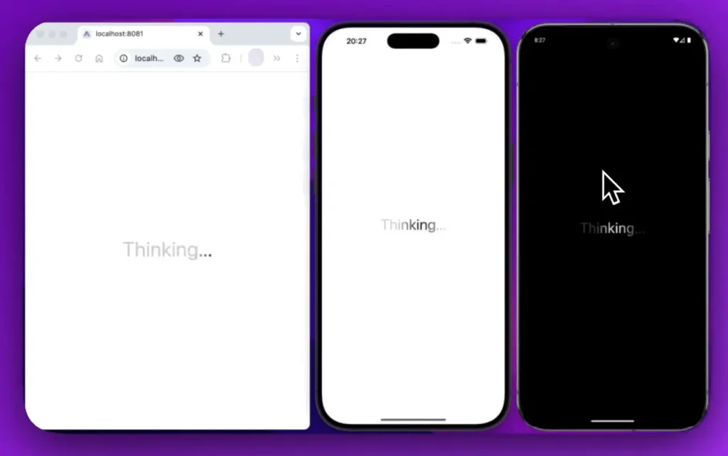
This component displays text with a gradient animation that moves across the characters. It is often used to indicate loading states while maintaining a polished user interface.
You can control the animation’s speed, direction, and color scheme. The component automatically adapts to your application’s light or dark theme.
Features
- 🎛️ Full control over animation duration and direction left to right or right to left.
- 🌗 Built in theme awareness that responds to light and dark mode settings.
- 📏 A range of predefined text sizes from extra small to 9xl.
- ⚡ Smooth performance powered by the react native reanimated library.
- 🎨 Customizable color sets for both the text and the shimmer gradient.
Preview
Use Cases
- Displaying a placeholder for a username or profile information while it is being fetched from a server.
- Indicating that a comment or chat message is in the process of being sent or loaded.
- Using it as a loading indicator for headlines or titles in a news feed or article list.
- Showing a “Processing…” or “Thinking…” state after a user submits a form or initiates an action.
How to Use It
1. Install the library and its peer dependencies.
For npm users:
npm install react-native-shimmer-textFor yarn users:
yarn add react-native-shimmer-textInstall the required peer dependencies:
expo install react-native-reanimated @react-native-masked-view/masked-view2. Import the component into your project and place your desired loading text inside it.
import React from 'react';
import { View, StyleSheet } from 'react-native';
import ShimmerText from 'react-native-shimmer-text';
export default function App() {
  return (
    <View style={styles.container}>
      <ShimmerText>ReactScript...</ShimmerText>
    </View>
  );
}
const styles = StyleSheet.create({
  container: {
    flex: 1,
    justifyContent: 'center',
    alignItems: 'center',
  },
});
3. The duration prop sets the animation cycle time in seconds, while direction can be either ltr (left-to-right) or rtl (right-to-left).
<ShimmerText
  size="2xl"
  duration={2}
  direction="rtl"
>
  Fetching Data
</ShimmerText>
4. You can also define custom colors for light and dark themes. The colors prop accepts an object with light and dark keys, each specifying colors for the text and the shimmer gradient.
const customShimmerColors = {
  light: {
    text: '#555555',
    shimmer: {
      start: '#f0f0f0',
      middle: '#ffffff',
      end: '#f0f0f0',
    },
  },
  dark: {
    text: '#bbbbbb',
    shimmer: {
      start: '#333333',
      middle: '#555555',
      end: '#333333',
    },
  },
};
<ShimmerText size="lg" colors={customShimmerColors}>
  Custom Themed Text
</ShimmerText>
5. All component props:
children(string): The text content that will receive the shimmer effect.style(TextStyle): Applies standard React Native text styles to the content.shimmerStyle(ViewStyle | WebShimmerStyle): Customizes the styling of the shimmer effect layer.containerStyle(ViewStyle): Applies styles to the component’s root container.duration(number): Sets the animation’s duration in seconds. The default is3.bold(boolean): A shorthand to apply a bold font weight to the text. It defaults totrue.highlightWidth(number): Defines the shimmer highlight’s width as a percentage (0-100) of the component’s width.direction(‘ltr’ | ‘rtl’): Specifies the animation’s direction, either left-to-right (ltr) or right-to-left (rtl). The default is'ltr'.angle(number): Sets the angle of the shimmer gradient in degrees. The default value is100.size(TextSize): A set of predefined font sizes, ranging from'xs'to'9xl'. The default is'md'.colors({ light?: ShimmerColors, dark?: ShimmerColors }): An object to define custom text and shimmer colors for both light and dark themes.width(number): Sets a specific width for the component.height(number): Sets a specific height for the component.


