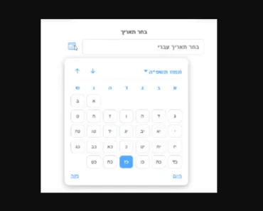
Description:
React Date Range Input is a lightweight, customizable component for React applications that simplifies date range selection.
It provides a user-friendly interface with popup calendars, making it easy for users to choose start and end dates.
Features
- 📅 Fully controlled input component
- 🎛️ Customizable popup with 1, 2, or more calendars
- 🎨 Adjustable highlight colors and custom day rendering
- 🧩 Headless & styled for easy extension or style overrides
- 📱 Responsive design with flexible positioning
- 🔧 TypeScript support for improved developer experience
Use Cases
- Booking systems: Implement date range selection for hotel reservations or rental services.
- Analytics dashboards: Allow users to select custom date ranges for data visualization.
- Event planning: Enable users to set start and end dates for multi-day events or conferences.
- Reporting tools: Facilitate date range selection for generating periodic reports or financial statements.
How to Use It
1. Install with package managers
npm install @cameratajs/react-date-range-inputor
yarn add @cameratajs/react-date-range-input2. Basic usage:
   import { useState } from 'react';
   import { DateRangeInput } from '@cameratajs/react-date-range-input';
   function App() {
     const [range, setRange] = useState({
       startDate: null,
       endDate: null,
     });
     return (
       <DateRangeInput
         startDate={range.startDate}
         endDate={range.endDate}
         onChange={setRange}
         calendars={2}
         anchor="bottom"
         color="#e11d48"
         highlightColor="#333"
         highlightRangeColor="#ddd"
         startDatePlaceholder="Start date"
         endDatePlaceholder="End date"
       />
     );
}- Key props:
startDateandendDate: Control the selected date rangeonChange: Callback function for handling date changescalendars: Number of calendars to display in the popupanchor: Position of the popup relative to the inputcolor,highlightColor,highlightRangeColor: Customize the appearancerenderDay: Custom day rendering function for advanced customization
FAQs
Q: Can I customize the date format displayed in the input fields?
A: The component doesn’t directly provide date formatting options. You’ll need to format the dates yourself before passing them to the startDate and endDate props. Consider using a library like date-fns for consistent formatting.
Q: How can I restrict the selectable date range?
A: Currently, the component doesn’t have built-in date restriction. You’d need to implement this logic in your onChange handler, rejecting invalid selections based on your criteria.
Q: Is it possible to style the calendar popup to match my application’s theme?
A: Yes, you can use the popupClassName and calendarContainerClassName props to apply custom CSS classes. For more granular control, you can override the default styles or use the renderDay prop for custom day rendering.
Q: Does this component support internationalization?
A: The component itself doesn’t handle internationalization. You’ll need to provide localized strings for placeholders and implement custom day rendering for localized day/month names.


