Description:
dot-anime-react is a React component library that renders animated dot matrix displays and text scramble effects.
The package comes with three main components: DotMatrix for grid-based animations, ScrambleText for character transition effects, and DotFlow for synchronized combinations of both.
Each component accepts configuration for colors, shapes, timing intervals, and custom styling through standard React props.
Features
- 🎨 Full Customization: Configure colors, dot shapes, grid dimensions, and animation timing through props.
- 📦 TypeScript Support: Includes complete type definitions for all components and configuration objects.
- 🔄 Frame Sequence Format: Define animations as arrays of active dot indices per frame.
- ⚡ Optimized Rendering: Updates only changed dots between frames to reduce unnecessary renders.
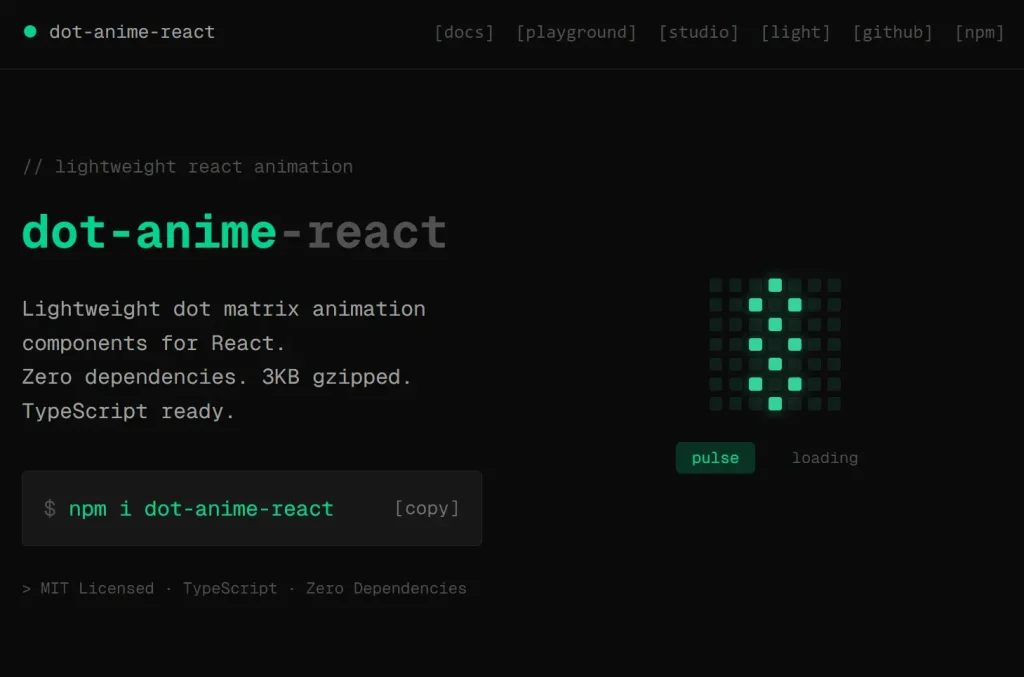
Preview
Use Cases
- Loading Indicators: Build animated status displays that cycle through different dot patterns while waiting for data or processing tasks.
- Status Labels: Combine dot animations with scrambled text transitions to show state changes in dashboards or monitoring interfaces.
- Micro Interactions: Add subtle animated feedback elements to buttons, cards, or notification badges.
- Retro UI Elements: Create pixel-art style animations for applications with vintage or arcade-themed designs.
How to Use It
1. Install the package through npm, yarn, or pnpm:
npm install dot-anime-react2. Import the DotMatrix component and define a sequence array where each nested array represents one animation frame. Each frame contains the indices of dots you want to activate on a 7×7 grid:
import { DotMatrix } from 'dot-anime-react';
const pulseSequence = [
  [24],
  [17, 23, 25, 31],
  [10, 16, 18, 24, 30, 32, 38],
  [17, 23, 25, 31],
  [24],
];
function App() {
  return <DotMatrix sequence={pulseSequence} />;
}
The component renders a grid and animates through each frame at 100ms intervals by default. Dot indices start at 0 in the top-left corner and increment left-to-right, top-to-bottom. Calculate any position as row × columns + column.
Configure grid dimensions, dot appearance, and timing through props:
<DotMatrix
  sequence={pulseSequence}
  cols={7}
  rows={7}
  dotSize={8}
  gap={3}
  shape="circle"
  interval={100}
  color="#00ffff"
  inactiveColor="#222222"
/>
The shape prop accepts three presets: “circle” for round dots, “square” for sharp corners, or “rounded” for slightly rounded squares. You can override these with a custom radius value:
<DotMatrix shape="circle" />
<DotMatrix shape="square" />
<DotMatrix shape="rounded" />
<DotMatrix radius={4} />
Control animation playback with the active prop and loop count. The component fires callbacks when frames change or animation completes:
const [isPlaying, setIsPlaying] = useState(true);
<DotMatrix
  sequence={pulseSequence}
  active={isPlaying}
  loop={3}
  onFrameChange={(frameIndex) => {
    console.log('Now showing frame:', frameIndex);
  }}
  onFinish={() => {
    console.log('Animation finished');
  }}
/>
Set loop to -1 for infinite repetition. Apply custom styles to dots through dotStyle for base appearance and activeDotStyle for lit dots:
<DotMatrix
  dotStyle={{ opacity: 0.3 }}
  activeDotStyle={{
    backgroundColor: '#00ffff',
    boxShadow: '0 0 8px #00ffff',
  }}
  bgColor="#000000"
/>
3. The ScrambleText component animates text changes by cycling through random characters before revealing the final text:
import { ScrambleText } from 'dot-anime-react';
<ScrambleText
  text="Loading"
  duration={800}
  interval={30}
  chars="ABCDEFGHIJKLMNOPQRSTUVWXYZ0123456789"
  onComplete={() => console.log('Text revealed')}
/>
When you update the text prop, the component scrambles through characters from the chars string at the specified interval, then settles on the new value after the duration elapses.
4. The DotFlow component combines DotMatrix and ScrambleText with automatic rotation between multiple items:
import { DotFlow } from 'dot-anime-react';
const statusItems = [
  {
    title: "Loading",
    frames: [[24],[17, 23, 25, 31], [24]]
  },
  {
    title: "Success",
    frames: [[30], [23, 30, 37], [16, 23, 30, 37, 44]]
  },
  {
    title: "Error",
    frames: [[0, 6, 42, 48], [8, 12, 36, 40]]
  },
];
<DotFlow items={statusItems} autoPlay={3000} />
The autoPlay prop rotates through items at the specified millisecond interval. For manual control, use activeIndex and onChange:
const [currentIndex, setCurrentIndex] = useState(0);
<DotFlow
  items={statusItems}
  activeIndex={currentIndex}
  onChange={setCurrentIndex}
/>
Configure the layout direction, spacing, and pass nested props to the matrix and scramble components:
<DotFlow
  items={statusItems}
  direction="horizontal"
  spacing={16}
  matrix={{
    dotSize: 8,
    shape: "circle",
    color: "#00ffff"
  }}
  scramble={{
    duration: 500
  }}
  textSize={18}
  textColor="#00ffff"
  textWeight={600}
/>
The matrix object accepts any DotMatrix prop except sequence, while scramble takes ScrambleText props except text. Text styling applies through dedicated props like textSize, textColor, and textWeight.
API Reference
DotMatrix Props
| Prop | Type | Default | Description |
|---|---|---|---|
sequence | number[][] | Required | Array of frames, each containing active dot indices |
cols | number | 7 | Number of columns in the grid |
rows | number | 7 | Number of rows in the grid |
dotSize | number | 6 | Dot diameter or width in pixels |
gap | number | 2 | Space between dots in pixels |
shape | "circle" | "square" | "rounded" | "rounded" | Preset dot shape |
radius | number | string | – | Custom border radius value |
interval | number | 100 | Milliseconds per frame |
active | boolean | true | Play or pause animation |
loop | number | -1 | Number of loops, -1 for infinite |
color | string | "#ffffff" | Color for active dots |
inactiveColor | string | "rgba(255,255,255,0.15)" | Color for inactive dots |
bgColor | string | – | Container background color |
dotStyle | CSSProperties | – | Base CSS styles for all dots |
activeDotStyle | CSSProperties | – | CSS styles for active dots |
onFrameChange | (index: number) => void | – | Callback fired when frame changes |
onFinish | () => void | – | Callback fired when animation completes |
The component also accepts standard HTML div attributes except children.
ScrambleText Props
| Prop | Type | Default | Description |
|---|---|---|---|
text | string | Required | Text to display after scramble |
chars | string | "ABCDEFGHIJKLMNOPQRSTUVWXYZ0123456789" | Character set for scramble effect |
duration | number | 800 | Total animation length in milliseconds |
interval | number | 30 | Milliseconds between character updates |
animate | boolean | true | Enable or disable animation |
onComplete | () => void | – | Callback fired when scramble finishes |
The component accepts standard HTML span attributes except children.
DotFlow Props
| Prop | Type | Default | Description |
|---|---|---|---|
items | DotFlowItem[] | Required | Array of objects with title and frames |
activeIndex | number | – | Current item index for controlled mode |
autoPlay | number | – | Millisecond interval for auto-rotation |
direction | "horizontal" | "vertical" | "horizontal" | Stack direction for matrix and text |
spacing | number | 16 | Gap between matrix and text in pixels |
matrix | DotMatrixConfig | – | Props to pass to DotMatrix component |
scramble | ScrambleTextConfig | – | Props to pass to ScrambleText component |
textSize | number | string | 16 | Font size for text |
textColor | string | – | Text color, inherits from matrix.color if unset |
textWeight | number | string | 500 | Font weight for text |
letterSpacing | number | string | – | Letter spacing for text |
textStyle | CSSProperties | – | Additional CSS styles for text |
onChange | (index: number) => void | – | Callback fired when active index changes |
The component accepts standard HTML div attributes except children and onChange.
Related Resources
- Framer Motion: React animation library with spring physics and gesture support for complex UI transitions.
- React Spring: Spring physics-based animation library for data-driven animations and interactive elements.
- GSAP: JavaScript animation platform for high-performance timelines and complex sequences.
FAQs
Q: Can I animate multiple dot matrices on the same page?
A: Yes. Each DotMatrix instance runs independently. Render multiple components with different sequences and they will animate without interfering with each other.
Q: How do I create diagonal or circular patterns in the grid?
A: Calculate the indices mathematically based on the pattern you want. For a diagonal from top-left to bottom-right on a 7×7 grid, use indices [0, 8, 16, 24, 32, 40, 48]. For circles, calculate distance from center and include dots within your radius threshold.
Q: Does the library work with Next.js server components?
A: No. The components use React hooks like useState and useEffect, which require client-side rendering. Add the “use client” directive at the top of files that import these components.
Q: Can I trigger animations programmatically instead of on mount?
A: Control playback with the active prop. Set it to false initially, then change it to true when you want the animation to start. You can also update the sequence prop to switch between different animations.
Q: How do I sync multiple DotFlow components?
A: Use controlled mode with activeIndex and manage the state in a parent component. Update the shared state value to rotate all instances simultaneously.