Description:
@rn-nui/switch is a React Native component that enhance native iOS & Android switches with improved functionality.
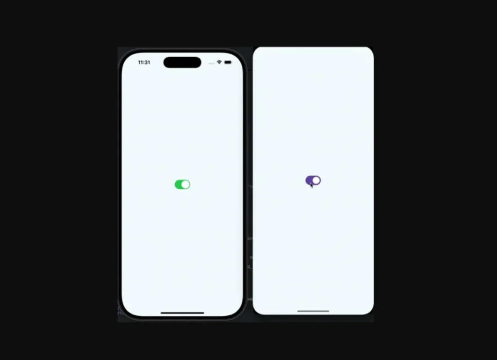
It uses Material 3 switches for Android applications and the standard switch component from React Native for iOS.
This approach ensures your application’s UI feels appropriate for each platform while managing a consistent API.
Features
- 🎨 State-Based Color Control. Specify distinct colors for the thumb and track for both “on” and “off” states directly in the props.
- ⚙️ Android Icon Support. Add a drawable resource as an icon on the switch’s thumb for Android devices.
- 🛠️ Simple Configuration. Requires minimal setup, with straightforward installation and platform-specific instructions.
- 🤝 Consistent API. Offers a unified set of properties and callbacks for both iOS and Android platforms.
Preview
How to Use It
1. Install the @rn-nui/switch package:
npm install @rn-nui/switchOR
yarn add @rn-nui/switch2. Platform configuration:
iOS
No additional configuration is necessary for iOS. The component uses the standard React Native switch.
Android
To support Material 3 components, you must update your app’s theme. Modify the file at /android/app/src/main/res/values/styles.xml to inherit from a Material 3 theme.
<resources>
    <style name="AppTheme" parent="Theme.Material3.DayNight.NoActionBar">
      <!-- Your custom theme attributes can go here -->
    </style>
</resources>
For Expo projects, you will need to edit the native files directly as described above, as an Expo plugin is not yet available.
3. To implement a basic switch, import the component and manage its state. The value prop controls its state, and the onValueChange callback updates it.
import React, { useState } from 'react';
import { View, StyleSheet } from 'react-native';
import { Switch } from '@rn-nui/switch';
const App = () => {
  const [notificationsEnabled, setNotificationsEnabled] = useState(false);
  return (
    <View style={styles.container}>
      <Switch
        value={notificationsEnabled}
        onValueChange={setNotificationsEnabled}
      />
    </View>
  );
};
const styles = StyleSheet.create({
  container: {
    flex: 1,
    justifyContent: 'center',
    alignItems: 'center',
  },
});
export default App;
4. You can customize the switch’s appearance with the following props.
value(boolean): Sets the current state of the switch, either on or off. This prop is required for both platforms.onValueChange((value: boolean) => void): A callback function that receives the new boolean value when the user toggles the switch.onChange((event: SwitchChangeEvent) => void): An alternative callback that is called with the full native event object when the switch’s value changes.disabled(boolean): If set totrue, the switch is non-interactive and appears grayed out.thumbColor({ false: ColorValue; true: ColorValue }): Sets the color of the switch’s thumb (the movable part) for both its off (false) and on (true) states.trackColor({ false: ColorValue; true: ColorValue }): Defines the color of the track (the background) for the switch’s off (false) and on (true) states.icon(string): Specifies the name of an Android drawable resource to display as an icon on the thumb. This prop is only for Android.iconSize(number): Sets the size of the icon on the thumb. This is an Android-only prop.iconColor({ false: ColorValue; true: ColorValue }): Controls the color of the icon for the switch’s off (false) and on (true) states on Android.outlineColor({ false: ColorValue; true: ColorValue }): Determines the color of the switch’s outline for its off (false) and on (true) states. This prop is exclusive to Android.
The example below shows a customized switch for Android that includes an icon.
import React, { useState } from 'react';
import { View, StyleSheet } from 'react-native';
import { Switch } from '@rn-nui/switch';
const App = () => {
  const [isAnalyticsEnabled, setAnalyticsEnabled] = useState(true);
  return (
    <View style={styles.container}>
      <Switch
        value={isAnalyticsEnabled}
        onValueChange={setAnalyticsEnabled}
        icon="outline_check_24" // Name of the drawable resource in Android
        thumbColor={{
          false: '#ECECEC',
          true: '#4CAF50'
        }}
        trackColor={{
          false: '#BDBDBD',
          true: '#A5D6A7'
        }}
        iconColor={{
          false: '#757575',
          true: '#FFFFFF'
        }}
      />
    </View>
  );
};
const styles = StyleSheet.create({
  container: {
    flex: 1,
    justifyContent: 'center',
    alignItems: 'center',
  },
});
export default App;


