Description:
react-rhf-zod-form is a React library that generates forms automatically from Zod schemas. It connects zod definitions directly to react-hook-form logic to render type-safe inputs without manual markup.
It infers field types from the schema structure, maps them to registered UI components, and handles validation states through the React Hook Form resolver.
This library removes the need to manually wire register, handleSubmit, and error states for every field. It detects Zod types like z.string(), z.number(), or z.date() and renders the corresponding input elements.
You maintain control over the UI by registering your own component library once at the application root. It works well for developers who want to build type-safe forms quickly while keeping full control over the visual layer.
Features
- Automatic Type Detection: It scans Zod schemas to select the correct input type, such as mapping
z.string().email()to an email input. - Schema Refinements: The validation logic supports
refine()andsuperRefine()for complex cross-field checks like password confirmation. - Component Registry: You define the visual components (inputs, labels, buttons) globally, so the form generator uses your existing UI kit.
- Translation Support: It accepts translation functions from libraries like
i18nextornext-intlto localize labels and error messages. - Layout Control: The children pattern accepts custom JSX to arrange fields into grids or specific structures when the default vertical stack is insufficient.
- TypeScript Inference: It derives all prop types directly from the Zod schema to prevent type mismatches.
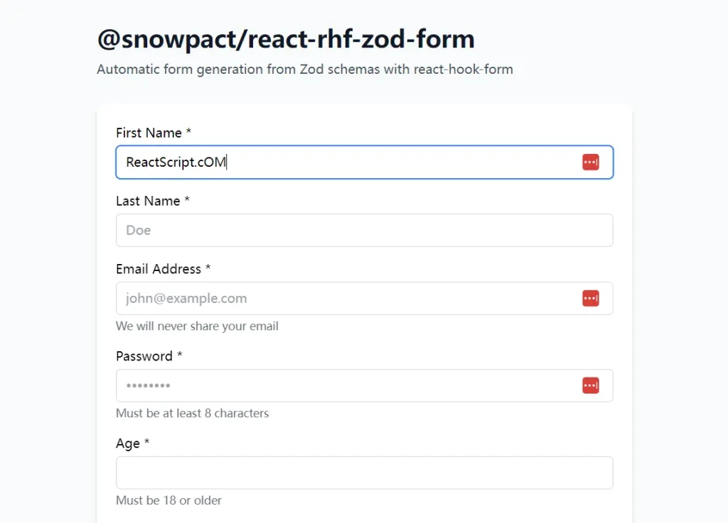
Preview
Use Cases
- Admin Dashboards: Generate repetitive CRUD forms for backend resources without writing unique JSX for every entity.
- Rapid Prototyping: Spin up functional forms with validation immediately after defining the data model.
- Complex Validation: Implement forms that require interdependent field validation, such as date ranges or matching passwords, using standard Zod methods.
- Multi-step Wizards: Manage form state across multiple steps by passing partial schemas to individual form instances.
How to Use It
Installation
Install the main package along with the required peer dependencies.
npm install @snowpact/react-rhf-zod-form react-hook-form zod @hookform/resolversGlobal Setup
You must configure the library once at your application’s entry point (e.g., App.tsx, main.tsx, or a dedicated setup file). This step registers your UI components so the generator knows how to render specific field types.
import { setupSnowForm } from '@snowpact/react-rhf-zod-form';
import type { RegisteredComponentProps, FormUILabelProps } from '@snowpact/react-rhf-zod-form';
// 1. Define your custom input component
function MyInput({ value, onChange, placeholder, disabled, className, name }: RegisteredComponentProps<string>) {
  return (
    <input
      id={name}
      name={name}
      type="text"
      value={value ?? ''}
      onChange={(e) => onChange(e.target.value)}
      placeholder={placeholder}
      disabled={disabled}
      className={`border p-2 rounded ${className ?? ''}`}
    />
  );
}
// 2. Define your label component
function MyLabel({ children, required, invalid, htmlFor }: FormUILabelProps) {
  return (
    <label htmlFor={htmlFor} className={`block mb-1 ${invalid ? 'text-red-500' : ''}`}>
      {children}
      {required && <span className="text-red-500 ml-1">*</span>}
    </label>
  );
}
// 3. Register everything
setupSnowForm({
  translate: (key) => key, // Pass your translation function here
  components: {
    text: MyInput,
    email: (props) => <MyInput {...props} type="email" />,
    password: (props) => <MyInput {...props} type="password" />,
    number: (props) => <MyInput {...props} type="number" />,
    checkbox: ({ value, onChange }) => (
      <input type="checkbox" checked={!!value} onChange={(e) => onChange(e.target.checked)} />
    ),
    // Add other types: textarea, select, date, etc.
  },
  formUI: {
    label: MyLabel,
    description: ({ children }) => <p className="text-sm text-gray-500">{children}</p>,
    errorMessage: ({ message }) => <p className="text-sm text-red-500">{message}</p>,
  },
  submitButton: ({ loading, disabled, children }) => (
    <button type="submit" disabled={disabled || loading} className="bg-blue-500 text-white px-4 py-2 rounded">
      {loading ? 'Sending...' : children}
    </button>
  ),
  styles: {
    form: 'space-y-4',
    formItem: 'flex flex-col',
  },
});
Basic Usage
Pass a Zod schema to the SnowForm component. The library handles the rendering and validation automatically.
import { SnowForm } from '@snowpact/react-rhf-zod-form';
import { z } from 'zod';
const userSchema = z.object({
  username: z.string().min(3),
  email: z.string().email(),
  age: z.number().min(18),
});
export function UserForm() {
  return (
    <SnowForm
      schema={userSchema}
      onSubmit={async (values) => {
        console.log('Form Data:', values);
        // API calls go here
      }}
      onSuccess={() => alert('Success!')}
    />
  );
}
Field Overrides
You can modify specific fields without changing the schema. Use the overrides prop to change input types, labels, or placeholders.
<SnowForm
  schema={userSchema}
  overrides={{
    username: {
      label: 'Display Name',
      placeholder: 'Enter your public name',
    },
    email: {
      description: 'We will never share your email.',
    },
    age: {
      // Force a specific component type if auto-detection misses
      type: 'number',
      emptyAsNull: true, // Converts empty strings to null
    },
  }}
/>
Custom Rendering
For fields that require unique UI logic not covered by the global registry, use the render function within overrides.
<SnowForm
  schema={userSchema}
  overrides={{
    avatar: {
      label: 'Profile Picture',
      render: ({ value, onChange, error }) => (
        <div className="custom-uploader">
          <img src={value || '/default-avatar.png'} alt="Preview" />
          <button type="button" onClick={() => onChange('/new-image.png')}>
            Upload
          </button>
          {error && <span className="error">{error}</span>}
        </div>
      ),
    },
  }}
/>
Layout Control (Children Pattern)
The default behavior stacks fields vertically. Use the children render function to create custom layouts, such as grids or grouped sections.
<SnowForm schema={userSchema} onSubmit={handleSubmit}>
  {({ renderField, renderSubmitButton }) => (
    <div className="grid grid-cols-2 gap-4">
      <div className="col-span-2">
        {renderField('username')}
      </div>
      {renderField('email')}
      {renderField('age')}
      <div className="col-span-2 mt-4">
        {renderSubmitButton({ children: 'Register Now' })}
      </div>
    </div>
  )}
</SnowForm>
Integration with Translation Libraries
You can connect localization libraries like next-intl or i18next during setup.
Example with next-intl:
import { useTranslations } from 'next-intl';
import { setupSnowForm } from '@snowpact/react-rhf-zod-form';
import { useEffect } from 'react';
function FormProvider({ children }) {
  const t = useTranslations('Forms');
  useEffect(() => {
    setupSnowForm({
      translate: t,
      components: { /* ... registered components ... */ },
    });
  }, [t]);
  return children;
}
API Reference
SnowForm Props
| Prop | Type | Description |
|---|---|---|
schema | ZodSchema | The Zod schema that defines the form structure and validation. |
overrides | object | Configuration object to customize labels, types, and rendering for specific fields. |
defaultValues | object | Initial values for the form fields. |
onSubmit | function | Async handler called when validation passes. Receives form data. |
onSuccess | function | Callback executed after onSubmit resolves successfully. |
onSubmitError | function | Callback executed if onSubmit throws an error. |
children | function | Render prop for custom layout control. Receives renderField and form helpers. |
className | string | CSS class applied to the <form> element. |
Setup Options (setupSnowForm)
| Option | Description |
|---|---|
components | A map of input types (text, email, select, etc.) to React components. |
formUI | Components for labels, descriptions, and error messages. |
submitButton | Component for the submit button, receiving loading and disabled states. |
translate | Function to translate keys into localized strings. |
styles | Global CSS classes for the form container and field wrappers. |
Related Resources
- React Hook Form: The underlying library that handles form state and validation performance.
- Zod: The schema declaration and validation library used to define data shapes.
- Shadcn UI: A collection of re-usable components that pairs well with the custom component registry.
FAQs:
Q: Can I use my own UI library like Material UI or Ant Design?
A: Yes. You register your library’s components in the setupSnowForm function. The library delegates rendering to whatever components you provide.
Q: How does it handle complex validation like “Confirm Password”?
A: It supports Zod’s refine and superRefine methods. You define the validation logic in the schema, and the form displays the error on the relevant field automatically.
Q: Is it possible to hide specific fields?
A: Yes. You can use the hidden type in the overrides configuration or omit the field from the layout when using the children pattern.
Q: Does it support server-side validation errors?
A: You can handle server errors in the onSubmit function and set them manually on the form using the form object provided by the children render prop or onSubmitError.


