Description:
web-glass-toast is a React toast notification library for creating glassmorphism-styled alerts with stacked card layouts and smooth transitions.
It currently comes with six notification variants and supports swipe-to-dismiss gestures, hover-based timer pausing, and per-toast position control.
Features
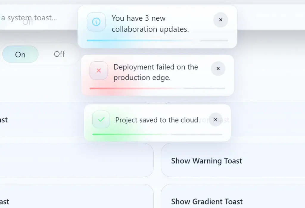
- Six built-in toast variants, including default, success, error, info, warning, and loading.
- Stacked card layout with depth perception and smooth entrance and exit transitions.
- Hover-pause behavior that suspends a toast’s countdown on mouse enter and resumes it on mouse leave.
- Swipe-to-dismiss gesture for touch and pointer-based dismissal.
- Six configurable positions, including top-left, top-center, top-right, bottom-left, bottom-center, and bottom-right.
- Color customization for background, text, and accent via direct CSS color values.
- Optional gradient fill, progress line indicator, and leading icon per notification instance.
- Action button support for attaching labeled callbacks directly inside a toast card.
Preview
Use Cases
- Displaying success messages after a user submits a complex settings form.
- Tracking background file uploads with real-time loading and completion states.
- Alerting users about critical system errors or network connection failures.
- Providing undo actions when a user accidentally deletes a database record.
How to Use It
1. Install the package via npm or yarn:
npm install @tarmiz/web-glass-toastyarn add @tarmiz/web-glass-toast2. Place ToastContainer once near your application root. This component renders the toast portal and manages the notification stack globally.
import { ToastContainer } from "@tarmiz/web-glass-toast";
// Import the bundled stylesheet for animations and glass-effect styles
import "@tarmiz/web-glass-toast/style.css";
export function AppRoot() {
  return (
    <>
      {/* Your application tree */}
      <App />
      {/* Mount the container at the top level so toasts render above all other content */}
      <ToastContainer />
    </>
  );
}
3. Import the toast object and call the appropriate variant from any event handler, effect, or server action callback.
import { toast } from "@tarmiz/web-glass-toast";
export function SaveButton() {
  const handleSave = () => {
    // Fires a success toast with a short confirmation message
    toast.success("Your profile has been updated.");
  };
  return <button onClick={handleSave}>Save Profile</button>;
}
4. Each variant applies a distinct icon and accent color automatically. No extra configuration is needed for the defaults.
// Default neutral toast — no icon or accent color
toast("Changes are pending review.");
// Positive confirmation
toast.success("Payment processed successfully.");
// Error state — red accent applied automatically
toast.error("Connection timed out. Please retry.");
// Informational update
toast.info("Version 2.4.0 is now available.");
// Caution prompt — yellow accent applied automatically
toast.warning("You have unsaved changes.");
// Indeterminate loading state — spinner icon displayed
toast.loading("Fetching your workspace data...");
5. Pass an options object as the second argument to override position, duration, colors, and interactive elements on any individual toast.
toast("Document archived.", {
  position: "bottom-left",       // Display in the bottom-left corner
  duration: 6000,                // Auto-dismiss after 6 seconds
  gradient: true,                // Apply a gradient fill to the background
  withIcon: true,                // Show the variant's default leading icon
  withProgressLine: true,        // Display a shrinking progress bar at the bottom edge
  backgroundColor: "#0d1117",    // Dark surface color
  textColor: "#f0f6fc",          // Light body text
  accentColor: "#58a6ff",        // Blue accent for the progress line and icon
  action: {
    label: "Restore",            // Label text rendered on the action button
    onClick: () => restoreDocument(), // Callback fired when the button is clicked
  },
});
6. toast.promise accepts a Promise and a messages object with loading, success, and error keys. The toast transitions through each state automatically as the promise settles.
// Basic string messages per lifecycle state
await toast.promise(
  fetch("/api/export").then(res => res.json()),
  {
    loading: "Preparing your export...",
    success: "Export ready. Check your downloads folder.",
    error: "Export failed. Please try again.",
  }
);
Pass resolver functions for success and error to access the resolved value or caught error directly:
// Resolver functions receive the resolved value or rejection reason
await toast.promise(syncUserData(), {
  loading: "Syncing account...",
  success: (data) => `Sync complete: ${data.recordCount} records updated.`,
  error: (err)  => `Sync error: ${String(err)}`,
});
7. Updating and Dismissing Toasts Programmatically.
// Create a loading toast and capture its ID for later updates
const id = toast.loading("Processing batch job...");
// After the job completes, update the same toast in place
toast.update(id, { type: "success", message: "Batch job complete." });
// Dismiss one specific toast by ID
toast.dismiss(id);
// Dismiss all active toasts at once (pass no arguments)
toast.dismiss();
// Pause a specific toast's countdown timer manually
toast.pause(id);
// Resume a timer that was paused programmatically
toast.resume(id);
8. Configuration Options
id(string): Assigns a custom identifier to the toast. Pass the same ID totoast.update()ortoast.dismiss()to target this specific notification.type(string): Sets the toast variant. Accepts"success","error","info","warning","loading", or"custom".position(string): Controls screen placement. Accepts"top-right","top-left","top-center","bottom-right","bottom-left", or"bottom-center".duration(number): Auto-dismiss delay in milliseconds. Set to0for a persistent toast that stays until dismissed explicitly.gradient(boolean): Applies a gradient fill to the toast background whentrue.dismissible(boolean): Lets the user dismiss the toast by clicking its surface whentrue.withIcon(boolean): Shows the variant’s default leading icon whentrue.withProgressLine(boolean): Displays a progress bar that depletes over the toast’sdurationwhentrue.backgroundColor(string): Overrides the toast’s background color. Accepts any valid CSS color string.textColor(string): Overrides the message body text color.accentColor(string): Overrides the color applied to icons, the progress line, and interactive accents.icon(ReactNode): Replaces the default variant icon with a custom React element.action(object): Adds a labeled action button to the toast. Requires alabelstring and anonClickcallback function.
Alternatives:
FAQs
Q: How do I prevent a toast from auto-dismissing?
A: Set duration: 0 in the options object. The toast stays visible until the user swipes or clicks it away, or until you call toast.dismiss(id) from your code.
Q: Can I show multiple toasts at the same time?
A: Yes. Each toast() call creates an independent entry in the stack. ToastContainer handles the stacked layout and z-index layering on its own.
Q: The toast container is appearing behind my modal overlay. How do I fix it?
A: ToastContainer renders into the document body. If a modal or overlay has a higher stacking context, target the container’s CSS class in your global stylesheet and raise its z-index above the modal’s value.
Q: Does @tarmiz/web-glass-toast work with Next.js App Router?
A: Yes, with one adjustment. Mark the component that mounts ToastContainer as a Client Component with the "use client" directive at the top of the file.


