Description:
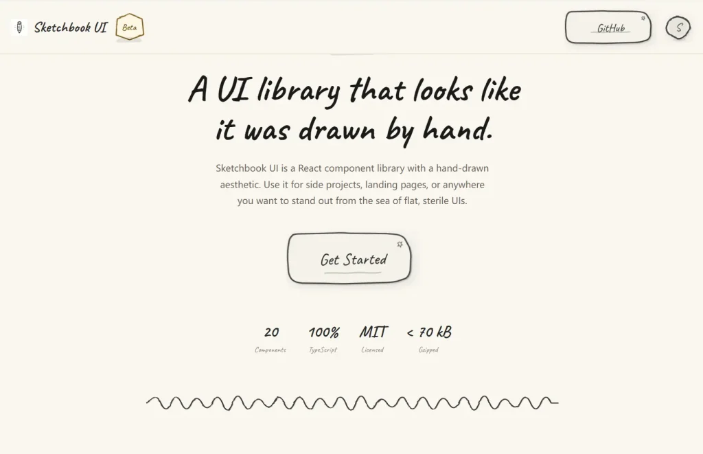
Sketchbook UI is a React component library that ships 20 fully typed UI components styled with a hand-drawn, notebook aesthetic.
Each component carries wobbly SVG borders, paper textures, and pencil-line details baked directly into the markup.
Preview
How to Use It
1. Download the repo and copy these three paths into your project root:
src/components/
src/lib/
src/styles/globals.css
2. Import globals.css at your application entry point.
// src/main.tsx
import "./styles/globals.css";
import React from "react";
import ReactDOM from "react-dom/client";
import App from "./App";
ReactDOM.createRoot(document.getElementById("root")!).render(
  <React.StrictMode>
    <App />
  </React.StrictMode>
);
In a Next.js project, import it inside app/layout.tsx or pages/_app.tsx:
// app/layout.tsx (Next.js App Router)
import "../styles/globals.css";
export default function RootLayout({ children }: { children: React.ReactNode }) {
  return (
    <html lang="en">
      <body>{children}</body>
    </html>
  );
}
3. Add a UI component to your app.
<Accordion>
  <AccordionItem
    number={1}
    title="Getting Started"
  >
    Welcome to our sketchy component library! This accordion component mimics the feel of a hand-drawn notebook with wobbly lines and paper textures.
  </AccordionItem>
  <AccordionItem
    number={2}
    title="Installation Guide"
  >
    To install this component library, simply run npm install and import the components you need. Each component is designed with customization in mind.
  </AccordionItem>
  <AccordionItem
    defaultOpen
    number={3}
    title="Advanced Features"
  >
    You can customize colors, typography, borders, and even toggle the lined paper effect. The accordion supports smooth animations and maintains the sketchy aesthetic throughout.
  </AccordionItem>
</Accordion>
4. Pass showBorder={false} to any component to remove the wobbly SVG outline while keeping the paper texture and typography intact:
<SketchCard showBorder={false}>
  <p>No border, paper texture only.</p>
</SketchCard>
5. All available UI components: Accordion, Avatar, Badge, Button, Card, Checkbox, Divider, Dropdown, Input, Modal, Progress, Radio, Select, Skeleton, Slider, Spinner, Switch, Textarea, Toast, Tooltip
FAQs
Q: Can I customize how wobbly the borders look?
A: The sketch intensity is embedded directly into the SVG path data and internal shape primitives. You cannot adjust wobble or noise levels via a prop at this time.
Q: Does Sketchbook UI conflict with an existing Tailwind setup?
A: No. Tailwind is only a dev dependency used to build the library itself. Your project’s Tailwind configuration does not interact with the library’s styles.
Q: How do I implement a dark theme?
A: Dark mode is not part of the current release. You can approximate it by overriding the colors prop on every component instance, or by defining a global CSS override that targets the library’s color variables.