Description:
The React Hebrew Date Picker component helps you handles both Hebrew date selection and automatic Gregorian conversion.
It addresses the specific needs of applications serving Hebrew-speaking users who require accurate Hebrew calendar functionality.
The component delivers full Hebrew calendar support with proper month and year calculations.
Suitable for religious applications, cultural websites, and any project requiring Hebrew date handling.
Features
- 📅 Complete Hebrew calendar system with accurate month and year calculations.
- 🔄 Automatic bidirectional conversion between Hebrew and Gregorian date formats.
- 🎨 Modern interface design with smooth animations and responsive layout.
- 📱 Full mobile device compatibility with touch-friendly controls.
- 🌐 Built-in right-to-left layout support for Hebrew text display.
- ⚡ Optimized performance with minimal dependencies and efficient rendering.
- 🎯 Complete TypeScript definitions for enhanced development experience.
- 🎪 Optional portal rendering for advanced positioning control.
- 🔧 Both controlled and uncontrolled component modes supported.
- ✅ Form integration compatibility with standard HTML form handling.
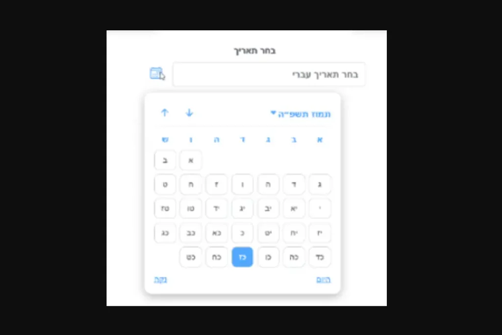
Preview
Use Cases
- Religious and cultural applications requiring Hebrew calendar date selection for holidays, events, and observances.
- Educational platforms teaching Hebrew calendar systems and Jewish history with interactive date components.
- Event management systems for synagogues, Jewish community centers, and cultural organizations.
- Genealogy and family history applications tracking Hebrew dates for births, marriages, and other life events.
- Business applications serving Hebrew-speaking markets that need localized date input functionality.
How to Use It
Installation and Setup
1. Install the React Hebrew DatePicker package using npm or yarn:
npm install react-hebrew-datepicker2. Import the required CSS file in your application’s entry point to enable the default styling:
import 'react-hebrew-datepicker/dist/styles.css';3. Import and implement the component in controlled mode where you manage the state externally:
import React, { useState } from 'react';
import HebrewDatePicker from 'react-hebrew-datepicker';
function DateSelection() {
  const [selectedDate, setSelectedDate] = useState('');
  const handleDateSelection = (event) => {
    setSelectedDate(event.target.value);
    console.log('Hebrew date selected:', event.target.value);
  };
  return (
    <HebrewDatePicker
      name="hebrewCalendarDate"
      value={selectedDate}
      onChange={handleDateSelection}
      label="בחר תאריך עברי"
      required={true}
    />
  );
}
4. Implement the component in uncontrolled mode where it manages its own internal state:
import React from 'react';
import HebrewDatePicker from 'react-hebrew-datepicker';
function SimpleHebrewDate() {
  const handleDateChange = (event) => {
    console.log('Date value:', event.target.value);
  };
  return (
    <HebrewDatePicker
      name="hebrewDate"
      defaultValue="2024-03-15"
      onChange={handleDateChange}
      label="תאריך לידה עברי"
    />
  );
}
5. Integrate the Hebrew date picker into existing form structures:
import React, { useState } from 'react';
import HebrewDatePicker from 'react-hebrew-datepicker';
function UserRegistrationForm() {
  const [formData, setFormData] = useState({
    fullName: '',
    hebrewBirthDate: '',
    email: ''
  });
  const handleInputChange = (event) => {
    setFormData(prevData => ({
      ...prevData,
      [event.target.name]: event.target.value
    }));
  };
  const submitForm = (event) => {
    event.preventDefault();
    console.log('Registration data:', formData);
  };
  return (
    <form onSubmit={submitForm}>
      <input
        type="text"
        name="fullName"
        value={formData.fullName}
        onChange={handleInputChange}
        placeholder="שם מלא"
        required
      />
      <HebrewDatePicker
        name="hebrewBirthDate"
        value={formData.hebrewBirthDate}
        onChange={handleInputChange}
        label="תאריך לידה עברי"
        required
      />
      <input
        type="email"
        name="email"
        value={formData.email}
        onChange={handleInputChange}
        placeholder="דואר אלקטרוני"
        required
      />
      <button type="submit">הרשם</button>
    </form>
  );
}
6. Configure the component with portal rendering for complex layouts:
<HebrewDatePicker
  name="eventDate"
  value={eventDate}
  onChange={handleEventDateChange}
  label="תאריך האירוע"
  usePortal={true}
  dir="rtl"
  required={false}
/>
7. The component accepts several configuration properties:
name: String identifier for the input field, required for form handlingvalue: Current date value in ISO format (YYYY-MM-DD) for controlled modedefaultValue: Initial date value in ISO format for uncontrolled modeonChange: Callback function triggered when date selection changeslabel: Display text for the input field, defaults to “בחר תאריך”required: Boolean indicating if the field is mandatory for form submissiondir: Text direction setting, accepts “rtl” or “ltr”, defaults to “rtl”usePortal: Boolean enabling React Portal rendering for advanced positioning
8. Override the default color scheme by targeting specific CSS classes:
.date-picker-day.selected,
.month-year-picker div:hover,
.tooltip-text,
.date-picker-day:hover {
  background-color: #your-brand-color !important;
  border-color: #your-brand-color !important;
}
Related Resources
- Hebcal Core Library – The underlying Hebrew calendar calculation library used by this component
- Moment.js Hebrew – Date manipulation library with Hebrew calendar plugin support
FAQs
Q: Does the component work with React form libraries like Formik or React Hook Form?
A: Yes, the component follows standard HTML input patterns and works with popular React form libraries. It accepts name, value, and onChange properties that integrate directly with form validation and state management systems.
Q: Can I use multiple Hebrew date pickers in the same application?
A: Absolutely. Each component instance maintains its own state when used in uncontrolled mode, or you can manage multiple date values in your parent component state for controlled usage.
Q: What Hebrew calendar calculations does the component support?
A: The component uses the @hebcal/core library for accurate Hebrew calendar calculations, including proper handling of leap years, month lengths, and conversion between Hebrew and Gregorian calendar systems.


