Description:
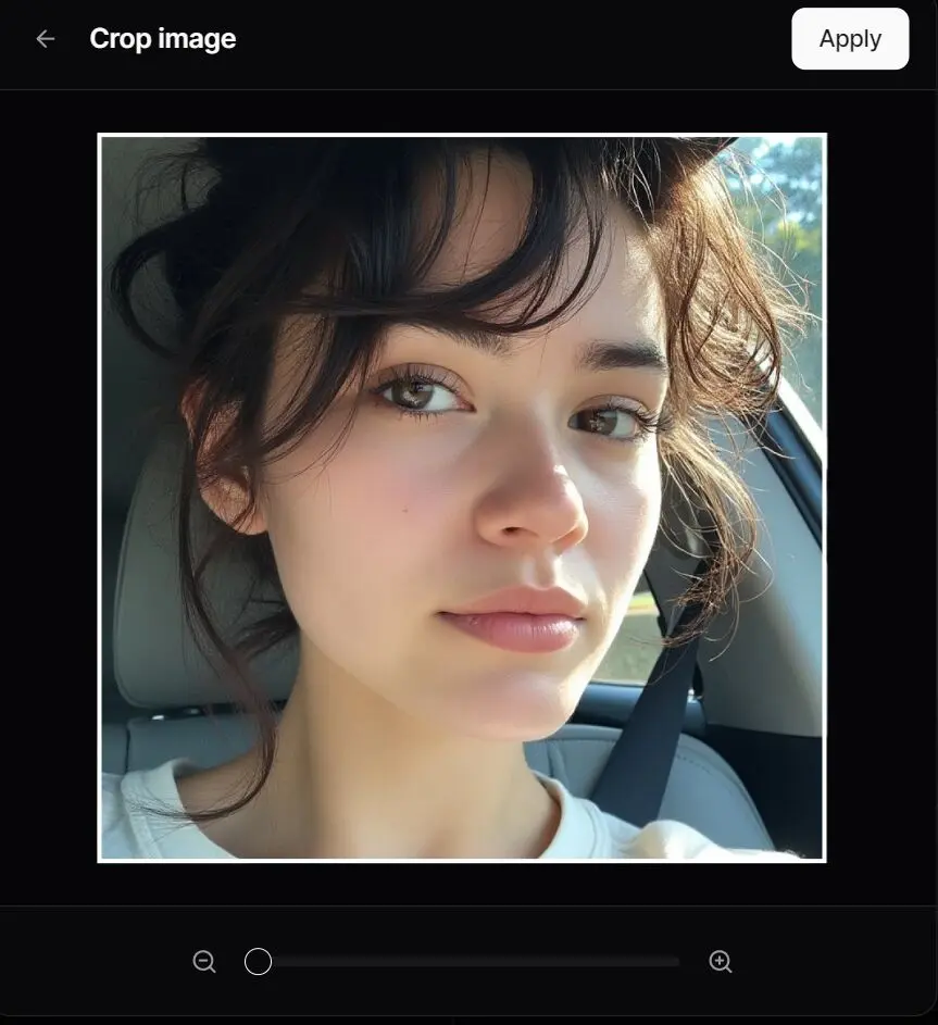
React Image Cropper is a lightweight, headless React component designed for interactive image cropping.
Inspired by the experience on X (formerly Twitter), it provides developers with composable building blocks to create fully customizable image cropping interfaces.
React Image Cropper is ideal for applications requiring precise image manipulation with full control over styling and behavior.
Features
- 🧩 Headless & Composable: Offers building blocks like
Cropper.Root,Cropper.Image,Cropper.CropArea, andCropper.Descriptionfor complete customization. - 🖱️ Interactive: Supports zooming (mouse wheel, pinch gestures) and panning (mouse drag, touch drag, arrow keys).
- 📐 Aspect Ratio Control: Enforces a specified aspect ratio for the crop area.
- 🎛️ Controlled/Uncontrolled: Manage zoom state internally or control it via props.
- 📏 Precise Crop Calculation: Outputs pixel coordinates of the cropped area relative to the original image.
- ♿ Accessible: Designed with ARIA attributes and requires a description element for screen reader users.
- 🎨 Customizable: Control zoom limits, sensitivity, padding, keyboard steps, and apply custom styles.
💼 Use Cases
- Social Media Platforms: Allow users to crop profile pictures or uploads to specific dimensions.
- E-commerce Applications: Enable product image cropping for consistent display across listings.
- Photo Editing Tools: Provide precise cropping functionality with zoom and pan controls.
- Content Management Systems: Ensure uploaded images adhere to specific aspect ratios for layouts.
How to Use It
Installation
npm install @origin/image-cropper
# or
yarn add @origin/image-cropper
# or
pnpm add @origin/image-cropper
Basic Usage
Here’s a simple example to get started:
import { Cropper } from "@origin-space/image-cropper";
import React from "react";
function MyImageCropper() {
  const [cropData, setCropData] = React.useState(null);
  return (
    <div>
      <Cropper.Root
        image="https://images.unsplash.com/photo-1494790108377-be9c29b29330"
        aspectRatio={1}
        onCropChange={setCropData}
        className="relative flex h-80 w-full cursor-move touch-none items-center justify-center overflow-hidden rounded-md border focus:outline-none focus-visible:ring-2 focus-visible:ring-ring"
      >
        <Cropper.Description className="sr-only" />
        <Cropper.Image className="pointer-events-none h-full w-full select-none object-cover" />
        <Cropper.CropArea className="pointer-events-none absolute border-2 border-dashed border-background shadow-[0_0_0_9999px_rgba(0,0,0,0.6)]" />
      </Cropper.Root>
      {cropData && (
        <pre className="mt-4 overflow-auto rounded bg-muted p-2 text-sm">
          {JSON.stringify(cropData, null, 2)}
        </pre>
      )}
    </div>
  );
}
Key Props for Cropper.Root
| Prop | Type | Default | Description |
|---|---|---|---|
image | string | Required | URL of the image to crop. |
aspectRatio | number | 1 | Width/height aspect ratio (e.g., 1, 1.5, 4/3, 16/9). |
cropPadding | number | 25 | Minimum padding (in pixels) between the crop area edges and container edges. |
minZoom | number | 1 | Minimum zoom level (1 = 100% original size relative to crop area). |
maxZoom | number | 3 | Maximum zoom level. |
zoomSensitivity | number | 0.005 | Multiplier for mouse wheel delta to control zoom speed. |
keyboardStep | number | 10 | Number of pixels to pan the image when using arrow keys. |
onCropChange | (pixels: Area | null) => void | undefined | Callback triggered when the crop area changes. |
Preview