Description:
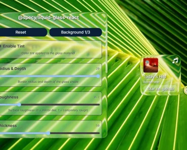
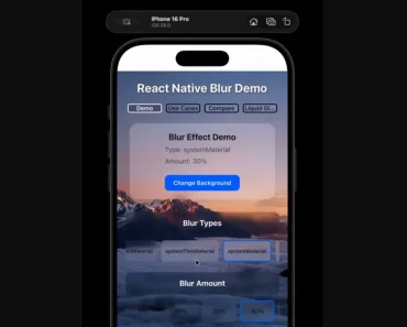
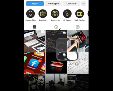
Yet another RN component that integrates the iOS 26 liquid glass effect into your React Native applications.
You can use this library to create components that have a blurred, translucent quality, similar to various elements found within the latest iOS ecosystem.
Features
- 🎨 Customizable tint color overlay for glass elements
- 🔧 Two distinct effect modes, clear and regular
- 📱 System-aware color scheme adaptation
- 👆 Interactive touch response effects
- 🧩 Container component for merging multiple glass elements
- 📋 Device compatibility detection
- ⚙️ TypeScript support with full type definitions
Preview

How to Use It
1. Install @callstack/liquid-glass:
npm install @callstack/liquid-glassOR
yarn add @callstack/liquid-glass2. The library exports a boolean constant, isLiquidGlassSupported, to check if the current device can render the effect. You should use this constant to define a fallback appearance for unsupported devices, such as Android or older iOS versions.
import {
  LiquidGlassView,
  isLiquidGlassSupported,
} from '@callstack/liquid-glass';
import { Text, StyleSheet } from 'react-native';
function GlassComponent() {
  return (
    <LiquidGlassView
      style={[
        styles.glassBox,
        !isLiquidGlassSupported && styles.fallbackBackground,
      ]}
      interactive
      effect="clear"
    >
      <Text>Your Content Here</Text>
    </LiquidGlassView>
  );
}
const styles = StyleSheet.create({
  glassBox: {
    width: 250,
    height: 150,
    borderRadius: 20,
    justifyContent: 'center',
    alignItems: 'center',
  },
  fallbackBackground: {
    backgroundColor: 'rgba(200, 200, 200, 0.5)',
  },
});
3. You can group multiple glass elements with the LiquidGlassContainerView component. This container merges the visual effects of its child components when they are near each other. The spacing prop defines the distance at which this merging effect begins.
import {
  LiquidGlassView,
  LiquidGlassContainerView,
} from '@callstack/liquid-glass';
import { StyleSheet } from 'react-native';
function MergingGlassComponents() {
  return (
    <LiquidGlassContainerView style={styles.container} spacing={25}>
      <LiquidGlassView style={styles.circle} />
      <LiquidGlassView style={styles.circle} />
    </LiquidGlassContainerView>
  );
}
const styles = StyleSheet.create({
  container: {
    flexDirection: 'row',
    justifyContent: 'center',
    alignItems: 'center',
  },
  circle: {
    width: 100,
    height: 100,
    borderRadius: 50,
  },
});
4. LiquidGlassView Props:
interactiveis a boolean that enables a touch effect when the view is pressed. It defaults tofalse.effectdetermines the visual style. You can set it to'clear'for a higher transparency or'regular'for the standard blur effect. The default value is'regular'.tintColorapplies a color layer over the glass effect. It accepts any color format that React Native supports.colorSchemeadjusts the component’s appearance for different themes. Your options are'light','dark', or'system'to follow the device’s setting.
5. LiquidGlassContainerView Props:
spacing is a number that defines the distance at which the glass effects of child components begin to merge into a single, combined effect.
FAQs
Q: What is liquid glass effect?
The liquid glass effect is a dynamic and fluid-like user interface design material, primarily known from Apple’s 2025 software updates, that mimics the optical properties of real glass by blurring, reflecting, and refracting surrounding content. It creates a layered, interactive experience where elements appear translucent and morph in real-time in response to touch or pointer movements, providing a sense of depth, light, and organic fluidity.
Q: How do the clear and regular effects differ?
A: The clear effect creates a more transparent glass appearance. The regular effect applies a standard blur that is common in native iOS interfaces.
Q: Can the interactive prop be changed after the component mounts?
A: No, this prop is only set when the component is first rendered. It will not update dynamically if the value changes.


