Description:
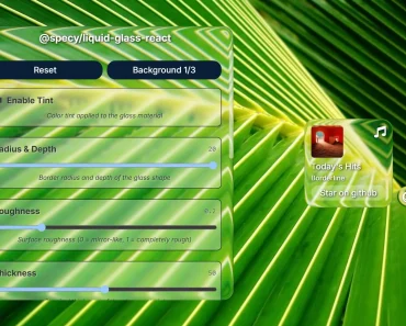
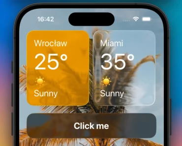
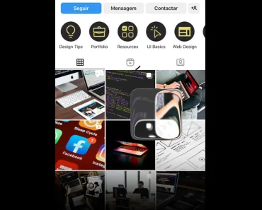
expo-liquid-glass-view is a SwiftUI-powered view component that creates a native Liquid Glass Effect for React Native applications.
It was built to give your iOS apps that fluid, frosted-glass look without performance drops, because it uses native SwiftUI under the hood.
This component renders a genuine glassEffect, not a JavaScript simulation, which makes a noticeable difference in feel and performance.
Features
- Native iOS liquid glass effects: Direct integration with iOS system blur materials through SwiftUI.
- SwiftUI performance optimization: Leverages SwiftUI’s rendering pipeline for smooth visual effects.
- Configurable corner styling: Supports both continuous and circular corner radius styles.
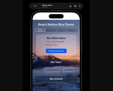
- Custom blur intensity types: Five different blur material types including clear, tint, regular, interactive, and identity.
- Flexible tint overlays: Custom color tinting with system material integration.
- React Native children support: Full compatibility with nested React Native components.
How to Use It
1. Install & add the package to your project.
npx expo install expo-liquid-glass-view2. Navigate to your ios directory and install the necessary CocoaPods.
cd ios && pod install3. Prebuild your app to generate the native project files.
npx expo prebuild --platform ios4. un your app on an iOS simulator or device.
npx expo run:ios5. Here is a basic implementation. You import the component and use it like any other view, passing props to configure its appearance.
import { ExpoLiquidGlassView, CornerStyle, LiquidGlassType } from "expo-liquid-glass-view";
import { Text } from "react-native";
export default function App() {
  return (
    <ExpoLiquidGlassView
      cornerStyle={CornerStyle.Circular}
      type={LiquidGlassType.Tint}
      tint="#333333"
      cornerRadius={24}
      style={{ width: 200, height: 200, alignSelf: "center", marginTop: 100 }}
    >
      <Text style={{ color: "#fff", textAlign: "center" }}>
        Liquid Glass
      </Text>
    </ExpoLiquidGlassView>
  );
}
6. Available props:
type: Defines the blur intensity. Options includeclear,tint,regular,interactive, oridentity. Defaults toregular.tint: An optional color string for the tint overlay, like a hex code or an iOS system material name ("systemUltraThinMaterial").cornerRadius: A number that sets the border radius. Defaults to12.cornerStyle: Sets the curvature style of the corners. It can be"continuous"(Apple’s “squircle” style) or"circular". Defaults to"continuous".style: Your standard React Native style object.children: Any React components you want to render inside the glass view.
FAQs
Q: Why doesn’t this work on Android?
A: The library is built on SwiftUI, which is Apple’s native UI framework for iOS. There is no equivalent on the Android platform, so it cannot be supported.
Q: Can I animate the props like tint or cornerRadius?
A: You can animate the props from the JavaScript side using a library like Reanimated. Since these props are passed to a native view, the updates should be performant, but complex animations might require some testing to ensure they feel smooth.
Q: What is the real difference between cornerStyle: 'continuous' and 'circular'?
A: 'Circular' gives you the standard corner rounding that borderRadius produces. 'Continuous' uses Apple’s smoother corner curve, often called a “squircle.” It’s designed to match the hardware and other native iOS UI elements more closely, creating a more integrated look.
Q: Do I really have to prebuild to use this?
A: Yes. Any library that includes native code (Swift/Objective-C or Java/Kotlin) requires you to generate the native ios and android project folders. This component will not work in the Expo Go client; you must use a development build or a prebuilt app.


