Description:
goey-toast is a React toast notification component that animates each toast through a pill-to-blob-to-pill morph cycle using Framer Motion. It wraps Sonner’s toast API with a custom animation layer, so you get the familiar goeyToast.success() / goeyToast.error() call pattern plus a configurable spring physics system underneath.
The component comes with five named toast types (default, success, error, warning, info), a promise helper that transitions through loading and resolved states, and an update method that rewrites an existing toast in-place. Every animation parameter, bounce intensity, preset, timing, spring on/off, is configurable both per-toast and globally via the <GoeyToaster /> component.
Features
- 🧬 Blob Morph Animation: Each toast cycles through pill → blob → pill with SVG path animation and configurable spring physics.
- 🎨 Five Toast Types:
default,success,error,warning, andinfo, each with its own fill color scheme. - ⏳ Promise Toasts:
goeyToast.promise()transitions a single toast through loading, success, and error phases automatically. - ✏️ In-Place Updates:
goeyToast.update(id, options)rewrites title, description, type, action, or icon on an existing toast without re-creating it. - 🗑️ Type-Filtered Dismiss:
goeyToast.dismiss({ type: 'error' })dismisses all toasts of one or more types at once. - 🧱 React Node Descriptions: The
descriptionprop accepts strings or full React components, so rich content layouts work inside the toast body. - 🕹️ Action Buttons with Success Label: An action button can morph back to pill state after click and display a
successLabelstring. - 🌊 Animation Presets: Four built-in presets —
smooth,bouncy,subtle,snappy. - 🎚️ Bounce Intensity Control: A single
bouncenumber from0.05to0.8adjusts spring stiffness, damping, and squish magnitude together. - 📊 Countdown Progress Bar:
showProgressrenders a progress bar that pauses on hover and resets on re-expand. - ⏸️ Hover Pause and Re-Expand: Hovering an expanded toast pauses the dismiss timer. Hovering a collapsed pill re-expands it.
- ⌨️ Keyboard and Swipe Dismiss: Escape key dismisses the most recent toast. Swipe-to-dismiss works on mobile.
- 🌐 6 Positions with Auto-Mirroring: Right-side positions automatically mirror the morph animation horizontally. Center positions use symmetric morph.
- 🌙 Dark Mode and RTL:
theme="dark"anddir="rtl"props handle both display variants. - 🗂️ Toast Queue:
maxQueueandqueueOverflowcontrol what happens when the toast stack fills up. - 🎭 CSS Class Overrides: The
classNamesprop targets wrapper, content, header, title, icon, description, actionWrapper, and actionButton independently. - 🔔 Dismiss Callbacks:
onDismissfires on any dismiss;onAutoClosefires only on timer expiry. - ⏱️ Timestamp Display: Expanded toasts show a timestamp.
- 📱 shadcn/ui Compatible: A one-command shadcn CLI install path drops a wrapper component into
components/ui/.
Preview
How to Use It
Installation
Install the package from npm.
npm install goey-toastgoey-toast requires React 18+, react-dom 18+, and framer-motion 10+. Install peer dependencies if your project does not already include them.
npm install react react-dom framer-motionshadcn/ui Installation
Run the shadcn CLI add command to install a pre-configured wrapper component at components/ui/goey-toaster.tsx. This command also auto-installs goey-toast and framer-motion.
npx shadcn@latest add https://goey-toast.vercel.app/r/goey-toaster.jsonCSS Import (Required)
Import the goey-toast stylesheet once in your app entry point. Without this import, toasts render without any visual styling.
import 'goey-toast/styles.css'Add this line to main.tsx or App.tsx.
Quick Start
Place <GoeyToaster /> once in your app root and call goeyToast methods from anywhere.
import { GoeyToaster, goeyToast } from 'goey-toast'
import 'goey-toast/styles.css'
function App() {
  return (
    <>
      <GoeyToaster position="bottom-right" />
      <button onClick={() => goeyToast.success('Saved!')}>Save</button>
    </>
  )
}
Calling Toast Methods
goeyToast('This is a default toast')
goeyToast.success('File uploaded')
goeyToast.error('Upload failed')
goeyToast.warning('Storage almost full')
goeyToast.info('New version available')
Adding a Description
Pass a description string as part of the options object.
goeyToast.error('Payment failed', {
  description: 'Your card was declined. Please try another payment method.',
})
Pass a React component as description for richer layouts.
goeyToast.success('Deployment complete', {
  description: (
    <div style={{ display: 'flex', flexDirection: 'column', gap: 10 }}>
      <div><span>Environment:</span> <strong>Production</strong></div>
      <div><span>Branch:</span> <strong>main @ 3f8a2c1</strong></div>
    </div>
  ),
})
Action Button with Success Label
After the user clicks the action button, the toast morphs back to the pill shape and shows successLabel.
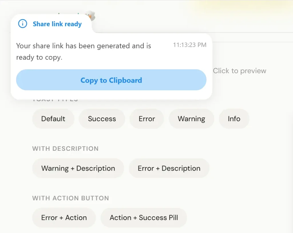
goeyToast.info('Share link ready', {
  description: 'Your link has been generated.',
  action: {
    label: 'Copy to Clipboard',
    onClick: () => navigator.clipboard.writeText(url),
    successLabel: 'Copied!',
  },
})
Promise Toast
goeyToast.promise() tracks a Promise and transitions the toast through loading, success, and error states automatically.
goeyToast.promise(saveData(), {
  loading: 'Saving...',
  success: 'Changes saved',
  error: 'Something went wrong',
  description: {
    success: 'All changes have been synced to the server.',
    error: 'Please try again later.',
  },
  action: {
    error: {
      label: 'Retry',
      onClick: () => retryOperation(),
    },
  },
})
success and error also accept functions that receive the resolved value or error object.
goeyToast.promise(fetchUser(id), {
  loading: 'Loading user...',
  success: (data) => `Welcome back, ${data.name}`,
  error: (err) => `Failed: ${err.message}`,
})
Updating a Toast In-Place
Call goeyToast.update(id, options) to rewrite an active toast without removing and recreating it. Store the id returned from the initial call.
const id = goeyToast('Uploading...', {
  icon: <SpinnerIcon />,
})
// After upload resolves:
goeyToast.update(id, {
  title: 'Upload complete',
  type: 'success',
  description: '3 files uploaded.',
  icon: null,
})
Pass icon: null to clear a custom icon that was set on the original toast.
Dismissing Toasts
// Dismiss a specific toast by id
goeyToast.dismiss(toastId)
// Dismiss all toasts of one type
goeyToast.dismiss({ type: 'error' })
// Dismiss multiple types at once
goeyToast.dismiss({ type: ['error', 'warning'] })
// Dismiss every active toast
goeyToast.dismiss()
Custom Styling
Pass fillColor, borderColor, and borderWidth directly in the options object for per-toast color overrides.
goeyToast.success('Custom styled toast', {
  fillColor: '#1a1a2e',
  borderColor: '#6c63ff',
  borderWidth: 2,
  classNames: {
    wrapper: 'my-toast-wrapper',
    title: 'my-toast-title',
    description: 'my-toast-desc',
    actionButton: 'my-toast-btn',
  },
})
Controlling Display Duration
Set displayDuration in the timing object to override how long the toast stays expanded before auto-dismissing.
goeyToast.success('Saved', {
  description: 'Your changes have been synced.',
  timing: { displayDuration: 5000 },
})
Spring Animations
Spring animations are on by default. Disable them per-toast or globally.
// Per-toast
goeyToast.success('Saved', { spring: false })
// Globally via GoeyToaster
<GoeyToaster spring={false} />
When spring is false, all spring-based animations (landing squish, blob squish, morph transitions, pill resize, header squish) switch to smooth ease-in-out curves. Error shake animations still fire regardless.
Bounce Intensity
The bounce value from 0.05 to 0.8 adjusts spring stiffness, damping, and squish magnitude as a single unit.
// Minimal spring feel
goeyToast.success('Saved', { bounce: 0.1 })
// Default
goeyToast.success('Saved', { bounce: 0.4 })
// Exaggerated spring
goeyToast.success('Saved', { bounce: 0.8 })
// Set globally
<GoeyToaster bounce={0.6} />
Animation Presets
Four built-in presets handle common animation personalities. Apply per-toast or globally.
goeyToast.success('Deployed', { preset: 'bouncy' })
<GoeyToaster preset="smooth" />
Available preset names: smooth, bouncy, subtle, snappy.
Countdown Progress Bar
Show a progress bar that depletes as the dismiss timer counts down. It pauses on hover and resets on re-expand.
goeyToast.success('Saved', { showProgress: true })
// Or enable globally
<GoeyToaster showProgress />
Dark Mode
<GoeyToaster theme="dark" />RTL Layout
<GoeyToaster dir="rtl" />Keyboard and Swipe Dismiss
Keyboard dismiss (Escape) and swipe-to-dismiss on mobile are both enabled by default. Disable either individually.
<GoeyToaster closeOnEscape={false} swipeToDismiss={false} />Toast Queue
maxQueue limits how many toasts can stack. queueOverflow controls which toast to drop when the limit is reached.
<GoeyToaster maxQueue={5} queueOverflow="drop-oldest" />Dismiss Callbacks
onDismiss fires whenever a toast is dismissed for any reason. onAutoClose fires only when the timer expires.
goeyToast.success('Saved', {
  onDismiss: (id) => console.log(`Toast ${id} was dismissed`),
  onAutoClose: (id) => console.log(`Toast ${id} auto-closed`),
})
API Reference
goeyToast Methods
| Method | Description |
|---|---|
goeyToast(title, options?) | Default (neutral) toast |
goeyToast.success(title, options?) | Green success toast |
goeyToast.error(title, options?) | Red error toast |
goeyToast.warning(title, options?) | Yellow warning toast |
goeyToast.info(title, options?) | Blue info toast |
goeyToast.promise(promise, data) | Tracks a Promise through loading → success/error |
goeyToast.update(id, options) | Rewrites an active toast in-place |
goeyToast.dismiss(idOrFilter?) | Dismisses one toast, all of a type, or all toasts |
GoeyToastOptions
| Option | Type | Description |
|---|---|---|
description | ReactNode | Body content (string or component) |
action | GoeyToastAction | Action button config |
icon | ReactNode | Custom icon override |
duration | number | Display duration in ms |
id | string | number | Unique toast identifier |
classNames | GoeyToastClassNames | CSS class overrides per element |
fillColor | string | Background color of the blob |
borderColor | string | Border color of the blob |
borderWidth | number | Border width in px (default 1.5) |
timing | GoeyToastTimings | Animation timing overrides |
spring | boolean | Enable spring/bounce animations (default true) |
bounce | number | Spring intensity from 0.05 to 0.8 (default 0.4) |
showProgress | boolean | Show countdown progress bar |
onDismiss | (id) => void | Called on any dismiss |
onAutoClose | (id) => void | Called only on timer-based auto-dismiss |
preset | AnimationPresetName | 'smooth', 'bouncy', 'subtle', or 'snappy' |
GoeyToastUpdateOptions
| Option | Type | Description |
|---|---|---|
title | string | New title text |
description | ReactNode | New body content |
type | GoeyToastType | Change the toast type and color |
action | GoeyToastAction | New action button |
icon | ReactNode | null | Custom icon (pass null to clear) |
GoeyToastAction
| Property | Type | Required | Description |
|---|---|---|---|
label | string | Yes | Button text |
onClick | () => void | Yes | Click handler |
successLabel | string | No | Label shown after click with morph-back animation |
GoeyToastTimings
| Property | Type | Default | Description |
|---|---|---|---|
displayDuration | number | 4000 | Milliseconds the toast stays expanded |
GoeyToastClassNames
| Key | Target element |
|---|---|
wrapper | Outer container |
content | Content area |
header | Icon and title row |
title | Title text |
icon | Icon wrapper |
description | Body text |
actionWrapper | Button container |
actionButton | Action button |
GoeyToasterProps
| Prop | Type | Default | Description |
|---|---|---|---|
position | 'top-left' | 'top-center' | 'top-right' | 'bottom-left' | 'bottom-center' | 'bottom-right' | 'bottom-right' | Toast stack position |
duration | number | — | Default display duration in ms |
gap | number | 14 | Gap between stacked toasts (px) |
offset | number | string | '24px' | Distance from screen edge |
theme | 'light' | 'dark' | 'light' | Color theme |
toastOptions | Partial<ExternalToast> | — | Default options passed to Sonner |
spring | boolean | true | Enable spring/bounce globally |
bounce | number | 0.4 | Spring intensity (0.05 to 0.8) |
preset | AnimationPresetName | — | Animation preset for all toasts |
closeOnEscape | boolean | true | Dismiss most recent toast on Escape |
showProgress | boolean | false | Show countdown progress bar globally |
maxQueue | number | Infinity | Maximum toasts in queue |
queueOverflow | 'drop-oldest' | 'drop-newest' | 'drop-oldest' | Overflow strategy |
dir | 'ltr' | 'rtl' | 'ltr' | Layout direction |
swipeToDismiss | boolean | true | Enable swipe-to-dismiss on mobile |
GoeyPromiseData<T>
| Property | Type | Required | Description |
|---|---|---|---|
loading | string | Yes | Title shown during loading |
success | string | ((data: T) => string) | Yes | Title on success |
error | string | ((error: unknown) => string) | Yes | Title on error |
description.loading | ReactNode | No | Body content during loading |
description.success | ReactNode | ((data: T) => ReactNode) | No | Body content on success |
description.error | ReactNode | ((error: unknown) => ReactNode) | No | Body content on error |
action.success | GoeyToastAction | No | Action button on success state |
action.error | GoeyToastAction | No | Action button on error state |
classNames | GoeyToastClassNames | No | CSS class overrides |
fillColor | string | No | Background color |
borderColor | string | No | Border color |
borderWidth | number | No | Border width in px |
timing | GoeyToastTimings | No | Animation timing overrides |
spring | boolean | No | Enable spring animations (default true) |
bounce | number | No | Spring intensity (default 0.4) |
onDismiss | (id) => void | No | Called on any dismiss |
onAutoClose | (id) => void | No | Called only on timer-based auto-dismiss |
Package Exports
// Components
export { GoeyToaster } from 'goey-toast'
// Toast function
export { goeyToast } from 'goey-toast'
// Animation presets
export { animationPresets } from 'goey-toast'
// Types
export type {
  GoeyToastOptions,
  GoeyPromiseData,
  GoeyToasterProps,
  GoeyToastAction,
  GoeyToastClassNames,
  GoeyToastTimings,
  GoeyToastUpdateOptions,
  DismissFilter,
  AnimationPreset,
  AnimationPresetName,
} from 'goey-toast'
Related Resources
- Sonner: The lightweight toast library that goey-toast builds on top of for queue and lifecycle management.
- Framer Motion: The animation library that drives the spring physics and SVG morph sequences in goey-toast.
- shadcn/ui: The component distribution system with a CLI path that goey-toast supports for drop-in installation.
- React Hot Toast: An alternative lightweight toast library worth comparing for projects that do not need morphing animations.
FAQs
Q: Do I need to install Sonner separately?
A: No. goey-toast bundles its own Sonner dependency.
Q: Can I use goey-toast with Next.js App Router?
A: Yes. Place <GoeyToaster /> inside a Client Component (mark it with "use client") and render it in your root layout. Call goeyToast methods from any Client Component in the tree.
Q: What happens when goeyToast.update() targets a toast that has already been dismissed?
A: The update call has no effect. The toast is no longer in the active queue, so there is no element to update. Store the id only for the window of time when the toast is active.
Q: Can bounce and preset be set at the same time?
A: Yes, but the preset takes effect first as a baseline. If you also pass bounce, the bounce value overrides the spring intensity from the preset while leaving the other preset timing values intact.
Q: Does the progress bar pause when the toast collapses to a pill?
A: The progress bar pauses on hover. When the dismiss timer fires and the toast begins pre-dismiss collapse, the bar finishes and the toast auto-dismisses on schedule. Re-expanding the collapsed pill via hover pauses the timer and the bar together.


