Description:
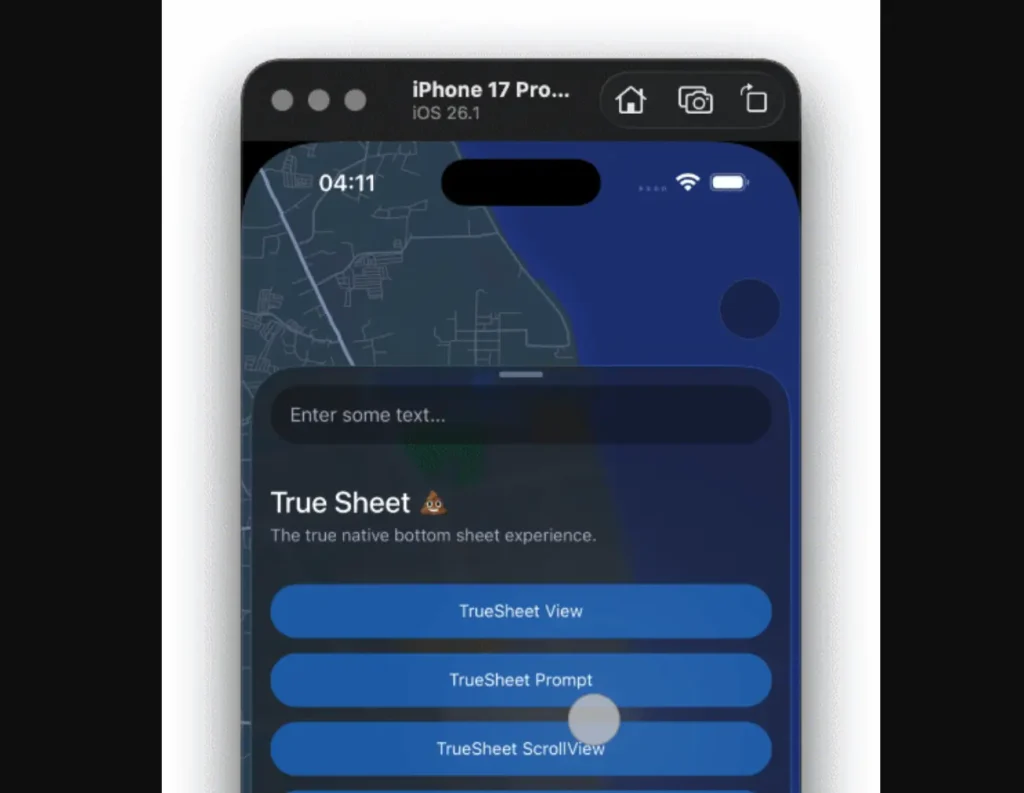
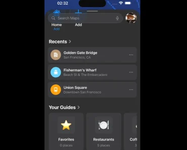
React Native True Sheet is a UI component that creates native bottom sheets for iOS and Android applications. It uses React Native’s Fabric architecture to handle sheet presentations directly on the native thread.
The component includes full TypeScript support with auto-generated native type definitions. You can manage sheets through a standard React ref or call them globally by name.
Features
- ⚡ Fabric Architecture: Builds on the new React Native architecture to maximize performance.
- 🎯 Type Safety: Includes full TypeScript support with interfaces generated by Codegen.
- 🚀 Direct Communication: Uses C++ to bypass the JavaScript bridge for faster execution.
- 🎨 Native Implementation: Renders actual native views rather than JavaScript-based simulations.
- ♿ Accessibility: Supports screen readers and native accessibility tools automatically.
- 🔄 Imperative Control: Controls sheet behavior through asynchronous ref methods.
Preview

Use Cases
- Contextual Menus: Display actions relevant to a selected item without leaving the current screen.
- Filter Panels: Show complex filtering options for lists or maps in a dismissible layer.
- Payment Confirmations: Present secure transaction details in a focused view that slides up from the bottom.
- Media Players: Host playback controls and track information in a resizeable sheet.
How to Use It
1. Install the package using your preferred package manager.
yarn add @lodev09/react-native-true-sheet2. The library uses a ref to control the sheet’s visibility. Define the sheet within your component tree and call methods like present() or dismiss() to manage its state.
The following example demonstrates how to set up a sheet with two specific snap points (detents).
import React, { useRef } from 'react';
import { View, Button, Text, StyleSheet } from 'react-native';
import { TrueSheet } from "@lodev09/react-native-true-sheet";
export const MyComponent = () => {
  // Initialize the ref with the TrueSheet type
  const sheetRef = useRef<TrueSheet>(null);
  // Function to open the sheet
  const openSheet = async () => {
    await sheetRef.current?.present();
    console.log('Sheet opened');
  };
  // Function to close the sheet
  const closeSheet = async () => {
    await sheetRef.current?.dismiss();
    console.log('Sheet closed');
  };
  return (
    <View style={styles.container}>
      <Button title="Open Options" onPress={openSheet} />
      <TrueSheet
        ref={sheetRef}
        detents={['auto', 0.6]} // Auto-height or 60% of screen
        cornerRadius={24}
        grabber={true}
      >
        <View style={styles.sheetContent}>
          <Text style={styles.title}>Settings</Text>
          <Button title="Close" onPress={closeSheet} />
        </View>
      </TrueSheet>
    </View>
  );
};
const styles = StyleSheet.create({
  container: {
    flex: 1,
    justifyContent: 'center',
    alignItems: 'center',
  },
  sheetContent: {
    padding: 24,
    height: 200,
    alignItems: 'center',
  },
  title: {
    fontSize: 20,
    marginBottom: 16,
  }
});
3. You can control a sheet from anywhere in your app by assigning it a unique name.
// 1. Define the sheet with a name
<TrueSheet name="global-settings" detents={['auto', 1]}>
  <SettingsView />
</TrueSheet>
// 2. Call it from anywhere
await TrueSheet.present('global-settings');
4. Available component props.
| Prop | Type | Description |
|---|---|---|
detents | SheetDetent[] | Defines snap points. Supports auto or numbers (0-1). Max 3 detents. |
name | string | Unique identifier for global control. |
backgroundColor | ColorValue | Sets the sheet background color. Defaults to system standard. |
cornerRadius | number | Sets the top corner radius. |
maxHeight | number | Overrides the maximum height limit. |
edgeToEdgeFullScreen | boolean | Extends the sheet behind the status bar (Android). |
dismissible | boolean | Enables or disables interactive dismissal. Default is true. |
dimmed | boolean | Dims the background when the sheet is open. |
dimmedDetentIndex | number | Index at which dimming begins. |
initialDetentIndex | number | Opens the sheet at this index immediately upon mounting. |
initialDetentAnimated | boolean | Animates the initial presentation if true. |
keyboardMode | "resize" | "pan" | Adjusts layout behavior when the keyboard opens. |
grabber | boolean | Shows the native drag handle. |
header | Component | Renders a fixed header component. |
footer | Component | Renders a floating footer component. |
fitScrollView | boolean | Pins a ScrollView or FlatList to the sheet’s available space. |
pageSizing | boolean | Uses large page sheet style on iPad (iOS 17+). |
blurTint | BlurTint | Applies a blur effect style (iOS only). |
5. API methods.
present(index?: number): Opens the sheet. Optionally accepts a detent index.dismiss(): Closes the sheet.resize(index: number): Changes the sheet size to a specific detent index.
6. Event handlers.
onMount: Fires when the sheet content is ready.onWillPresent: Fires before the sheet opens.onDidPresent: Fires after the sheet finishes opening.onWillDismiss: Fires before the sheet closes.onDidDismiss: Fires after the sheet finishes closing.onDetentChange: Fires when the active detent changes.onDragBegin: Fires when the user starts dragging.onDragChange: Fires while the user drags the sheet.onDragEnd: Fires when the user stops dragging.onPositionChange: Fires continuously during transitions and drags.
Related Resources
- React Native Reanimated: Handles complex animations and interactions in React Native.
- React Native Gesture Handler: Manages native touch and gesture systems.
FAQs
Q: How many snap points can I define?
A: You can define up to three detents. These typically correspond to collapsed, half-expanded, and expanded states.
Q: Can I prevent the user from closing the sheet?
A: Yes, set the dismissible prop to false. This disables drag-to-dismiss and background tap interactions.
Q: How does the sheet handle keyboards?
A: The keyboardMode prop controls this behavior. Set it to "resize" to shrink the view or "pan" to move the view up when the keyboard appears.


