Description:
react-tourlight is a React guided tour component that builds onboarding tours and guided feature highlights for modern React apps.
The component uses a provider-based setup, spotlight cutouts, tooltip positioning through Floating UI, and a small stylesheet for overlays and transitions.
It supports full tours, one-off highlights, keyboard navigation, theming, and callback-driven state handling.
Features
- Build onboarding tours with spotlight overlays and tooltip steps.
- Highlight one UI element for product updates and release callouts.
- Position tooltips with smart flip and overflow handling.
- Support keyboard navigation with next, previous, skip, and escape actions.
- Trap focus inside the active tour UI.
- Announce step content to assistive technology.
- Wait for lazy-loaded targets before showing a step.
- Light, dark, or custom themes.
- Localize button labels and step counters.
- Control tours with hooks from any component in the provider tree.
- Replace the default tooltip UI with a custom render function.
- Persist completion and skip state through callback props.
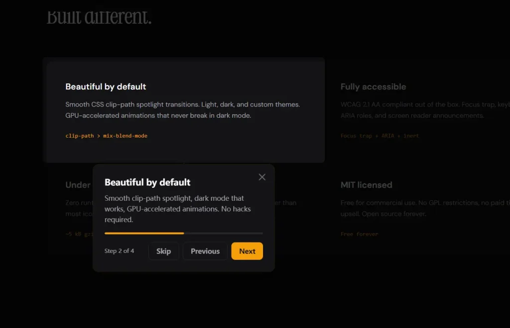
Preview
Use Cases
- Guide new users through a dashboard’s main features after their first login.
- Announce recent UI changes or new buttons with a one off spotlight highlight.
- Create a step by step checkout walkthrough for an ecommerce React application.
- Show contextual help inside a complex form with conditional async steps.
How to Use It
1. Install the package
# Install the library and its tooltip positioning peer dependency
npm install react-tourlight @floating-ui/react-dom
2. Import the stylesheet once
// Import the library stylesheet once in your app entry
import 'react-tourlight/styles.css'
3. Wrap your app with SpotlightProvider. The provider stores active tour state, shared labels, theme options, and global callbacks.
import React from 'react'
import ReactDOM from 'react-dom/client'
import { SpotlightProvider } from 'react-tourlight'
import 'react-tourlight/styles.css'
import App from './App'
ReactDOM.createRoot(document.getElementById('root')).render(
  // Place SpotlightProvider near the root so any child can start a tour
  <SpotlightProvider
    theme="auto"
    showProgress={true}
    showSkip={true}
    overlayClickToDismiss={true}
    escToDismiss={true}
  >
    <App />
  </SpotlightProvider>
)
4. Register a tour with SpotlightTour. This component registers your steps. It does not render a visible button or page content.
import { SpotlightTour } from 'react-tourlight'
const accountSetupSteps = [
  {
    // Target the search input with a CSS selector
    target: '#project-search',
    title: 'Find your workspace',
    content: 'Use this field to jump to a project or team space.',
    placement: 'bottom',
  },
  {
    // Target another element with a data attribute
    target: '[data-tour="nav-panel"]',
    title: 'Main navigation',
    content: 'Open sections here and move between views faster.',
    placement: 'right',
    spotlightPadding: 10,
    spotlightRadius: 14,
  },
  {
    // Add a CTA button inside the tooltip for a guided action
    target: '#new-project',
    title: 'Create a project',
    content: 'Start with a blank project or load one of your saved presets.',
    placement: 'bottom',
    action: {
      label: 'Open builder',
      onClick: () => {
        console.log('Launch the project builder')
      },
    },
    interactive: true,
  },
]
export default function TourRegistry() {
  return (
    <SpotlightTour
      // This ID is how you start the tour later
      id="account-setup"
      // Register all step objects for this tour
      steps={accountSetupSteps}
      // Run when the full tour completes
      onComplete={() => console.log('Tour completed')}
      // Run when the user skips the tour
      onSkip={(stepIndex) => console.log('Skipped at step', stepIndex)}
    />
  )
}
5. Start the tour with useSpotlight.
import { useSpotlight } from 'react-tourlight'
export function LaunchTourButton() {
  // Pull the start method from spotlight context
  const { start } = useSpotlight()
  return (
    <button
      type="button"
      // Start the registered tour by ID
      onClick={() => start('account-setup')}
    >
      Open onboarding
    </button>
  )
}
6. Use refs when selectors feel brittle.
import { SpotlightTour, useSpotlightTarget } from 'react-tourlight'
export function SearchPanel() {
  // Create a typed ref for the target element
  const searchRef = useSpotlightTarget<HTMLInputElement>()
  const steps = [
    {
      // Use the React ref as the target
      target: searchRef,
      title: 'Quick search',
      content: 'Search projects, users, and recent activity from one place.',
      placement: 'bottom',
    },
  ]
  return (
    <>
      {/* Register a short tour that points to the ref target */}
      <SpotlightTour id="search-tour" steps={steps} />
      {/* Attach the ref to the actual input element */}
      <input ref={searchRef} placeholder="Search your data" />
    </>
  )
}
7. Show a one-off highlight with SpotlightHighlight.
import { useState } from 'react'
import { SpotlightHighlight } from 'react-tourlight'
export function ReleaseNotice() {
  const [open, setOpen] = useState(true)
  return (
    <>
      <button id="export-report">Export report</button>
      <SpotlightHighlight
        // Point at one element and show a short callout
        target="#export-report"
        title="New export action"
        content="You can now export filtered results as CSV."
        active={open}
        placement="top"
        onDismiss={() => setOpen(false)}
      />
    </>
  )
}
8. Persist user progress.
import { SpotlightProvider } from 'react-tourlight'
import 'react-tourlight/styles.css'
// Restore previously stored tour state
const savedState = JSON.parse(localStorage.getItem('tour-state') || '{}')
export function Root() {
  return (
    <SpotlightProvider
      // Restore completed and in-progress tours on load
      initialState={savedState}
      // Save state changes after each step transition
      onStateChange={(tourId, state) => {
        const nextState = {
          ...savedState,
          [tourId]: state,
        }
        localStorage.setItem('tour-state', JSON.stringify(nextState))
      }}
      // Track completion for analytics or product logic
      onComplete={(tourId) => {
        console.log('Completed tour:', tourId)
      }}
      // Track skip events and the last viewed step
      onSkip={(tourId, stepIndex) => {
        console.log('Skipped tour:', tourId, 'at step:', stepIndex)
      }}
    >
      <App />
    </SpotlightProvider>
  )
}
9. Replace the default tooltip.
import { SpotlightTour } from 'react-tourlight'
const billingSteps = [
  {
    target: '#plan-name',
    title: 'Current plan',
    content: 'Review plan details and usage from this card.',
    placement: 'bottom',
  },
]
export function BillingTour() {
  return (
    <SpotlightTour
      id="billing-tour"
      steps={billingSteps}
      // Render your own tooltip layout
      renderTooltip={({ step, next, previous, skip, currentIndex, totalSteps }) => (
        <div className="custom-tour-card">
          {/* Print the current step title */}
          <h3>{step.title}</h3>
          {/* Render the current step content */}
          <div>{step.content}</div>
          {/* Show a simple step counter */}
          <p>
            {currentIndex + 1} / {totalSteps}
          </p>
          <div className="actions">
            <button type="button" onClick={previous}>Back</button>
            <button type="button" onClick={skip}>Skip</button>
            <button type="button" onClick={next}>Continue</button>
          </div>
        </div>
      )}
    />
  )
}
Available Props
SpotlightProvider props
children(ReactNode): Renders your application content inside the provider.theme('light' | 'dark' | 'auto' | SpotlightTheme): Applies a preset theme or a full custom theme object.overlayColor(string): Sets the overlay background color.transitionDuration(number): Sets the transition duration in milliseconds.escToDismiss(boolean): Lets the Escape key close the active tour.overlayClickToDismiss(boolean): Lets an overlay click close the active tour.showProgress(boolean): Shows the progress bar.showSkip(boolean): Shows the skip button.labels(SpotlightLabels): Overrides built-in UI labels for localization.onComplete((tourId: string) => void): Fires when any registered tour completes.onSkip((tourId: string, stepIndex: number) => void): Fires when any registered tour is skipped.onStateChange((tourId: string, state: TourState) => void): Reports tour state changes for persistence.initialState(Record<string, TourState>): Restores persisted tour state on load.
SpotlightTour props
id(string): Registers a unique ID for the tour.steps(SpotlightStep[]): Registers all steps for the tour.onComplete(() => void): Fires when this specific tour completes.onSkip((stepIndex: number) => void): Fires when this specific tour is skipped.renderTooltip((props: TooltipRenderProps) => ReactNode): Replaces the default tooltip UI.
SpotlightStep fields
target(string | RefObject<HTMLElement | null>): Points to the target element with a selector or React ref.title(string): Sets the tooltip title.content(ReactNode): Sets the tooltip body content.placement('top' | 'bottom' | 'left' | 'right' | 'auto'): Controls tooltip placement.spotlightPadding(number): Adds padding around the spotlight cutout in pixels.spotlightRadius(number): Sets the cutout corner radius in pixels.action({ label: string; onClick: () => void }): Adds an action button inside the tooltip.when(() => boolean | Promise<boolean>): Conditionally shows or skips a step.onBeforeShow(() => void | Promise<void>): Runs before a step becomes visible.onAfterShow(() => void): Runs after a step becomes visible.onHide(() => void): Runs when a step closes.disableOverlayClose(boolean): Blocks overlay-click dismissal for that step.interactive(boolean): Lets the user click the highlighted target element.
SpotlightHighlight props
target(string | RefObject<HTMLElement | null>): Points to the highlighted element.title(string): Sets the tooltip title.content(ReactNode): Sets the tooltip body content.active(boolean): Shows or hides the highlight.placement('top' | 'bottom' | 'left' | 'right' | 'auto'): Controls tooltip placement.spotlightPadding(number): Adds padding around the spotlight cutout.spotlightRadius(number): Sets the cutout border radius.onDismiss(() => void): Runs after the highlight closes.
SpotlightLabels
next(string): Sets the next button label.previous(string): Sets the previous button label.skip(string): Sets the skip button label.done(string): Sets the final step button label.close(string): Sets the close button aria label.stepOf((current: number, total: number) => string): Formats the step counter text.
TooltipRenderProps
step(SpotlightStep): Exposes the current step config.next(() => void): Advances to the next step or completes the tour.previous(() => void): Moves back one step.skip(() => void): Skips the tour.currentIndex(number): Returns the zero-based current step index.totalSteps(number): Returns the total number of steps in the active tour.
TourState
status('idle' | 'active' | 'completed'): Stores the current lifecycle state.currentStepIndex(number): Stores the active step index.seenSteps(number[]): Stores the indices of viewed steps.completedAt(number | undefined): Stores the completion timestamp.skippedAt({ stepIndex: number; timestamp: number } | undefined): Stores the skip step index and timestamp.
SpotlightTheme sections
overlay(object): Acceptsbackground.tooltip(object): Acceptsbackground,color,borderRadius,boxShadow,padding,maxWidth.title(object): AcceptsfontSize,fontWeight,color,marginBottom.content(object): AcceptsfontSize,color,lineHeight.button(object): Acceptsbackground,color,borderRadius,padding,fontSize,fontWeight,border,cursor,hoverBackground.buttonSecondary(object): Acceptsbackground,color,border,hoverBackground.progress(object): Acceptsbackground,fill,height,borderRadius.arrow(object): Acceptsfill.closeButton(object): Acceptscolor,hoverColor. ([GitHub][1])
API Methods
// Start a registered tour by its ID
const { start } = useSpotlight()
start('account-setup')
// Stop the active tour
const { stop } = useSpotlight()
stop()
// Move to the next step
const { next } = useSpotlight()
next()
// Move to the previous step
const { previous } = useSpotlight()
previous()
// Skip the active tour
const { skip } = useSpotlight()
skip()
// Jump to a specific step by zero-based index
const { goToStep } = useSpotlight()
goToStep(2)
// Show a single highlight with an inline step object
const { highlight } = useSpotlight()
highlight({
  target: '#activity-feed',
  title: 'Recent activity',
  content: 'Review the latest team updates here.',
  placement: 'left',
})
// Close the active single highlight
const { dismissHighlight } = useSpotlight()
dismissHighlight()
// Read the current spotlight state
const spotlight = useSpotlight()
console.log(spotlight.isActive)
console.log(spotlight.activeTourId)
console.log(spotlight.currentStep)
console.log(spotlight.totalSteps)
// Use the memoized control hook when you only need control methods
const control = useSpotlightControl()
control.start('billing-tour')
control.next()
control.skip()
// Create a typed target ref for ref-based steps
const profileRef = useSpotlightTarget<HTMLButtonElement>()
Events and Callbacks
// Run after any tour completes in SpotlightProvider
<SpotlightProvider
  onComplete={(tourId) => {
    console.log('Completed:', tourId)
  }}
>
  <App />
</SpotlightProvider>
// Run after any tour skips in SpotlightProvider
<SpotlightProvider
  onSkip={(tourId, stepIndex) => {
    console.log('Skipped:', tourId, 'step:', stepIndex)
  }}
>
  <App />
</SpotlightProvider>
// Run on every state change in SpotlightProvider
<SpotlightProvider
  onStateChange={(tourId, state) => {
    console.log('State changed:', tourId, state)
  }}
>
  <App />
</SpotlightProvider>
// Run after a specific SpotlightTour completes
<SpotlightTour
  id="account-setup"
  steps={steps}
  onComplete={() => {
    console.log('This tour finished')
  }}
/>
// Run after a specific SpotlightTour skips
<SpotlightTour
  id="account-setup"
  steps={steps}
  onSkip={(stepIndex) => {
    console.log('This tour skipped at step', stepIndex)
  }}
/>
// Run before a step shows
const steps = [
  {
    target: '#filters',
    title: 'Filters',
    content: 'Narrow results from this panel.',
    onBeforeShow: async () => {
      console.log('Prepare the UI before this step opens')
    },
  },
]
// Run after a step becomes visible
const moreSteps = [
  {
    target: '#member-list',
    title: 'Team members',
    content: 'Manage access from this table.',
    onAfterShow: () => {
      console.log('Step is now visible')
    },
  },
]
// Run when a step hides
const finalSteps = [
  {
    target: '#settings-link',
    title: 'Settings',
    content: 'Open app configuration here.',
    onHide: () => {
      console.log('Step closed')
    },
  },
]
// Run when a single highlight closes
<SpotlightHighlight
  target="#export-report"
  title="New export"
  content="CSV export is now live."
  onDismiss={() => {
    console.log('Highlight dismissed')
  }}
/>
Alternatives
- React Joyride: Add guided tours to React apps with a long-established API.
- Shepherd.js: Build framework-agnostic tours with a mature vanilla JS core.
- Driver.js: Highlight page elements and walkthrough flows with a lightweight vanilla JS approach.


