Description:
A lightweight React hook that replaces the native window.confirm() with accessible, customizable confirmation dialogs. This library provides a promise-based approach to user confirmations, returning user responses through async/await syntax instead of blocking the browser thread.
The hook renders modal overlays using React portals and requires zero external dependencies beyond React itself. You can customize everything from button colors to font families while maintaining full keyboard accessibility and screen reader support.
Features
- 🚀 Promise-based confirmation handling with async/await support.
- 🎨 Fully customizable styling including colors, fonts, and button text.
- ♿ Built-in accessibility features with keyboard navigation and ARIA support.
- 📦 Zero dependencies beyond React with inline styling approach.
- 🌐 Modal overlay rendering through React portals for proper z-index handling.
- 🔧 TypeScript support with complete type definitions included.
- 📱 Responsive design that works across desktop and mobile devices.
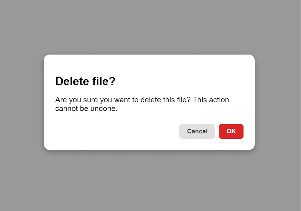
Preview
Use Cases
- Delete confirmations for files, records, or user accounts in admin dashboards.
- Form submission warnings when users have unsaved changes before navigating away.
- Irreversible action confirmations like clearing shopping carts or resetting application state.
- Subscription cancellation flows requiring explicit user acknowledgment.
- Bulk operation confirmations when processing multiple items simultaneously.
How to Use It
1. Install the package using npm or yarn:
npm install react-use-confirming-dialogor
yarn add react-use-confirming-dialog2. Wrap your entire application with the ConfirmProvider component at the root level:
import React from 'react'
import ReactDOM from 'react-dom/client'
import { ConfirmProvider } from 'react-use-confirming-dialog'
import App from './App'
ReactDOM.createRoot(document.getElementById('root')).render(
  <ConfirmProvider>
    <App />
  </ConfirmProvider>
)
3. Import the useConfirm hook in any component and call it with your configuration options:
import { useConfirm } from 'react-use-confirming-dialog'
function UserProfile() {
  const confirm = useConfirm()
  const handleDeleteAccount = async () => {
    const userConfirmed = await confirm({
      title: "Delete Account",
      message: "This will permanently delete your account and all associated data. This action cannot be undone.",
      confirmText: "Delete Account",
      cancelText: "Keep Account",
      confirmColor: "#ef4444"
    })
    if (userConfirmed) {
      // Proceed with account deletion
      await deleteUserAccount()
      redirectToHomepage()
    }
  }
  return (
    <button onClick={handleDeleteAccount} className="delete-btn">
      Delete My Account
    </button>
  )
}
4. Advanced Configuration:
import { useConfirm } from 'react-use-confirming-dialog'
function DocumentEditor() {
  const confirm = useConfirm()
  const handleClearDocument = async () => {
    const proceed = await confirm({
      title: "Clear Document",
      message: "All unsaved changes will be lost. Save your work before continuing or click cancel to return to editing.",
      confirmText: "Clear All",
      cancelText: "Cancel",
      confirmColor: "#f97316",
      confirmTextFont: "Inter, sans-serif",
      cancelTextFont: "Inter, sans-serif",
      dialogTextFont: "Georgia, serif"
    })
    if (proceed) {
      clearDocumentContent()
      showSuccessNotification("Document cleared successfully")
    }
  }
  return (
    <button onClick={handleClearDocument}>
      Clear Document
    </button>
  )
}
5. Configuration Options
| Option | Type | Default | Description |
|---|---|---|---|
title | string | “Confirm” | Modal dialog title text |
message | string | Required | Main confirmation message content |
confirmText | string | “OK” | Text displayed on confirmation button |
cancelText | string | “Cancel” | Text displayed on cancel button |
confirmColor | string | “#2563eb” | Background color for confirm button (any CSS color value) |
confirmTextFont | string | System default | Font family for confirm button text |
cancelTextFont | string | System default | Font family for cancel button text |
dialogTextFont | string | System default | Font family for dialog title and message |
6. Handle potential errors when the dialog component fails to render:
const handleRiskyOperation = async () => {
  try {
    const confirmed = await confirm({
      message: "Proceed with this risky operation?"
    })
    if (confirmed) {
      await performRiskyOperation()
    }
  } catch (error) {
    console.error('Confirmation dialog error:', error)
    // Fallback to native confirm if needed
    const fallback = window.confirm("Proceed with this risky operation?")
    if (fallback) {
      await performRiskyOperation()
    }
  }
}
FAQs
Q: Can I use multiple confirmation dialogs simultaneously?
A: No, the library shows one dialog at a time. Subsequent calls to confirm() will queue and display after the current dialog closes.
Q: How do I customize the modal backdrop or overlay?
A: Currently, backdrop styling is not configurable. The library uses a semi-transparent dark overlay by default.
Q: Can I prevent the dialog from closing when clicking outside?
A: The dialog only closes through the confirm/cancel buttons or ESC key. Clicking the backdrop does not close the modal.
Q: Is server-side rendering (SSR) supported?
A: Yes, the library works with SSR frameworks like Next.js since it only renders the modal after user interaction.


