Description:
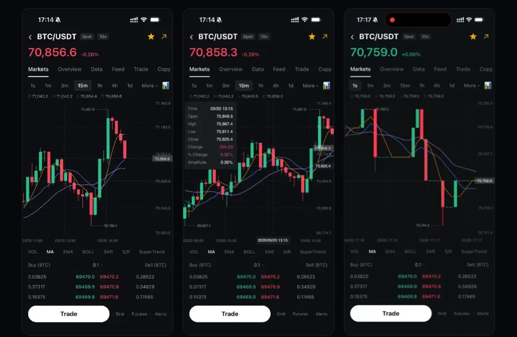
react-native-kline-chart is a Skia-powered candlestick chart library that renders K-line data at 60fps in React Native applications.
It draws all candle geometry directly onto a Skia canvas via PictureRecorder and runs every gesture handler as a Reanimated worklet on the UI thread.
Features
- Renders all candlestick bodies and wicks directly on a Skia canvas at 60 frames per second.
- Runs pan, pinch-to-zoom, and long-press crosshair gestures entirely as UI thread worklets.
- Viewport clipping limits drawing to the visible candle range, with full performance at 10,000+ entries.
- Built-in moving average overlay with configurable period counts and per-line color assignments.
- Long-press crosshair displays a synchronized info panel with open, high, low, close, and percentage change values.
- Dashed last-price reference line marks the most recent closing value in real time.
- High and low price markers appear at their exact positions on the chart canvas.
- Configurable candle width, spacing, and zoom bounds for the pinch interaction.
- Fully customizable color tokens for candle bodies, wicks, grid lines, axis labels, and background.
- TypeScript type exports for candle data structures and chart prop interfaces.
Preview
Use Cases
- Crypto trading apps get a jank-free candlestick view for high-frequency tick data feeds.
- Stock analysis dashboards display months of daily OHLC bars in a single scrollable, zoomable chart.
- Forex monitoring tools surface trend direction through the configurable moving average overlay.
- Portfolio review screens support long-press crosshair inspection of exact historical price values.
How to Use It
1. Install react-native-kline-chart with NPM
npm install react-native-kline-chart2. Install Peer Dependencies
npm install @shopify/react-native-skia react-native-reanimated react-native-gesture-handler3. Open babel.config.js and add the plugin entry. After editing the config, run npx pod-install on iOS and rebuild the project.
// babel.config.js
module.exports = {
  plugins: ['react-native-reanimated/plugin'], // Required — Reanimated worklet compilation
};
4. Wrap the chart in GestureHandlerRootView at the root level.
import { KlineChart } from 'react-native-kline-chart';
import { GestureHandlerRootView } from 'react-native-gesture-handler';
// Minimal OHLC dataset — each entry requires a millisecond timestamp
const priceData = [
  { time: 1715000000000, open: 62400, high: 63100, low: 62200, close: 62950 },
  { time: 1715003600000, open: 62950, high: 64000, low: 62800, close: 63750 },
  { time: 1715007200000, open: 63750, high: 63900, low: 62500, close: 62700 },
];
export default function App() {
  return (
    // GestureHandlerRootView must sit at the root for gesture recognition to work
    <GestureHandlerRootView style={{ flex: 1 }}>
      <KlineChart
        data={priceData}     // Array of Candle objects
        width={390}          // Canvas width in pixels
        height={500}         // Canvas height in pixels
        showMA               // Render moving average lines
        showCrosshair        // Enable long-press crosshair
      />
    </GestureHandlerRootView>
  );
}
5. This example reads the active candle from the crosshair and displays an OHLC header panel above the chart. The onCrosshairChange callback fires on every long-press move and returns null when the user lifts their finger.
import React, { useState, useCallback } from 'react';
import { View, Text, StyleSheet, useWindowDimensions } from 'react-native';
import { GestureHandlerRootView } from 'react-native-gesture-handler';
import { KlineChart } from 'react-native-kline-chart';
import type { Candle } from 'react-native-kline-chart';
const priceData: Candle[] = [
  { time: 1715000000000, open: 62400, high: 63100, low: 62200, close: 62950 },
  { time: 1715003600000, open: 62950, high: 64000, low: 62800, close: 63750 },
  // ...additional candles
];
export default function TradingScreen() {
  const { width } = useWindowDimensions(); // Use device width for a responsive canvas
  const [selectedCandle, setSelectedCandle] = useState<Candle | null>(null);
  // Fires with the hovered Candle during long-press; null on finger lift
  const handleCrosshairChange = useCallback((candle: Candle | null) => {
    setSelectedCandle(candle);
  }, []);
  return (
    <GestureHandlerRootView style={styles.root}>
      {/* Render an OHLC header bar only while the crosshair is active */}
      {selectedCandle && (
        <View style={styles.infoBar}>
          <Text style={styles.label}>O: {selectedCandle.open}</Text>
          <Text style={styles.label}>H: {selectedCandle.high}</Text>
          <Text style={styles.label}>L: {selectedCandle.low}</Text>
          <Text style={styles.label}>C: {selectedCandle.close}</Text>
        </View>
      )}
      <KlineChart
        data={priceData}
        width={width}
        height={460}
        showMA                                          // Enable the MA overlay
        maPeriods={[5, 10, 30]}                         // Three MA periods
        maColors={['#F7931A', '#4A90D9', '#A855F7']}   // One color per period, in order
        showCrosshair
        onCrosshairChange={handleCrosshairChange}       // Fires on every crosshair move
        bullishColor="#26A69A"                          // Teal for bullish candles
        bearishColor="#EF5350"                          // Red for bearish candles
        backgroundColor="#131722"                       // Dark chart background
        gridColor="rgba(255, 255, 255, 0.08)"          // Subtle grid lines
        textColor="rgba(255, 255, 255, 0.4)"           // Dimmed axis labels
        crosshairColor="rgba(255, 255, 255, 0.25)"     // Crosshair line opacity
        rightPaddingCandles={15}                        // Right-side padding in candle widths
      />
    </GestureHandlerRootView>
  );
}
const styles = StyleSheet.create({
  root: { flex: 1, backgroundColor: '#131722' },
  infoBar: { flexDirection: 'row', gap: 16, paddingHorizontal: 16, paddingVertical: 10 },
  label: { color: '#D1D4DC', fontSize: 13, fontVariant: ['tabular-nums'] },
});
6. All component props.
data(Candle[]): The array of candle objects to render. Each entry requirestime,open,high,low, andclose. This prop is required.width(number): The canvas width in pixels. This prop is required.height(number): The canvas height in pixels. This prop is required.candleWidth(number): The pixel width of each candle body. Defaults to8.candleSpacing(number): The pixel gap between adjacent candles. Defaults to3.minCandleWidth(number): The minimum candle width reachable by pinch-to-zoom. Defaults to2.maxCandleWidth(number): The maximum candle width reachable by pinch-to-zoom. Defaults to24.bullishColor(string): The fill color for bullish candles where close is greater than or equal to open. Defaults to'#2DC08E'.bearishColor(string): The fill color for bearish candles. Defaults to'#F6465D'.showMA(boolean): Renders moving average lines on the chart when set totrue. Defaults totrue.maPeriods(number[]): An array of period values for the MA calculation. Defaults to[5, 10].maColors(string[]): An array of hex or rgba color strings applied to MA lines in index order. Defaults to['#F7931A', '#5B8DEF', '#C084FC'].showCrosshair(boolean): Activates the long-press crosshair interaction. Defaults totrue.backgroundColor(string): The chart canvas background color. Defaults to'#0B0E11'.gridColor(string): The color applied to horizontal and vertical grid lines. Defaults to'rgba(255,255,255,0.2)'.textColor(string): The color of axis tick labels. Defaults to'rgba(255,255,255,0.35)'.crosshairColor(string): The color of the crosshair line. Defaults to'rgba(255,255,255,0.3)'.rightPaddingCandles(number): The right-side canvas padding expressed in candle widths. Defaults to20.onCrosshairChange((candle: Candle | null) => void): A callback that fires whenever the crosshair moves. Receives the hoveredCandleobject, ornullwhen the user lifts their finger.
Alternatives
- react-native-gifted-charts: A feature-rich React Native chart library covering bar, line, pie, and candlestick chart types.
- react-native-wagmi-charts: A gesture-driven charting library built for crypto and DeFi apps, with candlestick and line chart support.