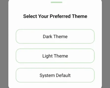
Description:
Better Themes is a framework-agnostic theming provider that manages dark mode and custom color schemes across React applications.
It injects script tags to prevent flash of unstyled content (FOUC) during server-side rendering and supports modern frameworks like Next.js, Remix, and Vite.
Features
- 🚫 Zero Flash Prevention: Blocks rendering until theme applies to prevent light/dark mode flicker on page load.
- 🖥️ System Detection: Reads
prefers-color-schememedia query and applies system theme automatically. - 💾 Storage Options: Persists theme preference in localStorage or sessionStorage with configurable keys.
- 🎨 Native Browser Styling: Sets CSS
color-schemeproperty to style scrollbars and form controls. - 🔧 Custom Theme Support: Accepts multiple theme values beyond the standard light/dark options.
- 📦 Attribute Flexibility: Applies themes through HTML class names or data attributes.
Use Cases
- Multi-Tenant Applications: Switch between brand-specific color schemes while maintaining user preference for light or dark mode across different client portals.
- Documentation Sites: Respect reader system preferences while allowing manual theme override.
- E-Commerce Platforms: Apply seasonal or promotional themes alongside standard dark mode.
- Component Libraries: Provide theme-aware design system demos that work correctly in both development and production builds.
How to Use It
1. Install better-themes using your preferred manager:
npm install better-themes
# or
pnpm add better-themes
# or
yarn add better-themes
# or
bun add better-themes
2. Wrap your application root with the ThemeProvider component. Add the suppressHydrationWarning attribute to your HTML tag to prevent React from flagging the theme class as a hydration mismatch:
// app/layout.tsx
import { ThemeProvider } from "better-themes";
export default function RootLayout({
  children
}: {
  children: React.ReactNode
}) {
  return (
    <html lang="en" suppressHydrationWarning>
      <body>
        <ThemeProvider>
          {children}
        </ThemeProvider>
      </body>
    </html>
  );
}
3. The provider adds a class name to the HTML element by default. Style your application with CSS variables that respond to this class:
/* global.css */
:root {
  --background: white;
  --foreground: black;
}
.dark {
  --background: black;
  --foreground: white;
}
4. You can also use fixed color values if you prefer not to use CSS variables:
html,
body {
  color: #000;
  background: #fff;
}
.dark,
.dark body {
  color: #fff;
  background: #000;
}
5. Access the current theme and switch between modes with the useTheme hook. This hook returns the active theme name and a setter function:
// components/theme-switcher.tsx
import { useTheme } from "better-themes";
export function ThemeSwitcher() {
  const { theme, setTheme } = useTheme();
  return (
    <div>
      <p>Current theme: {theme}</p>
      <button onClick={() => setTheme("light")}>Light</button>
      <button onClick={() => setTheme("dark")}>Dark</button>
      <button onClick={() => setTheme("system")}>System</button>
    </div>
  );
}
6. For Tailwind CSS projects, configure the provider to use class-based dark mode:
<ThemeProvider attribute="class">
  {children}
</ThemeProvider>
Apply Tailwind’s dark mode utilities in your components:
<h1 className="text-black dark:text-white">
  Welcome
</h1>
7. When working with React Server Components in Next.js App Router, import from the RSC-specific entry point. Create a client component for the theme switcher and mount it only after hydration completes:
// app/layout.tsx
import { ThemeProvider } from "better-themes/rsc";
import { ThemeSwitcher } from "@/components/theme-switcher";
export default function RootLayout({
  children,
}: {
  children: React.ReactNode;
}) {
  return (
    <html lang="en" suppressHydrationWarning>
      <body>
        <ThemeProvider attribute="class" disableTransitionOnChange>
          <ThemeSwitcher />
          {children}
        </ThemeProvider>
      </body>
    </html>
  );
}
// components/theme-switcher.tsx
"use client";
import { useTheme } from "better-themes/rsc";
import { useEffect, useState } from "react";
export function ThemeSwitcher() {
const [mounted, setMounted] = useState(false);
const { theme, setTheme } = useTheme();
useEffect(() => {
setMounted(true);
}, []);
if (!mounted) {
return null;
}
return (
<button onClick={() => setTheme(theme === "dark" ? "light" : "dark")}>
{theme === "dark" ? "Light" : "Dark"}
</button>
);
}8. Configure multiple custom themes by passing a themes array and mapping theme names to CSS class values:
<ThemeProvider
  themes={["light", "dark", "forest", "ocean"]}
  value={{
    forest: "theme-forest",
    ocean: "theme-ocean"
  }}
>
  {children}
</ThemeProvider>
API Reference
ThemeProvider Props
- themes: Array of available theme names. Defaults to
["light", "dark"]. - defaultTheme: Initial theme when no saved preference exists. Defaults to
"system"ifenableSystemis true, otherwise"light". - storage: Storage mechanism for theme persistence. Accepts
"localStorage"or"sessionStorage". Defaults to"localStorage". - storageKey: Key name used in storage API. Defaults to
"theme". - forcedTheme: Overrides user preference and locks theme to specific value.
- enableSystem: Detects and respects system color scheme preference. Defaults to
true. - enableColorScheme: Applies CSS
color-schemeproperty to style native browser elements. Defaults totrue. - attribute: HTML attribute modified to indicate theme. Accepts
"class"or"data-*". Defaults to"class". - value: Maps theme names to custom attribute values for CSS selectors.
- disableTransitionOnChange: Prevents CSS transitions from running during theme switches. Defaults to
false. - nonce: CSP nonce value for inline script tag.
useTheme Hook Props
- themes: Array containing all available theme names, including system option if enabled.
- theme: Currently active theme name. Returns
undefinedduring server-side rendering. - setTheme: Function accepting theme name string or callback function to update theme.
- forcedTheme: Returns forced theme value if set, otherwise
undefined. - systemTheme: Current system preference value of
"dark"or"light". Only available whenenableSystemistrue.
FAQs
Q: Why does the theme flash briefly on page load?
A: You need to add suppressHydrationWarning to your HTML tag. This attribute tells React to ignore the mismatch between server-rendered output and client-side theme class.
Q: How do I prevent CSS transitions when switching themes?
A: Set the disableTransitionOnChange prop to true on ThemeProvider. This temporarily disables transitions during theme changes to avoid visual artifacts.
Q: Can I use data attributes instead of class names?
A: Set the attribute prop to "data-theme" or any custom data attribute. You then write CSS selectors like [data-theme="dark"] instead of .dark.
Q: How do I force a specific theme on certain pages?
A: Pass the forcedTheme prop to ThemeProvider with the desired theme name. This overrides user preference and prevents theme switching on that page.

