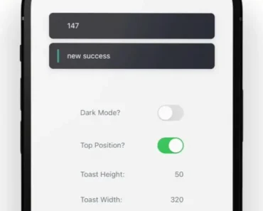
Description:
Sonner Native is a performant and customizable toast component library for React Native.
Built with Reanimated 3, it provides a simple API for displaying elegant toast notifications in your mobile applications.
Inspired by the web library Sonner, this native version brings the same intuitive functionality to the React Native ecosystem.
It allows developers to easily implement various toast types, including success, error, warning, and custom messages, enriching the user experience with informative and visually appealing feedback.
Features
- ✨ Multiple Variants: Success, error, warning, custom, and promise toasts.
- ⚙️ Promise Variant: Built-in loading state for asynchronous operations.
- 🎨 Customizable: Style and customize toasts using
stylesandclassNameprops. - 💫 Performant: Leverages Reanimated 3 for smooth, 60 FPS animations.
- 🌙 Dark Mode Support: Seamless integration with dark mode themes.
- 📱 Expo Compatible: Works seamlessly within the Expo environment.
- 💨 NativeWind Support: Style with NativeWind for consistent styling.
- 🛠️ External Usage: Works outside of React components for greater flexibility.
- 👆 Dismissable: Swipe to dismiss or programmatically dismiss toasts.
- ⚙️ Actionable: Include buttons with callbacks for user interaction.
- 👁️ Custom Icons: Enhance visual feedback with custom icons.
- 📍 Flexible Positioning: Display toasts at the top or bottom of the screen.
Preview

Use Cases
- Form Submissions: Provide feedback after a form submission, indicating success or highlighting errors. For example, display a success toast upon successful registration or an error toast if required fields are missing.
- Network Operations: Inform users about the status of network requests. Show a loading toast while fetching data, followed by a success or error toast based on the response.
- Asynchronous Actions: Display toasts during long-running tasks like file uploads or downloads to keep users informed of the progress.
- Real-time Updates: Use toasts to notify users of real-time events, such as new messages, incoming calls, or application updates.
- User Interactions: Confirm actions like adding an item to a cart or favoriting a post with a simple toast notification.
Install & Usage
Install Sonner Native and its peer dependencies:
yarn add sonner-native react-native-reanimated react-native-gesture-handler react-native-safe-area-context react-native-svgImport the Toaster component in your app’s entry point (e.g., App.tsx):
import { Toaster } from 'sonner-native';
function App() {
  return (
    <View>
      {/* ... your app content */}
      <Toaster />
    </View>
  );
}
Import the toast function to display toasts:
import { toast } from 'sonner-native';
function MyComponent() {
  const showToast = () => {
    toast('Hello, world!');
  };
  return (
    <Button title="Show Toast" onPress={showToast} />
  );
}
Related Resources
- React Native Reanimated: The animation library powering Sonner Native’s smooth animations. https://docs.swmansion.com/react-native-reanimated/
- React Native Gesture Handler: Enables gesture recognition for features like swipe-to-dismiss. https://docs.swmansion.com/react-native-gesture-handler/
- Sonner (Web): The original web-based toast library that inspired Sonner Native. https://github.com/emilkowalski/sonner
FAQs
Does Sonner Native work with Expo?
Yes, Sonner Native is fully compatible with Expo.
Can I customize the appearance of the toasts?
Yes, you can customize the styling and content of the toasts using props like styles and className.
How do I dismiss a toast programmatically?
You can use the toast.dismiss() method to dismiss one or all active toasts.
What are the different toast variants available?
Sonner Native provides success, error, warning, custom, and promise toast variants.
Can I use custom icons in my toasts?
Yes, you can use the icon prop to display custom icons within your toasts.
Changelog
v0.21.2 (12/03/2025)
- Bugfixes


