Description:
React Tree Multi Select is a lightweight and customizable React component that combines the functionality of a tree select, multi-select, and a simple select into a single dropdown.
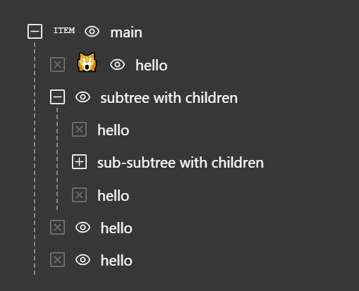
It allows you to render hierarchical data in a tree-like structure and enables your users to select single or multiple items with ease.
Features
- 🌳 Hierarchical Data Display: Presents nested data in an expandable tree structure.
- ✅ Multi-Select Capability: Users can select multiple nodes simultaneously.
- 🔍 Search and Filtering: Includes a search functionality to filter tree nodes.
- 🎨 Customizable: Offers options for custom rendering of nodes and the overall component style.
- ⌨️ Keyboard Navigation: Supports keyboard interactions for accessibility.
- 🔄 Controlled and Uncontrolled Modes: Can be used as a controlled or uncontrolled component.
Use Cases
- File Explorer: For selecting files and folders within a directory structure.
- Organizational Chart: To select employees or departments from a company hierarchy.
- Category Selection: In e-commerce or content management systems for assigning items to multiple categories.
- Permission Management: For assigning user permissions in a system with nested roles.
- Location Selection: To choose countries, states, and cities from a hierarchical dropdown.
How to Use It
1. Install the package using npm.
npm install react-tree-multi-select2. Import the component and necessary types in your React file. Use TypeScript for type safety.
import React from 'react';
import { TreeMultiSelect, TreeNode, CheckedState } from 'react-tree-multi-select';
3. Define your hierarchical data following the TreeNode structure. Each node requires a label and can contain children.
const categoryData: TreeNode[] = [
  {
    label: 'Electronics',
    children: [
      { label: 'Laptops' },
      { label: 'Smartphones' }
    ]
  },
  {
    label: 'Clothing',
    children: [
      { label: 'Men' },
      { label: 'Women' }
    ]
  }
];
4. Implement the component. The data prop accepts your tree structure.
function CategorySelector() {
  const [selectedItems, setSelectedItems] = React.useState<TreeNode[]>([]);
  const handleSelectionChange = (node: TreeNode, selectedNodes: TreeNode[]) => {
    setSelectedItems(selectedNodes);
  };
  return (
    <TreeMultiSelect
      data={categoryData}
      onNodeChange={handleSelectionChange}
      withSelectAll={true}
    />
  );
}
5. Configure additional event handlers for expanded state management. The onNodeToggle prop tracks opened nodes.
const handleToggle = (node: TreeNode, expandedNodes: TreeNode[]) => {
  console.log('Expanded nodes:', expandedNodes);
};
<TreeMultiSelect
  data={data}
  onNodeToggle={handleToggle}
  onClearAll={handleClear}
/>
6. All component props.
export interface TreeMultiSelectProps {
  /**
   * The data to be rendered in the component.
   */
  data: TreeNode[];
  /**
   * Specifies the type of the component, determining its behavior and rendering.
   *
   * @default Type.TREE_SELECT
   */
  type?: Type;
  /**
   * The `id` attribute to apply to the root `<div>` of the component.
   */
  id?: string;
  /**
   * The `className` to apply to the root `<div>` of the component.
   */
  className?: string;
  /**
   * Placeholder text displayed in the search input field.
   *
   * @default "search..."
   */
  inputPlaceholder?: string;
  /**
   * Text displayed when there is no data to show in the dropdown.
   *
   * @default "No data"
   */
  noDataText?: string;
  /**
   * Text displayed when no matching results are found during a search.
   *
   * @default "No matches"
   */
  noMatchesText?: string;
  /**
   * Disables the entire component, preventing user interaction.
   *
   * @default false
   */
  isDisabled?: boolean;
  /**
   * Controls whether the search input is rendered.
   * When `true`, a search input is shown either in the field or in the dropdown (if `withDropdownInput` is also `true`).
   *
   * @default true
   */
  isSearchable?: boolean;
  /**
   * Controls whether the chip-level clear button (`ChipClear`) is displayed for each selected item.
   *
   * @default true
   */
  withChipClear?: boolean;
  /**
   * Controls whether the field-level clear button (`FieldClear`) is displayed to clear all selected items at once.
   *
   * @default true
   */
  withClearAll?: boolean;
  /**
   * Controls whether a sticky "SelectAll" component is rendered at the top of the dropdown.
   *
   * This option is automatically hidden when:
   * - `type` is `Type.SELECT`
   * - the search input has a value (search mode)
   * - there is no available data
   *
   * @default false
   */
  withSelectAll?: boolean;
  /**
   * Controls whether a sticky search input is rendered at the top of the dropdown.
   * A hidden input is rendered in the field to preserve focus behavior.
   *
   * @default false
   */
  withDropdownInput?: boolean;
  /**
   * Closes the dropdown automatically after a node is changed (selected/unselected in dropdown).
   * Useful when `type` is `Type.SELECT`.
   *
   * @default false
   */
  closeDropdownOnNodeChange?: boolean;
  /**
   * Controls whether the dropdown is rendered (open) or hidden (closed).
   * This enables external control over the dropdown's rendering state.
   *
   * When set to `true`, the dropdown is rendered (opened).
   * When set to `false`, the dropdown is hidden (closed).
   *
   * If omitted, the component manages the dropdown state internally.
   * For full control, use this prop in conjunction with the `onDropdownToggle` callback.
   */
  openDropdown?: boolean;
  /**
   * Dropdown height in pixels. If the content height is smaller than this value,
   * the dropdown height is automatically reduced to fit the content.
   *
   * @default 300
   */
  dropdownHeight?: number;
  /**
   * The number of items to render outside the visible viewport (above and below)
   * to improve scroll performance and reduce flickering during fast scrolling.
   *
   * @default 1
   */
  overscan?: number;
  /**
   * Determines whether the dropdown list is rendered using virtualization.
   * When enabled, only the visible portion of the list (plus overscan items)
   * is rendered to improve performance with large datasets.
   *
   * @default true
   */
  isVirtualized?: boolean;
  /**
   * Controls when the Footer component is rendered in the dropdown.
   */
  footerConfig?: FooterConfig;
  /**
   * Controls keyboard navigation behavior for the component.
   */
  keyboardConfig?: KeyboardConfig;
  /**
   * Custom components used to override the default UI elements of the TreeMultiSelect.
   *
   * Allows you to replace built-in components with your own implementations to match your design and behavior requirements.
   */
  components?: Components;
  /**
   * Callback triggered when the dropdown is opened or closed by user interaction.
   * This is used to synchronize external state with the dropdown’s rendering state.
   *
   * Note: This callback is only invoked when the `openDropdown` prop is provided.
   * If `openDropdown` is undefined, the component manages its own state and
   * `onDropdownToggle` will not be called.
   *
   * @param open - `true` if the dropdown was opened, `false` if it was closed.
   */
  onDropdownToggle?: (open: boolean) => void;
  /**
   * Callback triggered when a node is selected or unselected.
   * This includes interactions from the dropdown as well as chip removal in the field.
   *
   * @param node - The node that was changed.
   * @param selectedNodes - The list of currently selected nodes.
   * @param data - The full tree data reflecting the updated state.
   */
  onNodeChange?: (node: TreeNode, selectedNodes: TreeNode[], data: TreeNode[]) => void;
  /**
   * Callback triggered when a node is toggled (expanded or collapsed).
   *
   * @param node - The node that was toggled.
   * @param expandedNodes - The list of currently expanded nodes.
   * @param data - The full tree data reflecting the updated state.
   */
  onNodeToggle?: (node: TreeNode, expandedNodes: TreeNode[], data: TreeNode[]) => void;
  /**
   * Callback triggered when the `FieldClear` component is activated by user interaction,
   * such as a mouse click or pressing the Backspace key.
   *
   * This is used to clear all selected nodes, except for nodes that are disabled.
   *
   * @param selectedNodes - The list of currently selected nodes.
   * @param selectAllCheckedState - The current check state of the `SelectAll` component,
   * or `undefined` if the component type is `Type.SELECT`.
   * @param data - The full tree data reflecting the updated state.
   */
  onClearAll?: (selectedNodes: TreeNode[], selectAllCheckedState: CheckedState | undefined, data: TreeNode[]) => void;
  /**
   * Callback triggered when the `SelectAll` component is activated by user interaction,
   * such as a mouse click or pressing the Enter key.
   *
   * This is used to select or unselect all nodes, except for nodes that are disabled.
   *
   * @param selectedNodes - The list of currently selected nodes.
   * @param selectAllCheckedState - The current check state of the `SelectAll` component.
   * @param data - The full tree data reflecting the updated state.
   */
  onSelectAllChange?: (selectedNodes: TreeNode[], selectAllCheckedState: CheckedState, data: TreeNode[]) => void;
  /**
   * Callback triggered when the component receives focus.
   *
   * @param event - The React focus event.
   */
  onFocus?: (event: React.FocusEvent) => void;
  /**
   * Callback triggered when the component loses focus.
   *
   * @param event - The React blur event.
   */
  onBlur?: (event: React.FocusEvent) => void;
  /**
   * Callback triggered when the last item in the dropdown is rendered.
   * This is useful for implementing infinite scrolling or lazy loading.
   *
   * Note: The callback is invoked when the last item (including overscan)
   * is rendered, not based on actual scroll position.
   *
   * @param inputValue - The current search input value.
   * @param displayedNodes - An array of TreeNode objects currently displayed in the dropdown.
   */
  onDropdownLastItemReached?: (inputValue: string, displayedNodes: TreeNode[]) => void;
}
FAQs
Q: Can I customize the appearance of the tree nodes?
A: Yes, the component is highly customizable, allowing you to modify styles and even provide custom rendering for the nodes to fit your application’s design.
Q: Does it support searching or filtering through the tree?
A: Yes, it includes a filtering feature that allows users to quickly search through the tree nodes.
Q: Is it possible to select an entire branch of the tree at once?
A: The component supports multi-level selection, which enables the selection of entire branches with ease.
Q: Can it handle large datasets?
A: The component is designed with performance in mind to efficiently handle large trees without significant performance degradation.


