Description:
Composify is a React library that adds visual editing capabilities to your application. Register your existing production components once, and non-technical team members can build pages using those components through a drag-and-drop UI.
The library works as a middle-ground solution. You avoid rigid page builders with generic components. You also skip complex headless CMS platforms that force you to restructure your codebase. Composify integrates with Next.js, Remix, or any React environment. Your data stays under your control.
Features
- ✨ Component Registration System: Register your production React components with a configuration schema that defines available props and their types.
- 🎨 Visual Editor Interface: Non-developers drag components, modify properties through a sidebar, and nest elements to build page layouts.
- 🔄 JSX String Serialization: The editor converts visual compositions back into clean JSX strings that you can store and render.
- ⚡ Server-Driven UI Updates: Change page structures server-side without redeploying your application or going through app store reviews.
- 🎯 Framework Agnostic: Works with Next.js, Remix, or any React environment without requiring framework-specific modifications.
- 🔧 Production Component Reuse: Content teams use the same components that power your core product features.
- 👥 Role Separation: Engineers build and maintain reusable components while content teams compose pages independently.
- 📦 Zero Lock-In: The open-source library runs entirely within your codebase with no vendor dependencies.
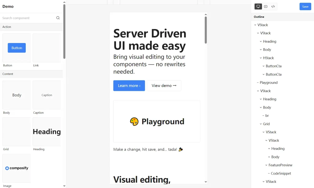
Preview
How to Use It
1. Install the package using your preferred package manager:
npm install @composify/react2. Register components in a catalog before using them in the editor or renderer. Create a catalog file that defines your components and their prop schemas.
// catalog.tsx
import { Catalog } from '@composify/react/renderer';
const Button = ({ variant, onClick, children }) => (
  <button
    className={`btn-${variant}`}
    onClick={onClick}
  >
    {children}
  </button>
);
Catalog.register('Button', {
  component: Button,
  props: {
    variant: {
      label: 'Button Style',
      type: 'select',
      options: [
        { label: 'Primary', value: 'primary' },
        { label: 'Secondary', value: 'secondary' },
      ],
      default: 'primary',
    },
    children: {
      label: 'Button Text',
      type: 'string',
      default: 'Click me',
    },
  },
});
Import this catalog file at your application entry point. For Next.js, add it to _app.tsx. For standard React apps, import it in index.tsx before your root component renders.
3. The Renderer component converts JSX strings into rendered React components. You pass a source string that contains valid JSX using your registered components.
// app/page.tsx
import { Renderer } from '@composify/react/renderer';
export default function Page() {
  const pageContent = `
    <div className="container">
      <h1>Product Launch</h1>
      <Button variant="primary">Sign Up Now</Button>
    </div>
  `;
  return <Renderer source={pageContent} />;
}
The renderer parses the JSX string and instantiates your registered components with the specified props. You can fetch the source string from a database, file system, or any data source.
4. The Editor component provides the drag-and-drop interface for building pages. Import the required stylesheet and pass your initial JSX source.
// app/editor/page.tsx
import { Editor } from '@composify/react/editor';
import '@composify/react/style.css';
export default function EditorPage() {
  const handleSave = (updatedSource) => {
    // Save to database or file system
    fetch('/api/save-page', {
      method: 'POST',
      body: JSON.stringify({ content: updatedSource }),
    });
  };
  const initialSource = `
    <div>
      <h1>Edit This Page</h1>
      <Button variant="secondary">Get Started</Button>
    </div>
  `;
  return (
    <Editor
      title="Landing Page"
      source={initialSource}
      onSubmit={handleSave}
    />
  );
}
Users click components to select them. The right sidebar displays all available props for the selected component. Users modify text fields, select dropdown options, and adjust settings in real time. The editor serializes the entire component tree back into a JSX string when users click save.
5. You can define more complex prop types, including arrays, objects, and custom validation.
const Card = ({ title, description, image, tags }) => (
  <div className="card">
    <img src={image} alt={title} />
    <h3>{title}</h3>
    <p>{description}</p>
    <div className="tags">
      {tags.map(tag => <span key={tag}>{tag}</span>)}
    </div>
  </div>
);
Catalog.register('Card', {
  component: Card,
  props: {
    title: {
      label: 'Card Title',
      type: 'string',
      default: 'Product Name',
    },
    description: {
      label: 'Description',
      type: 'textarea',
      default: 'Product description here',
    },
    image: {
      label: 'Image URL',
      type: 'string',
      default: '/placeholder.jpg',
    },
    tags: {
      label: 'Tags',
      type: 'array',
      items: { type: 'string' },
      default: ['new', 'featured'],
    },
  },
});
The editor automatically generates appropriate input controls based on the prop type definitions. Text fields appear for strings, textareas for longer content, and array inputs for lists.
FAQs
Q: How do I handle component updates after pages are built?
A: Composify renders components dynamically. When you update a component definition, all pages using that component reflect the changes immediately.
Q: Does the editor support custom styling and theming?
A: Yes. The editor accepts custom CSS variables and class names. You can override the default theme to match your design system.
Q: Can I restrict which components certain users can access?
A: You control this at the registration level. Create separate catalogs for different user roles and load the appropriate catalog based on permissions.
Q: How does version history work without Composify Cloud?
A: The library exports JSX strings. You implement version control by storing each save with a timestamp in your database and writing rollback logic.