Description:
An amazing list of 14 React loading spinner components built with pure CSS.
How to use it:
1. Installation with NPM.
# NPM
$ npm i react-spinners-css
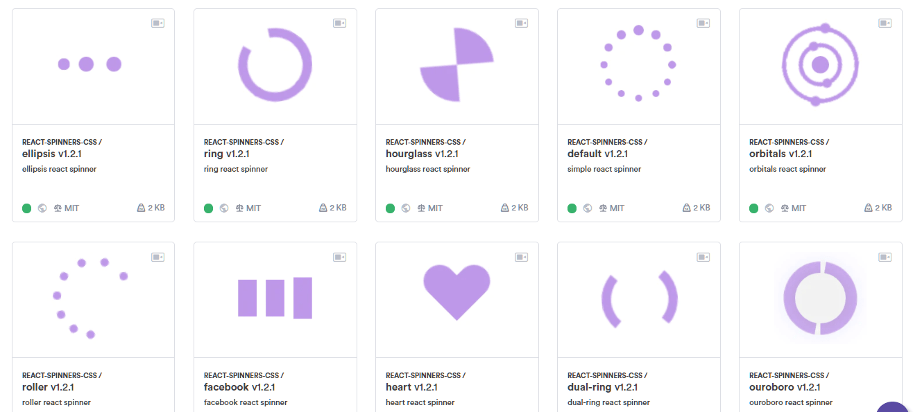
2. Import a loading spinner as a component into the React app. All loading spinners:
- <Circle/>
- <Default/>
- <Ellipsis/>
- <DualRing/>
- <Facebook/>
- <Grid/>
- <Heart/>
- <Hourglass/>
- <Ring/>
- <Ripple/>
- <Roller/>
- <Spinner/>
- <Orbitals/>
- <Ouroboro/>
import { Circle, Default } from 'react-spinners-css';3. Add the loading spinner to the app.
<Circle />
<Circle color="red" />
<Circle color="#be97e8" size={150} />
Preview: