Description:
BorderBeam is a React component that generates a moving gradient glow around cards, buttons, inputs, and similar UI blocks.
It works on React 18+ and uses modern CSS features such as conic gradients, masking, pseudo-elements, and @property animation.
The component wraps your content in a div, reads the child border radius, and paints the beam on decorative layers that sit above the wrapper.
BorderBeam is ideal for product cards, search bars, login panels, CTA buttons, and dashboard widgets that need stronger visual focus.
It keeps the content itself untouched. The glow layers stay decorative and ignore pointer events.
Features
- Adds a moving border glow around any wrapped React element.
- Uses three size presets for full border or bottom-line effects.
- Applies four built-in color palettes for different UI moods.
- Adapts glow rendering to dark, light, or system theme.
- Controls opacity, timing, brightness, saturation, and hue range.
- Toggles motion state through React props.
- Detects the child border radius automatically.
- Exposes activation and deactivation callbacks.
- Forwards standard
divattributes to the wrapper. - Keeps effect layers decorative and pointer-safe.
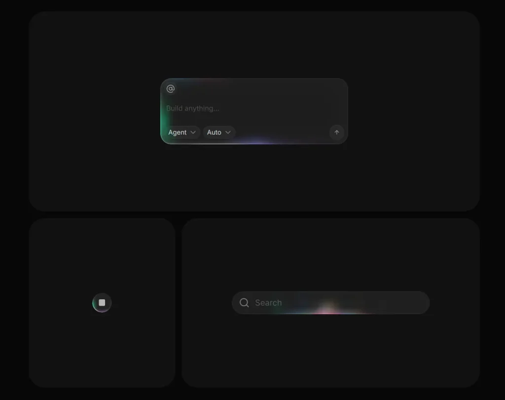
Preview
Use Cases
- Highlight pricing cards on a landing page.
- Add motion emphasis to a search bar.
- Draw attention to a primary action button.
- Decorate dashboard panels with subtle movement.
How to Use BorderBeam in React
1. Install the package with NPM.
npm install border-beam2. Import the component and wrap your content. BorderBeam wraps the block and paints the animated border effect on decorative layers. The child element keeps its own layout and content styles.
import { BorderBeam } from 'border-beam';
export default function DemoCard() {
  return (
    <BorderBeam>
      {/* The first child provides the radius that BorderBeam can read */}
      <section
        style={{
          padding: 24,
          borderRadius: 18,
          background: '#121212',
          color: '#f5f5f5',
        }}
      >
        <h2>Weekly Metrics</h2>
        <p>Traffic rose 18% in the last seven days.</p>
      </section>
    </BorderBeam>
  );
}
3. Pick a size preset. Use md for standard cards, sm for compact UI, and line for a bottom-edge motion effect.
import { BorderBeam } from 'border-beam';
export default function SizeExamples() {
  return (
    <>
      {/* Full border glow for medium and large surfaces */}
      <BorderBeam size="md">
        <div style={{ padding: 20, borderRadius: 16, background: '#171717' }}>
          Standard card beam
        </div>
      </BorderBeam>
      {/* Smaller beam for compact controls */}
      <BorderBeam size="sm">
        <button
          style={{
            padding: '10px 14px',
            borderRadius: 999,
            border: 0,
            background: '#1f1f1f',
            color: '#fff',
          }}
        >
          Save changes
        </button>
      </BorderBeam>
      {/* Bottom-line beam for bars and inputs */}
      <BorderBeam size="line">
        <div style={{ padding: 14, borderRadius: 12, background: '#101010' }}>
          Search panel
        </div>
      </BorderBeam>
    </>
  );
}
4. Choose a color palette and theme. theme="dark" and theme="light" tune the glow for the container background. theme="auto" follows the system color scheme.
import { BorderBeam } from 'border-beam';
export default function PaletteExamples() {
  return (
    <>
      {/* Multi-color spectrum */}
      <BorderBeam colorVariant="colorful" theme="dark">
        <div style={{ padding: 20, borderRadius: 16, background: '#111' }}>
          Colorful beam
        </div>
      </BorderBeam>
      {/* Neutral grayscale */}
      <BorderBeam colorVariant="mono" theme="light">
        <div style={{ padding: 20, borderRadius: 16, background: '#fafafa' }}>
          Mono beam
        </div>
      </BorderBeam>
      {/* Blue and purple range */}
      <BorderBeam colorVariant="ocean" theme="dark">
        <div style={{ padding: 20, borderRadius: 16, background: '#0f172a' }}>
          Ocean beam
        </div>
      </BorderBeam>
      {/* Warm orange and red range */}
      <BorderBeam colorVariant="sunset" theme="dark">
        <div style={{ padding: 20, borderRadius: 16, background: '#1c1917' }}>
          Sunset beam
        </div>
      </BorderBeam>
    </>
  );
}
5. Tune motion and intensity. strength changes beam visibility. duration changes speed. brightness, saturation, and hueRange shape the glow color treatment.
import { BorderBeam } from 'border-beam';
export default function CustomBeam() {
  return (
    <BorderBeam
      size="md"
      colorVariant="ocean"
      theme="dark"
      strength={0.75}      // Control effect opacity from 0 to 1
      duration={2.2}       // Set the animation cycle in seconds
      brightness={1.4}     // Increase glow brightness
      saturation={1.25}    // Increase color intensity
      hueRange={24}        // Limit hue rotation range
      staticColors={false} // Keep hue animation active
    >
      <div
        style={{
          padding: 24,
          borderRadius: 20,
          background: '#0b1120',
          color: '#dbeafe',
        }}
      >
        Activity report
      </div>
    </BorderBeam>
  );
}
6. Pause and resume the animation from React state.
import { useState } from 'react';
import { BorderBeam } from 'border-beam';
export default function PlayPauseExample() {
  const [active, setActive] = useState(true);
  return (
    <div>
      {/* Toggle the animation state from app logic */}
      <button
        onClick={() => setActive((current) => !current)}
        style={{ marginBottom: 12 }}
      >
        Toggle beam
      </button>
      <BorderBeam
        active={active}
        onActivate={() => console.log('Beam faded in')}
        onDeactivate={() => console.log('Beam faded out')}
      >
        <div
          style={{
            padding: 20,
            borderRadius: 16,
            background: '#18181b',
            color: '#fafafa',
          }}
        >
          Status panel
        </div>
      </BorderBeam>
    </div>
  );
}
7. Set the border radius manually when needed. Use borderRadius when your child styles come from a dynamic class system, a delayed style update, or a wrapper structure that makes radius detection unreliable.
import { BorderBeam } from 'border-beam';
export default function ManualRadiusExample() {
  return (
    <BorderBeam borderRadius={28}>
      {/* Manual radius helps when the child radius is dynamic or hard to detect */}
      <div style={{ padding: 24, borderRadius: 28, background: '#111827' }}>
        Rounded promo block
      </div>
    </BorderBeam>
  );
}
8. All available component props:
BorderBeam forwards standard
HTMLDivElementattributes to its wrapper. You can pass values such asid,role,aria-*, and custom data attributes.
children(ReactNode): Content wrapped by the component. No default value.size('sm' | 'md' | 'line'): Selects the beam style preset. Default:'md'.colorVariant('colorful' | 'mono' | 'ocean' | 'sunset'): Selects the color palette. Default:'colorful'.theme('dark' | 'light' | 'auto'): Tunes the effect for dark, light, or system theme. Default:'dark'.strength(number): Sets beam layer opacity from0to1. Default:1.duration(number): Sets the animation cycle length in seconds. Default:1.96or2.4based on preset.active(boolean): Starts or stops the beam animation with fade transitions. Default:true.borderRadius(number): Overrides automatic radius detection in pixels. Default: auto-detected.brightness(number): Multiplies glow brightness. Default:1.3.saturation(number): Multiplies glow saturation. Default:1.2.hueRange(number): Sets the hue rotation range in degrees. Default:30.staticColors(boolean): Keeps colors fixed and disables hue-shift motion. Default:false.className(string): Adds custom classes to the wrapper. No default value.style(CSSProperties): Adds inline styles to the wrapper. No default value.onActivate(() => void): Runs after the fade-in transition completes. No default value.onDeactivate(() => void): Runs after the fade-out transition completes. No default value.
9. Imperative API.
// BorderBeam does not expose instance methods.
// React props control the component state and appearance.
<BorderBeam active={isBeamActive} strength={0.8} theme="dark">
  <div style={{ borderRadius: 16 }}>Runtime-controlled beam</div>
</BorderBeam>
10. Event Callbacks.
// Run code after the beam fades in.
<BorderBeam
  onActivate={() => {
    console.log('Beam entered the active state');
  }}
>
  <div style={{ borderRadius: 16 }}>Beam start callback</div>
</BorderBeam>
// Run code after the beam fades out.
<BorderBeam
 active={false}
  onDeactivate={() => {
    console.log('Beam left the active state');
  }}
>
  <div style={{ borderRadius: 16 }}>Beam stop callback</div>
</BorderBeam>
FAQs
Q: Can I use BorderBeam in Next.js?
A: Yes. Import it into a client component and render it around any block-level content. The package relies on React rendering and browser-side CSS animation.
Q: Why does the glow shape look wrong on my component?
A: Check the child border radius first. Pass borderRadius manually if your styles load dynamically or come from nested wrappers.
Q: Can I stop the animation after a hover or tab change?
A: Yes. Drive the active prop from component state. Use onActivate and onDeactivate if you need transition hooks.
Q: Does BorderBeam affect screen readers or clicks?
A: The effect layers stay decorative. They use pointer-safe rendering, and they do not add semantic content.
Q: Why does the animation not run in an older browser?
A: The component depends on CSS @property. Use the documented browser baseline for reliable rendering.