Description:
A lightweight, zero-dependency, themeable multiple select component with support for check boxes, select all, and live search.
How to use it:
1. Install and import the multiple select component.
# Yarn
$ yarn add react-multi-select-component
# NPM
$ npm i react-multi-select-component
import React, { useState } from "react";
import { MultiSelect } from "react-multi-select-component";
2. Define your suggestions displayed in the dropdown.
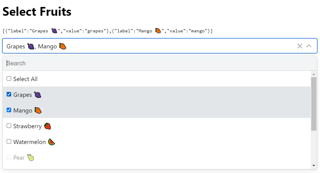
const suggestions = [
  { label: "JavaScript", value: "js" },
  { label: "CSS", value: "css" },
  { label: "HTML5", value: "html", disabled: true },
];
3. Add the component to the app.
const Example = () => {
  const [selected, setSelected] = useState([]);
  return (
    <div>
      <h1>Select Languages</h1>
      <pre>{JSON.stringify(selected)}</pre>
      <MultiSelect
        options={suggestions}
        value={selected}
        onChange={setSelected}
        labelledBy="Select"
      />
    </div>
  );
};
export default Example;
4. Available component props.
options: Option[];
value: Option[];
onChange?;
valueRenderer?: (selected: Option[], options: Option[]) => ReactNode;
ItemRenderer?;
ArrowRenderer?: ({ expanded }) => JSX.Element;
isLoading?: boolean;
disabled?: boolean;
disableSearch?: boolean;
shouldToggleOnHover?: boolean;
hasSelectAll?: boolean;
filterOptions?: (
  options: Option[],
  filter: string
) => Promise<Option[]> | Option[];
overrideStrings?: { [key: string]: string };
labelledBy: string;
className?: string;
onMenuToggle?;
ClearIcon?: ReactNode;
debounceDuration?: number;
ClearSelectedIcon?: ReactNode;
defaultIsOpen?: boolean;
isOpen?: boolean;
isCreatable?: boolean;
onCreateOption?;
closeOnChangedValue?: boolean;
Preview: