Description:
Reanimated Color Picker allows you to add a fully customizable color picker to your React Native-powered apps with support for IOS, Android, Expo, and Web.
Basic Usage:
1. Install and import the Reanimated Color Picker’s components into your project.
# NPM
$ npm i reanimated-color-picker
import React, { useState } from 'react';
import { Button, Modal, StyleSheet, View } from 'react-native';
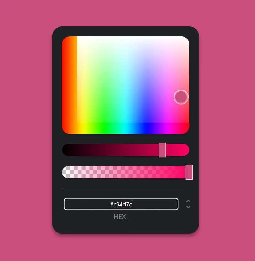
import ColorPicker, { Panel1, Swatches, Preview, OpacitySlider, HueSlider } from 'reanimated-color-picker';2. Create a basic color picker.
export default function App() {
  const [showModal, setShowModal] = useState(false);
  const onSelectColor = ({ hex }) => {
    // do something with the selected color.
    console.log(hex);
  };
  return (
    <View style={styles.container}>
      <Button title='Color Picker' onPress={() => setShowModal(true)} />
      <Modal visible={showModal} animationType='slide'>
        <ColorPicker style={{ width: '70%' }} value='red' onComplete={onSelectColor}>
          <Preview />
          <Panel1 />
          <HueSlider />
          <OpacitySlider />
          <Swatches />
        </ColorPicker>
        <Button title='Ok' onPress={() => setShowModal(false)} />
      </Modal>
    </View>
  );
}
const styles = StyleSheet.create({
  container: {
    flex: 1,
    justifyContent: 'center',
  },
});
3. See the Offical API for more usages.
Preview: