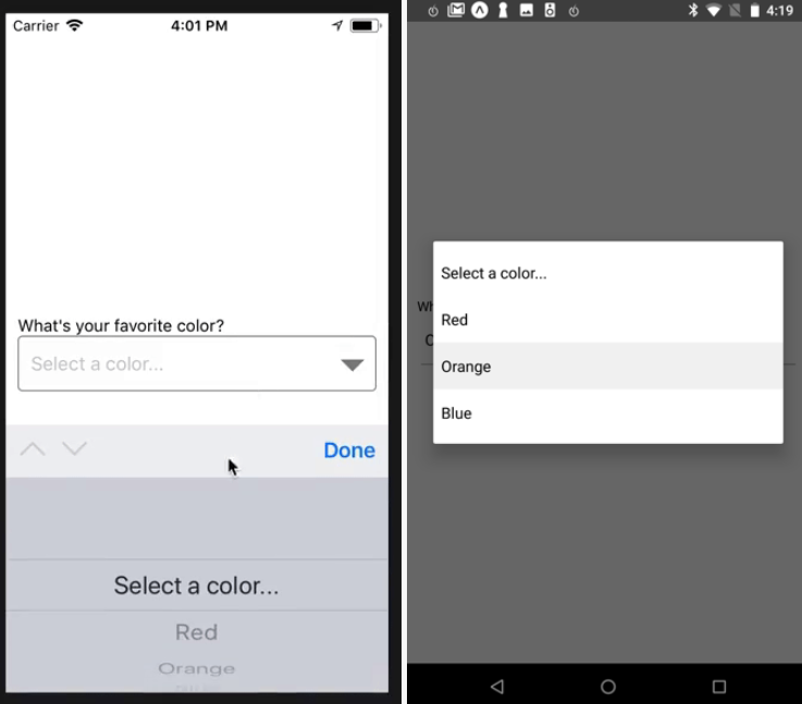
Description:
Picker is a cross-platform (iOS & Android) UI component for selecting an item from a list of options in your React Native app.
Install & Import:
# NPM
$ npm i @react-native-community/picker --save
# Bower
$ bower install @react-native-community/picker --save
import {Picker} from '@react-native-community/picker';Basic Usage:
<Picker
  selectedValue={this.state.language}
  style={{height: 50, width: 100}}
  onValueChange={(itemValue, itemIndex) =>
    this.setState({language: itemValue})
  }>
  <Picker.Item label="Java" value="java" />
  <Picker.Item label="JavaScript" value="js" />
</Picker>
state = {
  language: 'java',
};
Default Props
children?: Node,
style?: ?TextStyleProp,
/**
* Value matching value of one of the items. Can be a string or an integer.
*/
selectedValue?: ?(number | string),
/**
* Callback for when an item is selected. This is called with the following parameters:
* - `itemValue`: the `value` prop of the item that was selected
* - `itemIndex`: the index of the selected item in this picker
*/
onValueChange?: ?(itemValue: string | number, itemIndex: number) => mixed,
/**
* If set to false, the picker will be disabled, i.e. the user will not be able to make a
* selection.
* @platform android
*/
enabled?: ?boolean,
/**
* On Android, specifies how to display the selection items when the user taps on the picker:
*
* - 'dialog': Show a modal dialog. This is the default.
* - 'dropdown': Shows a dropdown anchored to the picker view
*
* @platform android
*/
mode?: ?('dialog' | 'dropdown'),
/**
* Style to apply to each of the item labels.
* @platform ios
*/
itemStyle?: ?TextStyleProp,
/**
* Prompt string for this picker, used on Android in dialog mode as the title of the dialog.
* @platform android
*/
prompt?: ?string,
/**
* Used to locate this view in end-to-end tests.
*/
testID?: ?string


