Description:
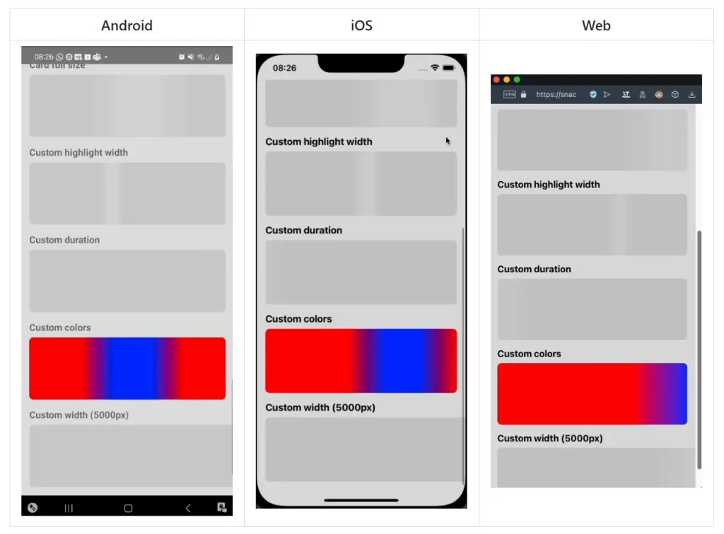
React Native Gradient Shimmer is a React Native skeleton loader library that animates a gradient across placeholder shapes.
It accepts an Expo or bare React Native gradient component and can synchronize multiple placeholders through an animation provider.
Preview
Install for Expo
For a bare React Native app, install react-native-linear-gradient and run CocoaPods installation for iOS. Import that library’s default export as the gradient component.
npm install react-native-gradient-shimmer
npx expo install expo-linear-gradient
Create a Profile Skeleton
import { View } from "react-native";
import { LinearGradient } from "expo-linear-gradient";
import GradientShimmer, {
  AnimationProvider,
} from "react-native-gradient-shimmer";
export function ProfileSkeleton() {
  return (
    <AnimationProvider animating={true}>
      <View style={{ flexDirection: "row", alignItems: "center", padding: 16 }}>
        <GradientShimmer
          LinearGradientComponent={LinearGradient}
          width={56}
          height={56}
          style={{ borderRadius: 28, marginRight: 12 }}
        />
        <View>
          <GradientShimmer
            LinearGradientComponent={LinearGradient}
            width={160}
            height={16}
            style={{ borderRadius: 4, marginBottom: 8 }}
          />
          <GradientShimmer
            LinearGradientComponent={LinearGradient}
            width={100}
            height={12}
            style={{ borderRadius: 4 }}
          />
        </View>
      </View>
    </AnimationProvider>
  );
}
Build Reusable Placeholders
Create a preset when several screens share colors and timing:
import { LinearGradient } from "expo-linear-gradient";
import { createGradientShimmer } from "react-native-gradient-shimmer";
const AppShimmer = createGradientShimmer({
  LinearGradientComponent: LinearGradient,
  backgroundColor: "#151838",
  highlightColor: "#2b3164",
  duration: 1200,
});
export function ArticleSkeleton() {
  return <AppShimmer width={280} height={180} style={{ borderRadius: 12 }} />;
}
Define a Skeleton as Layout Data
Use ShimmerLayout for nested rows and columns. It synchronizes its placeholders automatically:
import { LinearGradient } from "expo-linear-gradient";
import { ShimmerLayout } from "react-native-gradient-shimmer";
const layout = {
  flexDirection: "row",
  alignItems: "center",
  content: [
    { width: 48, height: 48, style: { borderRadius: 24 }, marginRight: 12 },
    {
      content: [
        { width: 140, height: 14, marginBottom: 8 },
        { width: 90, height: 12 },
      ],
    },
  ],
};
export function CompactProfileSkeleton() {
  return <ShimmerLayout LinearGradientComponent={LinearGradient} layout={layout} />;
}
Layout Configuration
Container nodes accept content, flexDirection, alignItems, justifyContent, style, and margins. Leaf nodes define numeric width and height, plus style and margins. gap, rowGap, and columnGap require React Native 0.71 or newer.
Pass defaultShimmerProps to ShimmerLayout for placeholder defaults, including colors, timing, and styles. Set its animating prop to control the group’s playback.
Animation Props
Use animating to start or stop the native-driver translation loop. Replace the skeleton with loaded content when the request completes.
| Prop | Default | Behavior |
|---|---|---|
LinearGradientComponent | Required | Gradient renderer supplied by the app |
width, height | Required | Numeric placeholder dimensions; width must be positive |
backgroundColor | rgb(200,200,200) | Placeholder base color |
highlightColor | rgb(210,210,210) | Moving highlight color |
highlightWidth | 200 | Highlight beam width |
duration | 1500 | Duration of one pass in milliseconds |
animating | true | Starts or stops playback |
easing | Easing.linear | Timing curve |
style | Unset | Container styling, including corners and margins |
testID | Unset | Identifier on the container view |