Description:
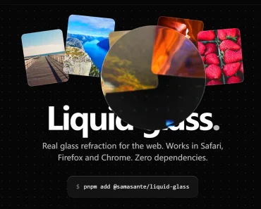
Glisse is a React UI component library that adds Apple-style Liquid Glass controls to web apps.
It supports glass-styled forms, action menus, and navigation, with draggable lenses on switches and selection controls.
Preview

How To Use It
Install glisse
npm install glisseStyles load with the component imports. Add a controlled switch to a settings panel:
import { useState } from "react";
import { Button, Switch } from "glisse";
export default function NotificationSettings() {
  const [enabled, setEnabled] = useState(true);
  return (
    <section>
      <label>
        Email notifications
        <Switch aria-label="Email notifications" checked={enabled} onCheckedChange={setEnabled} />
      </label>
      <Button variant="filled" onClick={() => console.log(enabled)}>
        Save preferences
      </Button>
    </section>
  );
}
Available UI Components
| Component | Purpose |
|---|---|
Button | Glass or accent-filled actions, with optional icons and destructive styling |
Switch | Boolean selection with a draggable lens thumb |
Slider | Continuous or stepped numeric selection |
SegmentedControl | Selection between labeled options |
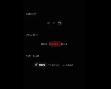
TabBar | Icon-and-label navigation with a movable selection indicator |
Menu | Action entries, separators, icons, and destructive items |
Input | Text entry with an optional icon |
SearchField | Search input with a magnifier icon and clear button |
Glass | A refractive container for custom content |
Add Segmented Selection
Use value and onValueChange to connect a segmented control to the selected reporting period:
import { useState } from "react";
import { SegmentedControl } from "glisse";
export function ReportPeriod() {
  const [period, setPeriod] = useState("week");
  return (
    <SegmentedControl
      aria-label="Report period"
      items={[
        { value: "day", label: "Day" },
        { value: "week", label: "Week" },
        { value: "month", label: "Month" },
      ]}
      value={period}
      onValueChange={setPeriod}
    />
  );
}
Configure Controls
| Component | Prop | Behavior |
|---|---|---|
Switch | checked / defaultChecked | Controlled or initial boolean value |
Switch | onCheckedChange | Receives the updated boolean |
SegmentedControl | items | Options with a string value and a renderable label |
SegmentedControl | value / defaultValue | Controlled or initial selection; null clears it |
SegmentedControl | onValueChange | Receives the selected string |
Style Buttons and Custom Glass
Button defaults to variant="glass"; set variant="filled" for an accent-filled action. Pass an icon to place content before the label.
Set tint to a CSS color for a colored label or fill, and use destructive for destructive actions. An icon-only button needs an aria-label.
The default HTML button type is
button; settype="submit"for form submission.
Mark the content behind a custom lens with data-glisse-backdrop. Position the marked background behind Glass within a shared container, outside the lens itself.
For unmarked backgrounds, Chromium applies live backdrop refraction and other browsers retain frost and edge lighting.
Size and shape Glass through style or className. Use --lg-glass-bend for refraction strength, --lg-glass-dispersion for color dispersion, --lg-blur for blur, and --lg-rim-shine for edge lighting.