Description:
This is a React Native and Expo date picker component that adds iOS-style wheel selection and calendar-day picking to Android apps.
Features
- Adds haptic feedback and sound to date selection.
- Displays a calendar grid for direct day selection.
- Uses glassmorphism styling for the dropdown surface.
- Runs animated picker interactions through the Expo stack.
- Supports typed date values in TypeScript.
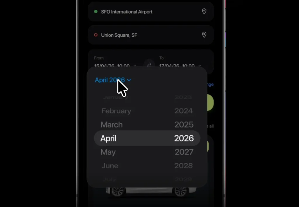
Preview
Use Cases
- Add a birth date field to an Android onboarding screen.
- Build appointment booking forms with touch-friendly date input.
- Create reminder apps with a compact dropdown picker.
- Match Android date selection closer to an existing iOS product.
How to use it
1. Clone and run the Expo project:
# Clone the Expo date picker project.
git clone https://github.com/rit3zh/expo-ios-like-date-picker
# Move into the project directory.
cd expo-ios-like-date-picker
# Start the Expo development server with Bun.
bun start
2. Import the dropdown date picker components:
import { useState } from "react";
import { StyleSheet, Text } from "react-native";
// Import the compound date picker API and its typed value shape.
import { DatePickerDropdown, type DateValue } from "@/src";
3. Store the selected date in React state:
// Store the selected date as a typed object.
const [appointmentDate, setAppointmentDate] = useState<DateValue>({
  day: 22,
  month: 7,
  year: 2026,
});
4. Render the dropdown picker:
export default function AppointmentDateField() {
  // Keep the picker value controlled by React state.
  const [appointmentDate, setAppointmentDate] = useState<DateValue>({
    day: 22,
    month: 7,
    year: 2026,
  });
  return (
    <DatePickerDropdown.Root
      // Pass the current date object into the picker.
      value={appointmentDate}
      // Save date changes from the picker.
      onChange={setAppointmentDate}
    >
      <DatePickerDropdown.Trigger style={styles.trigger}>
        {/* Render any React Native content inside the trigger. */}
        <Text>Choose appointment date</Text>
      </DatePickerDropdown.Trigger>
      {/* Position the picker panel below the trigger and align it at center. */}
      <DatePickerDropdown.Content side="bottom" align="center" />
    </DatePickerDropdown.Root>
  );
}
const styles = StyleSheet.create({
  trigger: {
    paddingHorizontal: 16,
    paddingVertical: 12,
    borderRadius: 14,
  },
});
5. Use the selected value in a form:
function formatDateValue(value: DateValue) {
  // Convert the numeric date object into a YYYY-MM-DD string.
  const year = String(value.year);
  const month = String(value.month).padStart(2, "0");
  const day = String(value.day).padStart(2, "0");
  // Return a backend-friendly date string.
  return `${year}-${month}-${day}`;
}
function submitAppointment(date: DateValue) {
  // Convert the picker value before sending it to an API.
  const scheduledDate = formatDateValue(date);
  // Send this value through your own request layer.
  console.log("Selected appointment date:", scheduledDate);
}
6. All configuration options:
value(DateValue): Sets the current selected date object for the controlled picker.onChange((value: DateValue) => void): Runs after the user selects a new date.style(StyleProp): Applies React Native styles to the trigger element.side(string): Places the dropdown content relative to the trigger. The usage pattern usesbottom.align(string): Aligns the dropdown content against the trigger. The usage pattern usescenter.
7. Value Type Reference:
// DateValue stores the selected date as separate numeric fields.
type DateValue = {
  day: number;
  month: number;
  year: number;
};
8: Component API Reference:
// Root controls the selected date and receives selection changes.
<DatePickerDropdown.Root value={appointmentDate} onChange={setAppointmentDate}>
  {/* Trigger and Content belong inside Root. */}
</DatePickerDropdown.Root>
// Trigger renders the visible button or field in your form.
<DatePickerDropdown.Trigger style={styles.trigger}>
  <Text>Choose delivery date</Text>
</DatePickerDropdown.Trigger>
// Content renders the dropdown picker panel.
<DatePickerDropdown.Content side="bottom" align="center" />
9. API Methods:
// The public API uses controlled React state rather than imperative methods.
// Set a new date from parent code when your screen needs a programmatic reset.
setAppointmentDate({ day: 1, month: 1, year: 2027 });
// Root receives the new value on the next render.
<DatePickerDropdown.Root value={appointmentDate} onChange={setAppointmentDate} />;
10. Events:
// The picker sends selection changes through the Root onChange callback.
<DatePickerDropdown.Root
  value={appointmentDate}
  onChange={(nextDate) => {
    // Persist the selected date in your component state.
    setAppointmentDate(nextDate);
    // Run form validation or analytics here if your app needs it.
    console.log("Date changed:", nextDate);
  }}
>
  <DatePickerDropdown.Trigger style={styles.trigger}>
    <Text>Select trip date</Text>
  </DatePickerDropdown.Trigger>
  <DatePickerDropdown.Content side="bottom" align="center" />
</DatePickerDropdown.Root>
Alternatives:
FAQs
Q: Does expo-ios-like-date-picker support iOS?
A: Android is the current runtime target. Use the native iOS date picker path for iOS production screens.
Q: Why does my @/src import fail?
A: Your project may not have the @ alias configured. Change the import to a relative path or add the alias to your Expo setup.
Q: How should I store the selected date in a form?
A: Store DateValue in React state. Convert it to a string or timestamp when the user submits the form.


