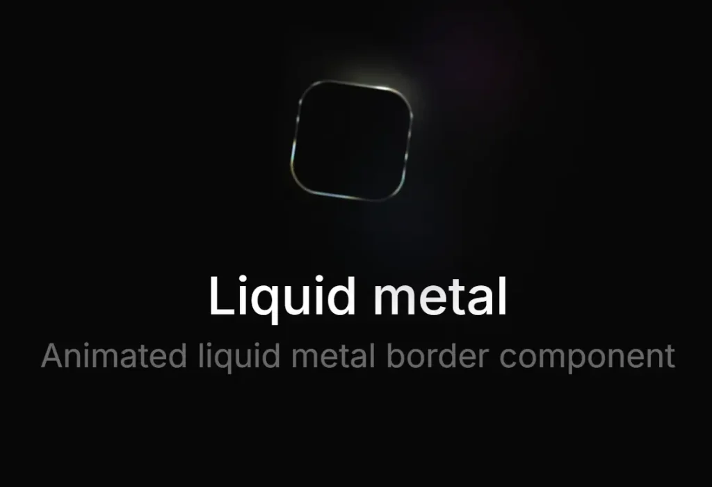
Description:
metal-fx is a React component library that adds an animated WebGL liquid metal effect to buttons, chips, and icon controls. It wraps a single React child element and paints a live metallic ring above it. The control remains clickable, and the effect works well for premium CTAs, compact icon buttons, and dark UI dashboards.
The library focuses on decorative UI motion rather than layout control. You still style the button yourself with normal CSS or utility classes. metal-fx then measures the rendered element, reads its radius, and draws the metal frame through a client-side WebGL pipeline.
Features
- Supports pill and circular control shapes.
- Includes chromatic, silver, and gold visual styles.
- Matches dark and light user themes.
- Keeps the wrapped control fully clickable.
- Pauses animation for static interface states.
- Reflects nearby metal highlights in dark interfaces.
- Shares one graphics context across page instances.
- Skips hidden elements during scroll.
- Supports SSR-friendly React apps.
Preview
How To Use metal-fx
1. Install The Package with NPM.
npm install metal-fx2. Import The React Component. metal-fx expects one child element inside the wrapper. A button, chip, anchor, or icon button all work, but the child should render a real DOM element with stable dimensions.
import { MetalFx } from 'metal-fx';
export default function BillingButton() {
  return (
    <MetalFx variant="button">
      {/* The child element keeps its normal button behavior */}
      <button className="billing-cta">
        View Plans
      </button>
    </MetalFx>
  );
}
3. Add Your Own Button Styles:
.billing-cta {
  height: 42px;
  padding: 0 22px;
  border: 0;
  border-radius: 999px;
  color: #fff;
  background: #101114;
  font: 600 14px/1 system-ui, sans-serif;
  cursor: pointer;
}
4. Use The Circle Variant For Icon Buttons:
import { MetalFx } from 'metal-fx';
export function SendMessageButton() {
  return (
    <MetalFx variant="circle">
      {/* Give circular controls an explicit square size */}
      <button
        aria-label="Send message"
        style={{
          width: 40,
          height: 40,
          borderRadius: '50%'
        }}
      >
        ↗
      </button>
    </MetalFx>
  );
}
5. Choose A Preset. Use chromatic for a colorful iridescent look. Use silver for cooler product UI. Use gold for premium or billing flows.
import { MetalFx } from 'metal-fx';
export function UpgradeControl() {
  return (
    <MetalFx preset="gold" variant="button">
      {/* The gold preset suits billing and upgrade actions */}
      <button className="premium-action">
        Start Membership
      </button>
    </MetalFx>
  );
}
6. Control The Theme Manually. The default theme mode follows the browser color scheme. For custom app themes, pass your theme state directly.
import { MetalFx } from 'metal-fx';
type ThemeName = 'dark' | 'light';
export function ThemeAwareButton({ theme }: { theme: ThemeName }) {
  return (
    <MetalFx theme={theme} preset="silver">
      {/* Pass your app theme when your toggle does not follow the OS */}
      <button className="settings-button">
        Open Settings
      </button>
    </MetalFx>
  );
}
7. Reduce The Visual Strength. strength accepts a number from 0 to 1. Use a lower value for dense dashboards, admin panels, and repeated UI elements.
import { MetalFx } from 'metal-fx';
export function QuietToolbarAction() {
  return (
    <MetalFx strength={0.45} preset="chromatic">
      {/* Lower strength works better in dense toolbar layouts */}
      <button className="toolbar-button">
        Export
      </button>
    </MetalFx>
  );
}
8. Pause The Animation.
import { MetalFx } from 'metal-fx';
export function StaticPreviewButton() {
  return (
    <MetalFx paused preset="silver">
      {/* The metal frame remains visible in its current frame */}
      <button className="preview-button">
        Preview Report
      </button>
    </MetalFx>
  );
}
9. Add Proximity Reflection Targets:
import { useRef } from 'react';
import { MetalFx } from 'metal-fx';
export function ComposerActions() {
  const attachRef = useRef<HTMLButtonElement>(null);
  const sendRef = useRef<HTMLButtonElement>(null);
  return (
    <div className="composer-actions">
      {/* This nearby control can receive a reflected metal highlight */}
      <button ref={attachRef} className="composer-chip">
        Attach
      </button>
      <MetalFx
        variant="circle"
        preset="chromatic"
        reflectionTargets={[attachRef]}
      >
        {/* The metal effect belongs to this primary action */}
        <button
          ref={sendRef}
          className="composer-send"
          aria-label="Send message"
        >
          ↑
        </button>
      </MetalFx>
    </div>
  );
}
10. Size The Wrapper When The Frame Needs More Space:
import { MetalFx } from 'metal-fx';
export function FramedIconButton() {
  return (
    <MetalFx
      variant="circle"
      style={{
        width: 44,
        height: 44
      }}
    >
      {/* Stretch the child when the wrapper controls the final box */}
      <button
        aria-label="Open assistant"
        style={{
          width: '100%',
          height: '100%',
          borderRadius: '50%'
        }}
      >
        ✦
      </button>
    </MetalFx>
  );
}
11. Override The Border Radius:
import { MetalFx } from 'metal-fx';
export function RoundedPanelButton() {
  return (
    <MetalFx borderRadius={18} preset="silver">
      {/* Use an explicit radius when computed CSS radius is not enough */}
      <button className="panel-action">
        Open Panel
      </button>
    </MetalFx>
  );
}
12. Configuration Options:
children(React.ReactElement): Sets the single host element that receives the visual metal frame.variant('button' | 'circle'): Sets the frame shape.buttonuses a pill-like frame.circleuses a compact circular frame.preset('chromatic' | 'silver' | 'gold'): Sets the metal color palette. The default value ischromatic.theme('auto' | 'dark' | 'light'): Sets the resolved color mode. The default value isauto.strength(number): Sets the effect intensity from0to1. The default value is1.paused(boolean): Freezes the shader animation on the current frame.reflectionTargets(React.RefObject<HTMLElement>[]): Adds nearby elements that can receive a reflected metal highlight in dark mode.borderRadius(number): Overrides the detected border radius in pixels.style(React.CSSProperties): Applies inline styles to the wrapper element.
13. API Methods:
// metal-fx exposes no public imperative API methods.
// Control the component through React props.
<MetalFx paused strength={0.5}>
  <button>Review Draft</button>
</MetalFx>;
// Update props from React state when your UI needs runtime control.
<MetalFx theme={currentTheme} preset={selectedPreset}>
  <button>Apply Theme</button>
</MetalFx>;
14. Events:
// metal-fx exposes no custom event API.
// Attach normal React events to the child element.
<MetalFx variant="button">
  <button onClick={() => console.log('Report opened')}>
    Open Report
  </button>
</MetalFx>;
// Pointer events stay on the child element.
<MetalFx preset="gold">
  <button onPointerEnter={() => console.log('Pointer entered')}>
    Try Premium
  </button>
</MetalFx>;
Alternatives
- react-liquid-glass: Add glass-style liquid UI effects to React components.
- ogl: Build lightweight WebGL effects with a small graphics utility layer.
- three.js: Create full WebGL scenes, shaders, and advanced 3D UI experiments.
FAQs
Q: Can I use metal-fx in a Next.js app?
A: Yes. The component uses an SSR-safe placeholder and starts the WebGL pipeline after hydration. Use it inside normal client-side React components.
Q: Why does the reflection effect not appear in light mode?
A: Reflections run only in dark mode. Set theme="dark" or pass a dark app theme state if you need that visual treatment.
Q: The metal ring does not match my button shape. How do I fix it?
A: Set a clear border-radius on the child button first. Pass borderRadius to MetalFx when your CSS radius changes through complex class rules.
Q: Can I use it on links or chips instead of buttons?
A: Yes. Wrap one interactive host element, such as an anchor or chip. Keep the child dimensions stable for better measurement.
Q: How should I handle many metal buttons on one page?
A: Use the effect on primary actions only. The shared graphics context helps performance, but too many animated accents can weaken the interface hierarchy.