Description:
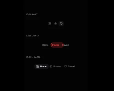
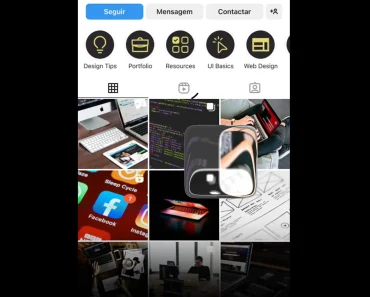
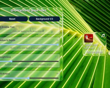
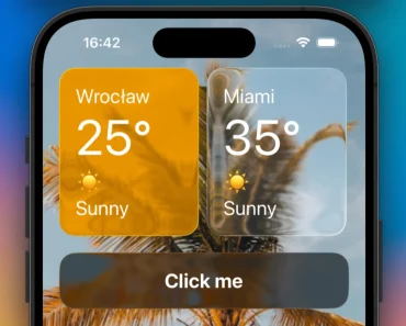
Plasma UI is a React component library for draggable, liquid-style panels on a shared WebGL canvas.
Panels fuse when they overlap, refract a supplied background, and snap to a grid or neighboring edges when released.
Preview

Features
- Shared WebGL material for panels that fuse and separate.
- Dragging with grid and neighbor-edge snapping.
tidal,aurora, andembermoods plus custom mood objects.- Adjustable refraction, frost, tint, rims, grain, glow, and spring motion.
- Semantic HTML through
as, with ordinary HTML content inside each panel. - CSS frosted-panel fallback when WebGL2 is unavailable.
- Server-rendered fallback markup that changes to the canvas effect after hydration.
How To Use It
Install @cruxgarden/plasma-ui with NPM, Wrap the panel area in PlasmaProvider and put ordinary controls inside each Plasma panel.
In a Next.js App Router project, add
"use client"at the top of the component file.
npm install @cruxgarden/plasma-uiimport { PlasmaProvider, Plasma } from "@cruxgarden/plasma-ui";
export function Workspace() {
return (
<PlasmaProvider mood="tidal">
<Plasma as="header" lean={false}>
Project workspace
</Plasma>
<Plasma draggable padding={20}>
<h2>Inbox</h2>
<button type="button">Open message</button>
</Plasma>
</PlasmaProvider>
);
}Dragging and Joining Panels
Set draggable on a panel to move it. It snaps to neighboring edges or the provider grid on release.
onDragEnd receives the settled { x, y } offset, defaultOffset sets an initial position, while offset controls the position from React state.
<Plasma
  draggable
  defaultOffset={{ x: 24, y: 24 }}
  onDragEnd={(offset) => console.log(offset)}
  onJoinChange={(joined) => console.log(joined)}
>
  <h2>Tasks</h2>
  <button data-plasma-nodrag type="button">Add task</button>
</Plasma>
Styling the Material
The provider sets the shared appearance and physics. A panel can override tint, opacity, frost, elevation, radius, and related values.
The built-in moods set color, blend distance, and spring behavior. Set background to a CSS color, image URL, or an image, canvas, or video element.
Keep overlapping dialogs and menus as CSS layers, or use a second provider canvas when they need the plasma material.
<PlasmaProvider
  mood="aurora"
  viscosity={0.6}
  stretch={1.2}
  rimColor="#5fd4ff"
  rimWidth={1.6}
>
  <Plasma tint="#ff5fa2" opacity={0.3} draggable>
    <h2>Player</h2>
  </Plasma>
</PlasmaProvider>
Key Props and Hooks
| API | Purpose |
|---|---|
PlasmaProvider mood | Built-in mood name or a custom Mood object. |
blend | Distance at which panels begin to fuse. |
grid, magnet, spring | Shared placement and motion settings. |
maxSurfaces | Visible panel budget, default 16. Changing it rebuilds shaders. |
Plasma draggable, snap, bounds | Dragging, snap behavior, and drag area. |
offset, defaultOffset | Controlled or initial panel position. |
onDragStart, onDragEnd, onJoinChange | Drag and fusion callbacks. |
usePlasmaRuntime() | Renderer state, reduced-motion state, pulse(), and bump(). |