Description:
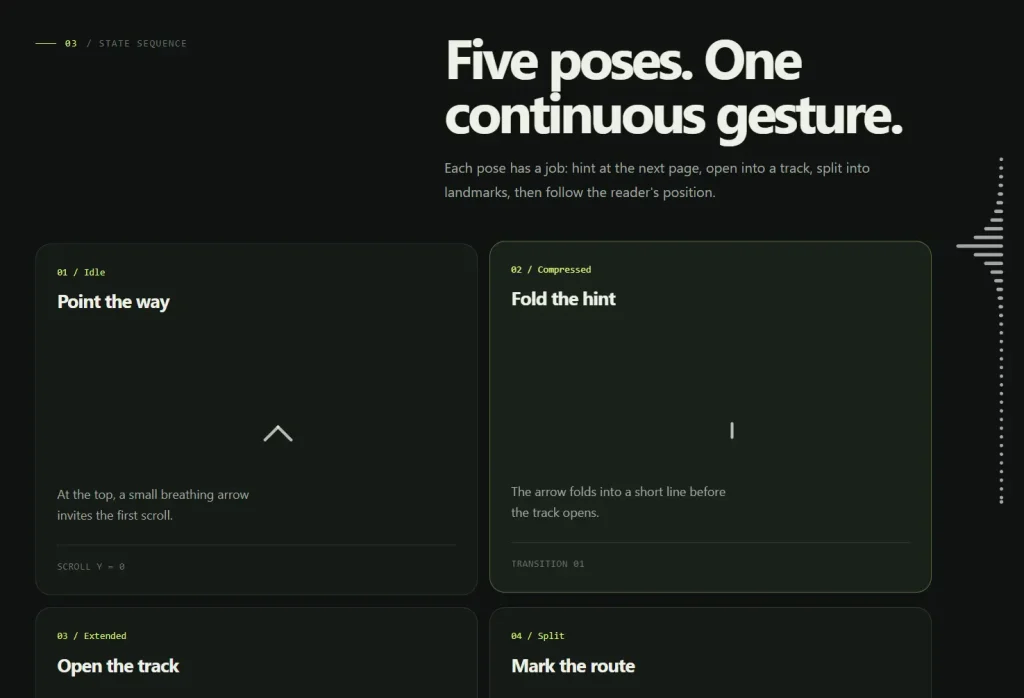
Scrollbar but Cooler is a React SVG scrollbar component that changes from a small arrow at the bottom right into a scroll-linked column of dots. As the page begins to move, the indicator passes through idle, compressed, extended, split, and tracking poses.
The component is ideal for long-form pages, visual essays, portfolios, and interactive landing pages that need a clearer sense of document position. The focused dot extends toward the page, nearby dots follow with a configurable falloff, and clicking a dot scrolls to the corresponding document fraction.
Preview
Features
- A fixed SVG layer replaces the visible native scrollbar while normal page scrolling remains available.
- Scroll movement passes through five visual poses: idle, compressed, extended, split, and tracking.
- The number of landmarks comes from the configured line length and dot spacing.
- The focused dot reaches left toward the page content while nearby dots follow an exponential falloff.
- Invisible SVG hit areas let visitors click individual landmarks and jump to equal scroll positions.
- The idle arrow scrolls down by one viewport when clicked.
- Hovered dots tint nearby landmarks according to the configured color falloff.
ResizeObserverrecalculates the SVG geometry and hit areas after the viewport changes.prefers-reduced-motionswitches animated transitions and smooth scrolling to immediate movement.- DialKit exposes controls for the arrow, line, tracking behavior, timing, and appearance.
How to use it
Installation
Download & enter the repository, install the checked-in dependencies and start the Vite development server:
npm install
npm run dev
Basic usage
The component is rendered once inside the page-level React layout. The surrounding page must contain enough content to create a scrollable document.
Add the DialKit root and global styles in main.tsx:
import { StrictMode } from 'react'
import { createRoot } from 'react-dom/client'
import { DialRoot } from 'dialkit'
import 'dialkit/styles.css'
import './index.css'
import App from './App.tsx'
createRoot(document.getElementById('root')!).render(
  <StrictMode>
    <App />
    <DialRoot position="top-left" productionEnabled />
  </StrictMode>,
)
Render the scrollbar from the page component:
import './App.css'
import Scrollbar from './components/Scrollbar/Scrollbar'
function App() {
  return (
    <main className="page">
      <article className="page-content">
        <h1>Long-form page</h1>
        <p>
          Add enough content here to create a document taller than the viewport.
        </p>
      </article>
      <Scrollbar />
    </main>
  )
}
export default App
The component imports its own Scrollbar.css file. The project also hides the browser scrollbar in src/index.css:
html {
  scrollbar-width: none;
}
html::-webkit-scrollbar {
  display: none;
}
Configuration options
Scrollbar does not accept props. Its settings are created inside useScrollbarSettings() and passed to DialKit. To change the defaults, edit that hook or tune the values through the DialKit panel.
Arrow settings
arrow.arrowLength(number): Length of the arrow shaft in the idle pose. The default is28.arrow.wingSpread(number): Distance between the two arrow wings. The default is8.arrow.bobAmplitude(number): Vertical movement applied to the idle arrow. The default is3.arrow.bobPeriod(number): Duration of one idle bob cycle in seconds. The default is2.arrow.hitPadding(number): Extra clickable space around the idle arrow. The default is10.
Line settings
line.length(number): Height of the extended line and dot column. The default is400.line.dotSpacing(number): Spacing used to calculate the number of landmarks. The default is10.
The component derives the dot count with:
Math.max(1, Math.round(settings.line.length / settings.line.dotSpacing))Tracking settings
tracking.maxExtension(number): Maximum distance that the focused dot reaches toward the page. The default is50.tracking.extensionFalloff(number): Falloff applied to dots near the focused landmark. The default is0.6.tracking.colorFalloff(number): Color falloff applied around a hovered dot. The default is0.3.tracking.smoothingTau(number): Settling time used to smooth dot extensions. The default is0.05.tracking.hitPadding(number): Extra clickable space around each tracking landmark. The default is10.
Timing settings
The component has four transition settings:
timing.compressedtiming.extendedtiming.splittiming.tracking
The checked-in values use easing objects with a transition type, duration, and cubic Bézier coordinates:
timing: {
  compressed: {
    type: 'easing',
    duration: 0.15,
    ease: [0.33, 1, 0.68, 1],
  },
  extended: {
    type: 'easing',
    duration: 0.35,
    ease: [0.65, 0, 0.35, 1],
  },
  split: {
    type: 'easing',
    duration: 0.2,
    ease: [0.33, 1, 0.68, 1],
  },
  tracking: {
    type: 'easing',
    duration: 0.2,
    ease: [0.33, 1, 0.68, 1],
  },
}
Appearance settings
appearance.dotColor(hex color): Base color for the scrollbar lines and dots. The source default is#a6a6a6.appearance.hoverColor(hex color): Color used for the arrow hover state and nearby landmark tinting. The source default is#ff00ea.appearance.strokeWidth(number): SVG stroke width. The default is4.
Styling and customization
The main CSS hooks are .scrollbar, .hit-area, and .arrow-hit. The SVG receives a data-state attribute with either idle or tracking.
The intermediate compressed, extended, and split poses are geometry transitions. They do not receive separate data-state values.
The component sets --dot-color, --dot-hover-color, and --stroke-width on the SVG. The base CSS uses --dot-color for currentColor and --stroke-width for line thickness. Hover colors are calculated in JavaScript from the configured appearance and tracking settings.
The native scrollbar is hidden by src/index.css, while src/components/Scrollbar/Scrollbar.css controls the SVG layer and pointer behavior. Deeper visual changes require edits to those source files because the component does not expose a prop-based theme API.
Advanced Usages
Page-level navigation
The current implementation is designed for the document viewport. It reads window.scrollY, measures document.documentElement.scrollHeight, and scrolls the window when a landmark is clicked.
It does not accept a target element or nested scroll container. Supporting a scrollable panel would require changing the scroll source, maximum scroll calculation, geometry placement, and click handler.
Live visual tuning
useScrollbarSettings() creates a DialKit group named Scrollbar. The sample application mounts:
<DialRoot position="top-left" productionEnabled />This gives the running page a control panel for the values declared in the hook. The scrollbar itself remains prop-free, so application state cannot currently configure it through <Scrollbar />.


